tkamiya
Member
I'm wondering what went wrong.
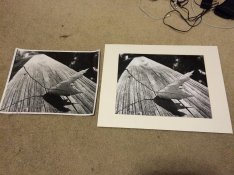
Please see the attached picture first. They were printed in the same darkroom, same lens, and the same enlarger. Developer used were scratch mixed D72.
The right image was printed on Adorama branded RC Pearl paper. Contrast was #2. The leaf was dodged and top left corner were burned in. Please note, texture of the wood is very evident. It look high contrast. But the filter used was #2.
The left image was printed on Adorama branded FB glossy paper. Contrast was #5. No dodge and burn, yet. Please note, it lacks contrast, especially for #5 filter. Forward part of the wood does not have the bright white embedded in it.
I am wondering what went wrong here. I've been using these paper for long time, and they usually behave normally, pretty close to Ilford MGIV. I never had to go beyond 2 1/2 to get good contrast. Neither of paper are new. I had these for 3 years or so and were kept at the same location in human comfortable environment.
I can pretty much rule out developer being bad because maximum black is about the same on both. Another thing I've noticed is, going from 2 1/2 to 3 1/2 (in contrast), I've noticed some change but going from 3 1/2 to 5, I've noticed very little difference. However, I shouldn't have to go even to 3 1/2 to get the same contrast as what I can achieve on RC with 2.
I'm very aware, RC and Fiber acts differently. Emulsion may also be very different. But, I've been using these paper for quite a while and this is the first time they are behaving oddly.
After going through 8 sheets, I'm taking a break. If anyone have an opinion or ideas, I'd like to know. Thanks!