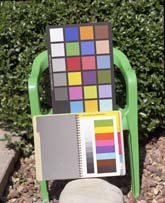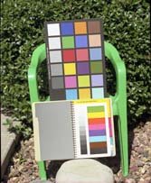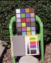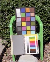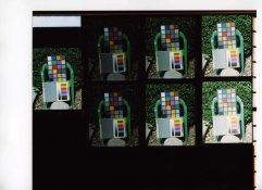


So now that I can print RA-4 at home, I decided to use my BW400CN for what they were made for, namely RA-4 printing. First reaction: blimey! they are nice, no grain, and smooth tones. It's weird to have an entire colour chain but to produce shades of gray in the end, but "toning" is much more simple 
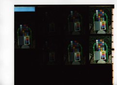
Second reaction: why is it that certain areas of my print have a cooler tone than others? Anybody ever noticed something similar?
It's hard to tell whether it's related to densities. I would suspect that different shades of gray may vary in apparent hue. After all, color dyes are not perfect. But I'm wondering if that would be related to processing instead. I'm sorry I can't post a scan right now, but I'll try later if I can make it visible. I'm confused, and I wonder whether it's metamerism playing a trick on me.
I'm using Supra Endura in Kodak chems, processed in a Unicolor drum on a motor base. I use a stop bath between dev and blix.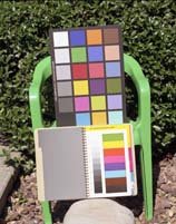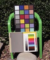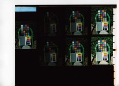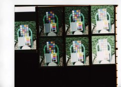