How to make color prints less contrasty?

Chiaro o scuro?

D
Chiaro o scuro?

  • 0
  • 0
  • 206
sdeeR

D
sdeeR

  • 3
  • 1
  • 239
Rouse St

A
Rouse St

  • 1
  • 0
  • 263
Untitled

A
Untitled

  • 3
  • 2
  • 300

Recent Classifieds

Forum statistics

Threads
199,199
Messages
2,787,724
Members
99,835
Latest member
Onap
Recent bookmarks
0

hencz

Member
Joined
Jun 28, 2012
Messages
23
Format
Multi Format
Hi,

I'm fairly new with enlargers and stuff. And I find my prints too shiny, too rich in colors, they look like high quality digital photos to me, I like simpler colors more, I'm using fujicolor crystal archive papers. Is there a way to reduce the contrast, get an old newspaper look on my prints? Something similar to this 182301_599238960087945_839696370_n.jpg
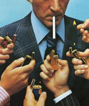
Maybe use another paper, or another film (I'm using ektachrome e100g)?

Thanks a lot.
 

Bob Carnie

Subscriber
Joined
Apr 18, 2004
Messages
7,735
Location
toronto
Format
Med. Format RF
You could use tissue or diffusion under your lens to create a muted look.

could be full exposure or partial, you would need to play a bit.
 
OP
OP

hencz

Member
Joined
Jun 28, 2012
Messages
23
Format
Multi Format
sorry, I meant to say Kodak gold 200
 

DREW WILEY

Member
Joined
Jul 14, 2011
Messages
14,080
Format
8x10 Format
Either look for a softer contrast P (portrait) paper, or in the future switch to a softer film itself, like Portra 160. There are different types of Crystal Archive paper. It might take some experimentation to find the specific match you like best.
 

Roger Cole

Member
Joined
Jan 20, 2011
Messages
6,069
Location
Atlanta GA
Format
Multi Format
Didn't PE mention developer changes to affect contrast? I think it was at the expense of greatly reduced life of the developer though.

I miss the variety of films we used to have. Agfa Portrait 160 was a good film for the kind of look the OP is after. But we have the Portras and Ektar and that's something, at least.
 

Noble

Member
Joined
Nov 25, 2012
Messages
277
Format
Multi Format
sorry, I meant to say Kodak gold 200

Use Portra. It's higher resolution and has a more "realistic" palette. This is film not digital. You are not shooting a RAW file that you can manipulate in Photoshop. I scanned for a long time before I started doing darkroom printing. I haven't done any color printing. But with my B&W negatives once I started printing I changed films, developers, personal exposure index, and developing time and agitation method. Obviously with C-41 unless you are feeling really adventurous a lot of that will not change but choice of film and personal EI may. Get things as right in the camera as possible and you will make your life a lot easier in the dark room.
 

Sirius Glass

Subscriber
Joined
Jan 18, 2007
Messages
50,411
Location
Southern California
Format
Multi Format
I agree, switch to Portra 160, Portra 400 and Porta 800 if you want to lower the contrast and have the photographs look realistic.
 

brucemuir

Member
Joined
Dec 25, 2007
Messages
2,228
Location
Metro DC are
Format
Multi Format
I know I've seen some say they liked Gold but I always detested that stuff.
It's consumer film made to get decent results with a wide range of exposure errors.
 

Noble

Member
Joined
Nov 25, 2012
Messages
277
Format
Multi Format
I know I've seen some say they liked Gold but I always detested that stuff.
It's consumer film made to get decent results with a wide range of exposure errors.

Maybe it's because Portra in 35mm costs a minimum of three times the price.
I shoot a lot of black and white so really the price difference between the premium stuff and the cheap stuff isn't that much. I used to shoot a ton of ACROS because it was less than $3 per a roll of 120. Now? Not so much. I just shoot TMAX 100 because their prices have become so similar. But if TMAX cost three times the price? There would be no question I would be still shooting ACROS. And no I do not think ACROS is B&W Kodak Gold.
 
OP
OP

hencz

Member
Joined
Jun 28, 2012
Messages
23
Format
Multi Format
I think he meant flashing the paper with a specific color before projecting the image onto it to get a tint in the shadows. I was looking for that for a long time cause I didn't know how to do that with an enlarger so thanks. I'm still not certain about the color range though, I want to achieve a look similar to screen prints, where there is very little gradient, less color rich. I'll try the tissue method, but I still don't get what it does to the projected image, I think it just softens the edges, but does it make the colors less striking?
 

Bob Carnie

Subscriber
Joined
Apr 18, 2004
Messages
7,735
Location
toronto
Format
Med. Format RF
Actually the tint goes into the highlights. With testing you can dial in any colour the paper can handle.
This was used a lot for cross processed negs and trans
to add colour to blown out highlights.
 

Bob Carnie

Subscriber
Joined
Apr 18, 2004
Messages
7,735
Location
toronto
Format
Med. Format RF
Yes If you move a tissue, into the light path you can control how much softness is happening and with the right combinations will mute the colours or desaturate in this case to give you a pleasing effect.

Many sources of diffusion, can be used which means you can have fun playing with this.
I think he meant flashing the paper with a specific color before projecting the image onto it to get a tint in the shadows. I was looking for that for a long time cause I didn't know how to do that with an enlarger so thanks. I'm still not certain about the color range though, I want to achieve a look similar to screen prints, where there is very little gradient, less color rich. I'll try the tissue method, but I still don't get what it does to the projected image, I think it just softens the edges, but does it make the colors less striking?
 

Bob Carnie

Subscriber
Joined
Apr 18, 2004
Messages
7,735
Location
toronto
Format
Med. Format RF
yOu could go as far as using a clear polyester material with transparent dyes smeared on that can cause all kinds of funky results as well.
print deep and let the dyes act as a doging tool.
We use to swing optical glass under the lens and put all sorts of material in the light path to create effects.

Only trial and error will help you here, don't kill me if it dosen't work , I am only the messanger.
 

polyglot

Member
Joined
Jun 12, 2009
Messages
3,467
Location
South Australia
Format
Medium Format
Ideally, a lower-contrast paper but it's not made any more so you'd be hunting down ancient expired stocks of Portra Endura. It might be OK but it's probably colour-shifted or fogged by now and likely to cause you frustration. The aging damage to negative film can largely be repaired in printing, but the aging of paper cannot.

Start with lower contrast films (Portra 160NC if you can find expired frozen stocks, otherwise Portra 160 or Fuji 160S), try exposing your film at about +3 or +4 stops overexposure to get a lower-contrast pastel look and then have a look at SLIMT for contrast reduction while processing the paper. If you're developing your own C41, you can also reduce the development time there. Affects the colours a little but it does reduce contrast, same as it would with pulling a B&W film.

You can also do (partial) bleach bypass in the negative or the paper to get a high contrast, low saturation look.
 

RPC

Member
Joined
Sep 7, 2006
Messages
1,630
Format
Multi Format
My observations are that with Kodak RA-RT replenisher, Kodak Endura paper is slightly flat and Fuji CA II is too contrasty and often a bit harsh with skin tones.

One way to control contrast that works for me and solves these problems is to use home-brew RA-4 chemistry and adjust the level of carbonate to raise or lower contrast. I have also increased contrast with Kodak RA-RT replenisher by adding carbonate and re-adjusting pH. As for lowering contrast with Kodak developer you can add sulfite but for me using home-brew and using less carbonate works better.
 

lhalcong

Member
Joined
Nov 26, 2012
Messages
245
Location
Miami, Flori
Format
35mm
Funny that I see this posting. I get sort of the retro look that OP is trying to get in his prints, and he gets the kind of look I want in my prints. I use Portra 160 and 400. I print (like they mentioned in old expired Kodak Supra Endura paper, luster finish I purchased on eBay) it has yellowed but with right filtering you can get right colors, they just look very retro and low contrast. I print at room temp.

I do crave for the high contrast and fine detail, and saturation. I am beginning to try Fuji paper. Perhaps I should try a Fuji Film instead of Portra as well.
 
Last edited by a moderator:

Roger Cole

Member
Joined
Jan 20, 2011
Messages
6,069
Location
Atlanta GA
Format
Multi Format
Funny that I see this posting. I get sort of the retro look that OP is trying to get in his prints, and he gets the kind of look I want in my prints. I use Portra 160 and 400. I print (like they mentioned in old expired Kodak Supra Endura paper, luster finish I purchased on eBay) it has yellowed but with right filtering you can get right colors, they just look very retro and low contrast. I print at room temp.

I do crave for the high contrast and fine detail, and saturation. I am beginning to try Fuji paper. Perhaps I should try a Fuji Film instead of Portra as well.

The first step is to use fresh paper. If it's still not saturated enough, Ektar is the most saturated negative film I know of on the current market.
 
Photrio.com contains affiliate links to products. We may receive a commission for purchases made through these links.
To read our full affiliate disclosure statement please click Here.

PHOTRIO PARTNERS EQUALLY FUNDING OUR COMMUNITY:


Ilford ADOX Freestyle Photographic Stearman Press Weldon Color Lab Blue Moon Camera & Machine
Top Bottom