How does anyone know what Etkar/Porta/etc actually looks like?

Recent Classifieds

Forum statistics

Threads
198,725
Messages
2,779,962
Members
99,691
Latest member
Vlad @ausgeknipst
Recent bookmarks
1

10speeduk

Member
Joined
May 8, 2012
Messages
158
Location
Ash, Kent
Format
Medium Format
Hi Guys,

I have a conundrum. I shoot some portra then decided to give Ektar a go as I liked the look of the shots on flickr. My first roll was lab processed and scanned. It came out great and what I was expecting. I then developed the 2nd roll and scanned it. It looked very white and cyan. I could tweak it in Photoshop to make it look like the other roll, but how do I know this would be a true representation of Ektar? Esp with diff lighting conditions etc...

I tried a trial of Silver Pro 8 and scanned a neg on the ektar profile. I then compared it to the lab developed/scanned version. It looked similar-ish, but levels were different and lab version had less magenta. I then scanned using my Epson V500 software and it was truer to the lab version.

But who's to say which is the closest to true ektar rendering?? Not only that but everyones monitor is calibrated differently for web viewing so its all a bit mad.

I am now trying some fuji pro400h. But why bother? Why not just shoot on portra and then Photoshop it to look like Pro400h!

Apologies for ranting but I am in love with film for its honesty and cant seem to do it justice with my workflow. I just want to show the truest representation of the film characteristics. That's surely why we go to pick up one box of film over another?!

Any comments on how I can best profile for different films or find a control for different films to calibrate against would be great :smile: I'm sure some people on here cracked this years ago!

I have Vuescan 9, Epson Scan software, an Epson V500 and Photoshop CS6.
 
Last edited by a moderator:

OzJohn

Member
Joined
Feb 15, 2011
Messages
302
Format
35mm
Welcome to DPUG. You've got too many variables in your workflow to make any sort of meaningful comparison between two quite dissimilar films. The most problematic one is self processed film. Unless you have a setup that adheres strictly to the C41 process (and few home workers have) you will have a deviation from perfect colour. That's not to say that the negs are unusable just that you cannot compare your results to those from a well controlled setup.

If you liked the result from one film that was commercially developed and scanned, then at least get a roll of the other type done at the same place - better still get a roll of each done at the same time. You then will have a basis upon which to benchmark your own processing and scanning. OzJohn
 

L Gebhardt

Member
Joined
Jun 27, 2003
Messages
2,363
Location
NH
Format
Large Format
Negative film by its very nature doesn't have a single look like slide film does. Its look will be affected by the process that makes it into a positive. That could be the paper it's printed on, or the scanner, software and processing parameters.

But you can say that Ektar is more contrasty than Portra; you can easily compare the grain. You can also compare how well a process creates a pleasing positive from the different films. With optical printing you are limited to the available papers, so you need to pick a combination that works. With scanning you are not as constrained, and most films can be made to look very similar (but it may take some weird curves to fix color crossover).

My recommendation is not to make one film look like another, but rather to make your scans look like how you want them to.
 

Alan Klein

Member
Joined
Dec 12, 2010
Messages
1,067
Location
New Jersey .
Format
Multi Format
Film colors are more loyal to the original film if you chemically print them. Once you run it into a scanner and photoshop it, anything goes. Rather than worry about keeping loyal to the film's original intent, why don't you just impart your vision to the end result as you remember it when you shot it. Or impart it to your imagination if that's what you want.

remember that before digital, film manufacturers produced many kinds of films to meet the desires or photographers who's tastes varied just like people who buy different fabrics and colors in clothes. Ultimately, it's the result you're looking for. Now you can do that with Photoshop to a large degree.
 
OP
OP

10speeduk

Member
Joined
May 8, 2012
Messages
158
Location
Ash, Kent
Format
Medium Format
Hi all. Thankyou for taking the time to respond. It makes sense that I should follow a vision rather than a pilgrimage to a std. colour profile. I will def use lab processed controls to benchmark future editing. I can make pleasing results with my current workflow. If I do any professional work in the future, I will def lab process to try and keep the C41 process robust. Looking fwd to trying my ektar and pro 400H tonight!
 
OP
OP

10speeduk

Member
Joined
May 8, 2012
Messages
158
Location
Ash, Kent
Format
Medium Format
Good luck and please post the results. We'd love to see them.

Will do. The last roll of Ektar and 400h went to the lab this morning for dev and scan. I will scan the negs at home and see the comparison. it will also be interesting to see how a self dev affects the scans...

to be confirmed...!
 

pellicle

Member
Joined
May 25, 2006
Messages
1,175
Location
Finland
Format
4x5 Format
Hi

well the short answer is this: you don't.

The longer answer is this:
Each film has differences. Try a roll of each and if you don't immediately see differences which swing you one way or another then pick which one you like for whatever reason and then use it for a while. Get to know that one for a while and see what you think (if anything) limits you. If you find that resolution / ability to hold highlights / "feel" is lacking, then try a roll of the other and see what you think.

essentially there is no wrong answer and the differences lay in the most subtle of details.

:smile:
 

I.G.I.

... everyones monitor is calibrated differently for web viewing so its all a bit mad.

Not true AFAIK. This is precisely the point of calibration: when the monitor is calibrated for the web/photography, and an image with attached standardised profile is seen in a colour-aware application colour rendition should be the same (or almost the same) between monitors and applications. EIZO, who are well respected in the monitor's business, specify for the Photography viewing profile in their calibration software Brightness: 100 cd/square m; White point: 5500 K; Gamma R, G, B: 2,20

Why not just shoot on portra and then Photoshop it to look like Pro400h!

It's not worth the time and effort IMHO; you could do much more creative stuff instead
 

GerardK

Member
Joined
Jun 27, 2006
Messages
14
Location
Netherlands
Format
4x5 Format
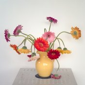
306-11-900px.jpg
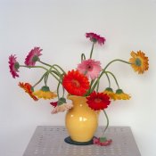
307-08-900px.jpg

Image 306-11 was shot on Portra 160nc, image 307-08 on Ektar.

I'm going to risk offending anyone that I'm selling something: warning. I'm selling something. I will also post this in a separate thread.

I have developed a scanning workflow that I believe does exactly what you're looking for, namely extracting the data that is present in the film without subjectively interpreting the data during the scanning process. In this way, you can make general observations about differences between various films, in this case Portra vs Ektar. Recently I thought that my experiences might be of interest to others who are looking for a way to scan their analogue images just once, to extract all data from highlights as well as shadow areas. I wrote a detailed description of the method, illustrated with screenshots, with a brief introduction to color management because in my opinion that is a critical element.

I published this workflow description with Amazon CreateSpace. It is available at the following link:

Dead Link Removed

The method requires a desktop flatbed or film scanner, Photoshop CS or later, VueScan or Silverfast, and the Photoshop plug-in ColorPerfect.
 

StoneNYC

Member
Joined
Aug 5, 2012
Messages
8,345
Location
Antarctica
Format
8x10 Format
Why don't you pick a single image from each roll that you like, and bring them to a pro lab and ask them to optically print then (chemically on real photo paper) then you can use those prints as a base for understanding the films true color profile...


~Stone | Sent w/ iPhone using Tapatalk
 
OP
OP

10speeduk

Member
Joined
May 8, 2012
Messages
158
Location
Ash, Kent
Format
Medium Format
Hi guys, thanks for all the feedback and help. Well, the lab scans came back. It appears that when they scanned the negs to CD, they didnt do any colour correction. I was hoping they would have used a Pro 400H colour profile that I could use for a benchmark for future scans. Oh well. Anyway I rescanned and edited in PS.


Iryna II by The Paul Reid, on Flickr
 
OP
OP

10speeduk

Member
Joined
May 8, 2012
Messages
158
Location
Ash, Kent
Format
Medium Format
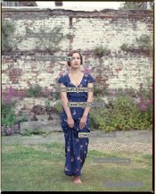
Here is the neg scanned with Silver Fast 8 Demo using the Fuju Pro 400H profile

silver fast fuj400h.jpg

There appears to be a slight magenta cast. Also the actual shot was shot on a sunny evening, I was expecting more yellow. !
 

I.G.I.

Here is the neg scanned with Silver Fast 8 Demo using the Fuju Pro 400H profile View attachment 927

You are joking, right... soooo off ?!? And I was complaining on another thread that my Minolta is "confused" how to render Fuji Pro... apparently it works like a charm if what you show from Fuji_SilverFast is anything to by...
 
OP
OP

10speeduk

Member
Joined
May 8, 2012
Messages
158
Location
Ash, Kent
Format
Medium Format
You are joking, right... soooo off ?!? And I was complaining on another thread that my Minolta is "confused" how to render Fuji Pro... apparently it works like a charm if what you show from Fuji_SilverFast is anything to by...

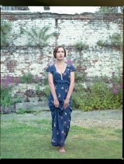
I know! Well here is a small size of a the straight neg scan from my V500

Please feel free for anybody to edit this and repost. I would love to see what other people come up with. Can you make it look like Fuji Pro 400H????


I.G.I.

Here is a very quick take: just opened the file; Levels, with Black point from the film base; and White point from some of the bricks in the background. Only you remember the dress hue, but I think that the simplest level correction gives a bit more natural result.
fuji_proba_1.jpg
 

I.G.I.

and here is with some colour balance correction - again quick and simple; I haven't used Hue/Sat or Selective Colour. My aim was to get rid of the somewhat greenish tint still present (to my eye)

fuji_proba_2.jpg
 

I.G.I.

I am sure with a bit more time it could be made better. But the substantive point - at the risk of ruffing some feathers - in my view is that making good images is not a factory process, and cannot be automated. There is no "actions"/profiles/secret sauces that will churn out from a roll 36 brilliant images. I believe interesting images need a bit of time, sensitivity, and effort to bring out the best of it.
 

I.G.I.

Now when not busy and not under the daily pressures I did another Colour Balance correction, and this is the version I like most. The palette is still unmistakably Fuji, but - I think - with better balance between the green/cyan/blues and the magenta/red/yellows.

Beautiful portrait of an alluring woman btw... there is some air of the portraits and the female grace from the Belle Epoque

fuji_proba_3.jpg
 

StoneNYC

Member
Joined
Aug 5, 2012
Messages
8,345
Location
Antarctica
Format
8x10 Format
Here is the neg scanned with Silver Fast 8 Demo using the Fuju Pro 400H profile

View attachment 927

There appears to be a slight magenta cast. Also the actual shot was shot on a sunny evening, I was expecting more yellow. !

Interesting because you say magenta and I see a green cast... :/


~Stone | Sent w/ iPhone using Tapatalk
 

selmslie

Member
Joined
Apr 11, 2012
Messages
52
Location
Fernandina Beach
Format
Multi Format
It will be very difficult to compare two films unless you can manage to control all of the other variables to keep them within specs.

Scanning and post processing allow you to introduce subtle changes to contrast and color rendition that might make the two films nearly indistinguishable.

To say that Ektar 100 may have slightly more contrast or different color rendition than Portra 160 has little relevance if you can easily tweak the results for either film.

The real differences are in apparent grain and sharpness, which are harder to fake.
 

Les Sarile

Member
Joined
Aug 7, 2010
Messages
3,425
Location
Santa Cruz, CA
Format
35mm
As it pertains to color and contrast, Kodak acknowledges there aren't any standards. So at the end of the day, we are each left with our own devices to determine what it really is or how we want it to look.
Straight up scanning - no pre or post anything, is likely not indicative of what it is or what we want it to be.

large.jpg
 

Les Sarile

Member
Joined
Aug 7, 2010
Messages
3,425
Location
Santa Cruz, CA
Format
35mm
Bad enough for normal daylight balanced condition but what are your experiences with Kodak Ektar 100 in extreme lighting and dramatically long exposure times?

These are probably familiar sights to most.

This was about a 2 second exposure
large.jpg


This one was about a 35+ minute exposure.
large.jpg
 
Photrio.com contains affiliate links to products. We may receive a commission for purchases made through these links.
To read our full affiliate disclosure statement please click Here.

PHOTRIO PARTNERS EQUALLY FUNDING OUR COMMUNITY:


Ilford ADOX Freestyle Photographic Stearman Press Weldon Color Lab Blue Moon Camera & Machine
Top Bottom