How Did All Those Old-Time Movies Get Such Great Grey Balence And Why....

Frank Dean,  Blacksmith

A
Frank Dean, Blacksmith

  • 10
  • 5
  • 127
Woman wearing shades.

Woman wearing shades.

  • 1
  • 1
  • 99
Curved Wall

A
Curved Wall

  • 6
  • 0
  • 112
Crossing beams

A
Crossing beams

  • 11
  • 1
  • 134

Recent Classifieds

Forum statistics

Threads
198,848
Messages
2,781,823
Members
99,727
Latest member
rohitmodi
Recent bookmarks
0

DF

Member
Joined
Nov 10, 2012
Messages
583
....and why I cant get my photos to be the same? I want more mid-tones, so I pulled my FP4's but with minimal differences.
Was movie film so different or was it the lighting ?
I sit and watch these gems from the 40's/50's and marvel how good stills could appear...
 

glbeas

Member
Joined
Sep 25, 2002
Messages
3,932
Location
Marietta, Ga. USA
Format
Multi Format
The movie makers back then were for the most part masters at lighting. The film was different too, had more toe and shoulder than the t grain films of today. Filters were used quite often to render tones natural looking. Have you tried shooting with a yellow filter to see how you like the tones? You do have to be more aware of the lighting if you want amazing images.
 

Paul Howell

Subscriber
Joined
Dec 23, 2004
Messages
9,687
Location
Scottsdale Az
Format
Multi Format
Sets and costumes were often made in colors and tones to look good in black and white, I once saw the set of the old TV show from the early 50s I Love Lucy, it was all in black and white.
 

pentaxuser

Member
Joined
May 9, 2005
Messages
19,956
Location
Daventry, No
Format
35mm
Sets and costumes were often made in colors and tones to look good in black and white, I once saw the set of the old TV show from the early 50s I Love Lucy, it was all in black and white.
Yes to the extent that the actor, Ben Affleck, playing George Reeves of TV Superman fame actually says in a conversation just off set in a break that his drab clothing in terms of colour was designed to look right on a B&W TV screen The blue and red just didn't "cut it" on B&W In the conversation it may have been discussed what the colours were I have a feeling that some of the costume was a drab brown

pentaxuser
 

NB23

Member
Joined
Jul 26, 2009
Messages
4,307
Format
35mm
Guys, please make up your minds. HP5 cannot take this anymore.
 

BobD

Member
Joined
Dec 22, 2006
Messages
1,113
Location
California,
Format
Analog
It was all the factors mentioned above and more. Lighting, set design, makeup, film, processing, lenses, filtration, costumes – everything.


pentaxuser

Member
Joined
May 9, 2005
Messages
19,956
Location
Daventry, No
Format
35mm
It was all the factors mentioned above and more. Lighting, set design, makeup, film, processing, lenses, filtration, costumes – everything.


So DF can you afford to buy Warner Bros, RKO Pictures etc to solve your problem:D

pentaxuser
 
Last edited:

voceumana

Member
Joined
Aug 4, 2004
Messages
896
Location
USA (Utah)
Format
Multi Format
Getting the lighting, exposure, and development just right. Makes a world of difference.
 

btaylor

Subscriber
Joined
Dec 28, 2010
Messages
2,254
Location
Los Angeles
Format
Large Format
Those guys were masters of light- when you see a really good scan or print it can be breathtaking. As mentioned above they also had a whole studio behind them- a camera department, lighting department, costume department, make up department- and on and on. The cinematographers were true masters of their art, I admire their work so much.
 

Vaughn

Subscriber
Joined
Dec 13, 2006
Messages
10,081
Location
Humboldt Co.
Format
Large Format
....and why I cant get my photos to be the same? I want more mid-tones, so I pulled my FP4's but with minimal differences.
Was movie film so different or was it the lighting ?
I sit and watch these gems from the 40's/50's and marvel how good stills could appear...
The late Terry King of the Royal Photographic Society suggested FP4+ developed in Universal PQ Developer to create good mid-tone separation, especially for Platinum printing. I have taken his advice and it works very well for me.

Since Universal PQ is also a print developer, it can be quite active -- which leads me to wonder if 'pulling' film is the opposite way one would want to go to get that mid-tone separation you are missing. Seems to me one would want to develop normal to push, depending on one's highlight situation.
 

BobD

Member
Joined
Dec 22, 2006
Messages
1,113
Location
California,
Format
Analog
Another way to "get more midtones" is to put more midtones in front of your lens. Film is not likely to give you what wasn't there at exposure.
 
OP
OP

DF

Member
Joined
Nov 10, 2012
Messages
583
The movie makers back then were for the most part masters at lighting. The film was different too, had more toe and shoulder than the t grain films of today. Filters were used quite often to render tones natural looking. Have you tried shooting with a yellow filter to see how you like the tones? You do have to be more aware of the lighting if you want amazing images.
 
OP
OP

DF

Member
Joined
Nov 10, 2012
Messages
583
I filter with yellow in the printing process - color head diffuser anywhere from about 30 to 100. It has some evening out effects but the prints lack a certain crispness & clarity that unfiltered prints have.
 
OP
OP

DF

Member
Joined
Nov 10, 2012
Messages
583
I filter with yellow in the printing process - color head diffuser anywhere from about 30 to 100. It has some evening out effects but the prints lack a certain crispness & clarity that unfiltered prints have.
 

glbeas

Member
Joined
Sep 25, 2002
Messages
3,932
Location
Marietta, Ga. USA
Format
Multi Format
That just drops the overall contrast of the print. Totally unrelated to using a filter on your camera to change the tonal relationship.
 

Pioneer

Member
Joined
May 29, 2010
Messages
3,879
Location
Elko, Nevada
Format
Multi Format
The late Terry King of the Royal Photographic Society suggested FP4+ developed in Universal PQ Developer to create good mid-tone separation, especially for Platinum printing. I have taken his advice and it works very well for me.

Since Universal PQ is also a print developer, it can be quite active -- which leads me to wonder if 'pulling' film is the opposite way one would want to go to get that mid-tone separation you are missing. Seems to me one would want to develop normal to push, depending on one's highlight situation.

This is interesting Vaughn. I like Universal PQ for paper but never had a lot of luck with it as a film developer. Maybe I'll have to give it another try to see what I missed.
 

Vaughn

Subscriber
Joined
Dec 13, 2006
Messages
10,081
Location
Humboldt Co.
Format
Large Format
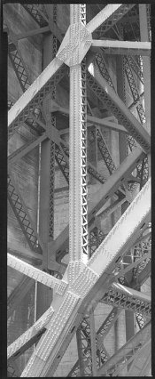
Dan, it will depend on what process and its contrast needs -- since I print alt processes that need the contrast boost, I use it up to the print concentration of 1:9 (I've been known to use Dektol straight and 1:1 for scenes of low SBR, too.) For silver gelatin printing I have heard others use Universal PQ successfully at its film dilution of 1:19 or a little more dilute. This image was developed in Dektol (Girders, Golden Gate Bridge, 4x10 Carbon Print)
 

Attachments

  • Girders_Golden_Gate_Bridge2.jpg
    Girders_Golden_Gate_Bridge2.jpg
    175.7 KB · Views: 142
Last edited:

Kino

Subscriber
Joined
Jan 20, 2006
Messages
7,759
Location
Orange, Virginia
Format
Multi Format
There is about 90 years of documentation on the principals and techniques used by cinematographers to obtain the delicate tonal range. Pick up a copy of the ASC Handbook from 1940's through the 1960's and study it.

It's pretty well-defined; tons of precisely placed light in strictly defined key-to-fill ratios, relatively slow film stock, precision film processing to specific gammas and tightly controlled printing to well defined aim points.

The "magic" is in the complexity and thoroughness of craft mixed with artistry.
 

choiliefan

Member
Joined
Dec 27, 2013
Messages
1,311
Format
Medium Format
I'm surprised no one has mentioned the camera lenses.
Cooke immediately comes to mind but I'm ignorant on most aspects of this subject.
 

btaylor

Subscriber
Joined
Dec 28, 2010
Messages
2,254
Location
Los Angeles
Format
Large Format
Bausch and Lomb Baltar and Super Baltars in the US In the ‘30’s through ‘60’s- they were the standard. The “look” if it differed from film to film was the work of the cinematographer with lighting, makeup, filters and the tricks they used with stockings or Vaseline smears. Decades ago I read a lot about DP’s like John Alton, Greg Toland, etc. such mastery! If you get a really good transfer of work from the teens and twenties what they were able to do with the tools they had is amazing to me.
 

SilverShutter

Member
Joined
Jan 16, 2017
Messages
134
Location
Cork. Ireland
Format
35mm
Dan, it will depend on what process and its contrast needs -- since I print alt processes that need the contrast boost, I use it up to the print concentration of 1:9 (I've been known to use Dektol straight and 1:1 for scenes of low SBR, too.) For silver gelatin printing I have heard others use Universal PQ successfully at its film dilution of 1:19 or a little more dilute. This image was developed in Dektol (Girders, Golden Gate Bridge, 4x10 Carbon Print)
Not sure if it's of any value, but I use Studional/Rodinal Special which I believe is also a PQ developer, gives me some really nice results at 1+30 dilutions in 35mm to extend developing times.
 
Joined
Sep 10, 2002
Messages
3,589
Location
Eugene, Oregon
Format
4x5 Format
Getting the lighting, exposure, and development just right. Makes a world of difference.

See, it's that simple! The devil is in the details, though... :smile:

I might add that we landscape and field photographers don't have the possibility to add a lot of fill-light to a scene... That's where the Zone System comes in handy, i.e. being able to control the density range on the film between shadow and highlight values. Lack of mid-tones is often just too-much contrast.

Best,

Doremus
 
Last edited:
Joined
Mar 21, 2006
Messages
839
Location
mid-Missouri
Format
Pinhole
There are a number of factors, as mentioned previously. To my mind the single biggest one is lighting. What ever you do with set lighting/clothing, processing, or filtration still has to be interpreted by lighting. And yes Key to Fill ratios demand close attention.
 
Photrio.com contains affiliate links to products. We may receive a commission for purchases made through these links.
To read our full affiliate disclosure statement please click Here.

PHOTRIO PARTNERS EQUALLY FUNDING OUR COMMUNITY:


Ilford ADOX Freestyle Photographic Stearman Press Weldon Color Lab Blue Moon Camera & Machine
Top Bottom