Bosaiya
Member
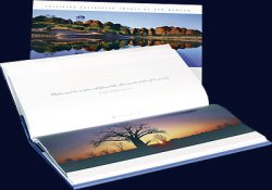
I am somewhat torn on the question of whether or not I prefer photos that are in the horizontal orientation to span two facing pages or not. I'm wondering if people have definite opinions on the matter or not. I am using a vertically oriented book as the starting point.
On the plus side for why it looks good to span the photo across two facing pages is just that in many cases photos, at least in books, look better bigger. Spanning the pages lets you show the photo larger. If the photo contains a lot of details then this allows them to be more visible.
The other good thing is that horizontal photos don't always look good when printed on a vertical page. The photo doesn't sit right on the page nd there's simply too much white space that has to be filled with something.
On the negative side, and for me this is always a pet peeve, the seam where the pages meet in the middle never looks good. It just never does unless you break the back of the book or it's a super-heavyweight coffee table book. For some masochistic reason art directors always seem to put portraits of people or other subjects with a clear center right in the middle. It just looks awful when that happens.
A third option might be to print the horizontal photo such that the reader has to rotate the book to view it, but that gets tiresome as well.
Is this like splitting hairs? I'm trying to lay some ideas out and I just feel like the choice is somewhere between a rock and a hard place. Probably right on the center line!


