Graded paper

Pride

A
Pride

  • 2
  • 0
  • 52
Paris

A
Paris

  • 4
  • 0
  • 140
Seeing right through you

Seeing right through you

  • 4
  • 1
  • 177
I'll drink to that

D
I'll drink to that

  • 1
  • 2
  • 128

Recent Classifieds

Forum statistics

Threads
198,401
Messages
2,774,282
Members
99,608
Latest member
Javonimbus
Recent bookmarks
1

Sorrycharlie

Member
Joined
Nov 3, 2019
Messages
62
Location
Australia, NSW, Illawarra
Format
Medium Format
Hi guys. I’ve just bought someone’s darkroom setup and included with it is a LOT of grade 3 paper. Ilford ilfospeed 3. I’ve gone through it and tested strips and it’s all still good. I’ve made a few prints with it and not surprisingly, my results have not been great. I’ve noticed some negatives obviously look better than others.

So my question is. What types of images should I be looking for to get through the paper? Should I be looking at under or over exposed images? Also, what contrast control do I have if at all? I’ve read that developers can affect it but I just use ilford multi grade. Can I do much with dodging and burning? Are there other techniques?

I’ve only been printing in the darkroom now for just over a month so I am very much a beginner still and have absolutely no idea what I’m doing. I’ve made some nice prints with VC paper but would love to utilise the grade 3 because I have LOTS.
 

koraks

Moderator
Moderator
Joined
Nov 29, 2018
Messages
22,200
Location
Europe
Format
Multi Format
Well-exposed negatives generally work best regardless of what printing method you use...
All the things you say are feasible; you can have some contrast control with developer fidgeting (contrast reduction of maybe a full grade and contrast increase of perhaps a half grade if you're lucky), burning & dodging will work just fine and may be inevitable for some images. If you're very adventurous contrast masks are an option too, but rather involved/a lot of work. You could try lith printing if you want to stray a bit into pictorialist territory.

What you print is all up to you; it's your creative decision. I'd just start printing and make some mileage; you'll figure out soon enough what works and what doesn't.
 

Alan9940

Member
Joined
Jun 17, 2006
Messages
2,410
Location
Arizona
Format
Multi Format
You may be able to buy a 'soft working' developer off-the-shelf, possibly from Tetenal.

O, mix you own like Ansco 120 or Defender 59D; or, utilize David Kachel's SLIMT techniques. You can drop the contrast by, at least, one full grade with SLIMT.
 

MattKing

Moderator
Moderator
Joined
Apr 24, 2005
Messages
52,593
Location
Delta, BC Canada
Format
Medium Format
Grade 3 Ilfospeed should be well suited to negatives of slightly low to moderate contrast. Scenes that are well exposed with slightly diffused light - high overcast skies and moderately directional light are great.
Shadows in the negatives should be defined, but detailed. Highlights should not be too brilliant.
Don't confuse contrast - the relative differences between similar tones - with subject luminance ranges - the difference between the darkest and lightest tones in the scene.
Negatives like that are sufficiently common that it makes sense to choose the paper to match the negatives.
You could experiment with modifying the contrast response of the paper, but if you also have variable contrast materials at hand, why not use them instead?
This (near IR) negative would probably look good on Ilfospeed 3:
05b-2019-10-06-SFX-Watershed-res-1000.jpg
 

Arklatexian

Member
Joined
Jul 28, 2014
Messages
1,777
Location
Shreveport,
Format
Multi Format
Hi guys. I’ve just bought someone’s darkroom setup and included with it is a LOT of grade 3 paper. Ilford ilfospeed 3. I’ve gone through it and tested strips and it’s all still good. I’ve made a few prints with it and not surprisingly, my results have not been great. I’ve noticed some negatives obviously look better than others.

So my question is. What types of images should I be looking for to get through the paper? Should I be looking at under or over exposed images? Also, what contrast control do I have if at all? I’ve read that developers can affect it but I just use ilford multi grade. Can I do much with dodging and burning? Are there other techniques?

I’ve only been printing in the darkroom now for just over a month so I am very much a beginner still and have absolutely no idea what I’m doing. I’ve made some nice prints with VC paper but would love to utilise the grade 3 because I have LOTS.
Why not reserve your "grade 3" paper for normal 35mm negatives. There has been some thought that 35mm negatives lose contrast when enlarged to 8 x 10, etc. and needed Grade 3 to print normally. Medium format and large format needed Grade 2 to do the same thing. Anyhow, that is how this geezer was taught.......Good Printing and Have Fun.......Regards!
 

Bill Burk

Subscriber
Joined
Feb 9, 2010
Messages
9,220
Format
4x5 Format
I use grades 2 and 3. Grade 2 is for normal to contrasty negatives, and grade 3 is for when I need more contrast because the negative is underexposed or flat.

A lot of times I have to admit that prints I made on grade 2 might have looked better on grade 3.

Can you describe what didn’t look good? Maybe the paper isn’t as good as you think. Bad paper has a grayish overall cast and to be avoided because it will make you feel like you aren’t good.

But if you get clean whites and rich blacks you should be ok.
 

kevs

Member
Joined
Aug 21, 2006
Messages
711
Location
North of Pangolin
Format
Multi Format
Most properly exposed and developed negs will print acceptably on Grade 3 paper. A soft-working developer will give a softer print, you could try pre-flashing the paper before exposure, or you could use a diffusion enlarger to lower contrast (diffusion enlargers usually have less contrast than condenser models. If you're using a condenser type, you could place light tracing paper or film in the filter drawer to provide some diffusion.

Make sure you develop prints properly; don't 'snatch' prints early but leave them in the drink a minute or two longer than the recommended time; you'll get deeper blacks and nicer mid-tones. Make sure print dev is up to strength and hasn't absorbed oxygen and gone bad.
 
OP
OP

Sorrycharlie

Member
Joined
Nov 3, 2019
Messages
62
Location
Australia, NSW, Illawarra
Format
Medium Format
Can you describe what didn’t look good? Maybe the paper isn’t as good as you think. Bad paper has a grayish overall cast and to be avoided because it will make you feel like you aren’t good.
.

Thanks for the reply Bill. I would say that the images do look a little greyish overall. The test I did on all the paper was to develop and fix a piece and just fix another piece, this left me with identical white pieces, so I assumed the paper is good. Perhaps it's not and there's another test I can do to see if the paper is giving the greyish look. I've included some images below of some of my results. The 8x10's of the car are different paper. The darker greyer image is the grade 3 and the brighter (not great, I know) one is a VC paper with split filters.
 
OP
OP

Sorrycharlie

Member
Joined
Nov 3, 2019
Messages
62
Location
Australia, NSW, Illawarra
Format
Medium Format
Thanks everybody for the replies. I will look further into all your suggestions and try some of them. I'm not totally dissatisfied with the results, I'm just trying to utilise the paper in the best way. I understand it's going to be easier to learn on the VC paper, but I also feel like I might get a deeper understanding of what's involved if I can get good results with the graded paper. I feel like it will make me a better photographer and printer in the long run? Anyway, it's all fun at the moment and I really appreciate all of the replies. Cheers
 

CMoore

Subscriber
Joined
Aug 23, 2015
Messages
6,220
Location
USA CA
Format
35mm
Don't confuse contrast - the relative differences between similar tones - with subject luminance ranges - the difference between the darkest and lightest tones in the scene.
: View attachment 237287
I understand what you are saying, and i probably make that mistake all the time....Thanks for the definition.

However..... is that what we are doing in the darkroom (color head) when we crank the M Knob.?
It seems like whenever i hear people talk a bout a High Contrast print, it is a picture with lots of Dark/Black areas and lots of Bright/White areas and not much in between. :wondering:
Thank you
 

Bill Burk

Subscriber
Joined
Feb 9, 2010
Messages
9,220
Format
4x5 Format
Ok it looks like your negatives generally need the higher contrast. The vertical carousel under umbrella looks fine but the bumper cars and diving need more contrast. Plus with the side by side comparison of the car, the second looks better. Your paper probably is fine.
 

koraks

Moderator
Moderator
Joined
Nov 29, 2018
Messages
22,200
Location
Europe
Format
Multi Format
Yes, the paper looks fine, but I'd give your negatives a bit more exposure and maybe some longer development as well. They look fairly thin and flat.
 

bernard_L

Member
Joined
Feb 17, 2008
Messages
2,004
Format
Multi Format
RC paper (which ilfospeed is) degrades faster than FB, and the first symptom is loss of contrast (after comes fog). So your grade 3 is maybe 2.5 or 2 after all.
Does not matter as long as you have negatives with matching density range.
Do not cut the paper dev time hoping to make it softer grade: you would lose Dmax (poor blacks).
 

tezzasmall

Member
Joined
Dec 29, 2013
Messages
1,127
Location
Southend on Sea Essex UK
Format
Plastic Cameras
Although I totally use MG / VC papers, on various bases and sizes, my general go to filter is grade 3. I use this grade for the majority of my prints, so using just one grade of paper is fine - if it is still holding its contrast.

For someone who has not long started (and self taught??), I think you are off to a good start. :smile:

But, (isn't there nearly always a but?...) I do think that some of your prints are a little too dark, so knowing which papers these were done on, could be helpful. The ones I am talking about mostly, as shown in your first messages, are 'the divers' and the first one of the 'abandoned cars'.

I get the general feeling that they would look better with a little less exposure, so you get some lighter and brighter tones in parts of the prints. If you can't get these and they have both been printed on the single speed grade 3 paper that you have, then it may well be a little too old and has lost some of its sparkle. :sad:

One other point, is to ask if there are any 'darkroom classes' held any where near by to you? Or even another member in your area, who could offer some advice? I ask, as you will learn so much more, much quicker, if either of these are possible,

To end, I'll say again, for someone just starting out, you're doing good, so well done! :smile:

Terry S
 

GRHazelton

Subscriber
Joined
May 26, 2006
Messages
2,247
Location
Jonesboro, G
Format
Multi Format
Back in the day .... decades ago! .... my Father and I standardized on the late lamented Kodak Plus X souped in Beutler; rating the Plus X at perhaps ASA 250. The resulting fairly thin negs printed beautifully on Luminos grade 3 fiber paper, using Dektol. As noted earlier give the paper the full two minutes development, pulling earlier will give muddy results. As always, YMMV.
 

awty

Subscriber
Joined
Jul 24, 2016
Messages
3,639
Location
Australia
Format
Multi Format
Ilfordspeed 3 would be at least 20 years old wouldn't it?
I have a heap of it, most has degraded and doesn't have the tonal range it should. A good way of telling is if it needs half a stop or more than new rc paper for the same exposure.
I do have some grade 2 gloss that is still good. Generally its best to use new rc to begin with so you have one less variable to worry about.
Old paper can be used for toning and bleaching, can get some nice results.
 

MattKing

Moderator
Moderator
Joined
Apr 24, 2005
Messages
52,593
Location
Delta, BC Canada
Format
Medium Format
I understand what you are saying, and i probably make that mistake all the time....Thanks for the definition.

However..... is that what we are doing in the darkroom (color head) when we crank the M Knob.?
It seems like whenever i hear people talk a bout a High Contrast print, it is a picture with lots of Dark/Black areas and lots of Bright/White areas and not much in between. :wondering:
Thank you
I missed this question when it was first posted.
There does seem to be a common belief out there that contrast means really dark shadows and really bright highlights, but that is actually not contrast, it is a wide range of tones.
If you add magenta filtration while printing VC paper, you are adding density in a proportional way - more to the shadows than the mid-tones, and more to the mid-tones than to the highlights. That results in an increase in the "slope" of the paper's tone rendition - adjacent tones end up being more clearly delineated.
The "inky shadows and blazing highlights" look comes from adding too much magenta filtration and printing the whole thing too light. It is often contributed to by the tendency of so many people to under-expose film (blocked up shadows) and over-develop film (blocked up highlights).
While many people will recommend consistently adding extra exposure to black and white negatives, the mid-tones and highlights are incredibly important to our appreciation of a print.
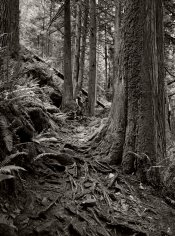
The following image is actually fairly low in contrast, but the deep and dramatic shadows mean that some observes think it is not:

41d-2019-07-09-Minnekhada-Andrew-res-800.jpg
 

awty

Subscriber
Joined
Jul 24, 2016
Messages
3,639
Location
Australia
Format
Multi Format
I understand what you are saying, and i probably make that mistake all the time....Thanks for the definition.

However..... is that what we are doing in the darkroom (color head) when we crank the M Knob.?
It seems like whenever i hear people talk a bout a High Contrast print, it is a picture with lots of Dark/Black areas and lots of Bright/White areas and not much in between. :wondering:
Thank you
Also dont confuse high contrast with low key. Of coarse you may not, but seems to be a lot of confusion between the two.
 

CMoore

Subscriber
Joined
Aug 23, 2015
Messages
6,220
Location
USA CA
Format
35mm
I missed this question when it was first posted.
There does seem to be a common belief out there that contrast means really dark shadows and really bright highlights, but that is actually not contrast, it is a wide range of tones.
If you add magenta filtration while printing VC paper, you are adding density in a proportional way - more to the shadows than the mid-tones, and more to the mid-tones than to the highlights. That results in an increase in the "slope" of the paper's tone rendition - adjacent tones end up being more clearly delineated.
The "inky shadows and blazing highlights" look comes from adding too much magenta filtration and printing the whole thing too light. It is often contributed to by the tendency of so many people to under-expose film (blocked up shadows) and over-develop film (blocked up highlights).
While many people will recommend consistently adding extra exposure to black and white negatives, the mid-tones and highlights are incredibly important to our appreciation of a print.
The following image is actually fairly low in contrast, but the deep and dramatic shadows mean that some observes think it is not:

View attachment 237479
OK..... i am following this, mostly. Actually, all of it if i concentrate. It just takes a minute ti read your Info/Definitions a few times.
That photo you posted... YES... if i printed that on VC paper, i would dial in more M. THAT does look like typical "Low Contrast" to me.
Where i have been struggling (obviously) is with what is or is not a "High Contrast" picture.
And yes, when my negs are exposed and developed "properly"... they damn near print themselves. I would prefer to never over expose, or under expose again. :smile:

Also dont confuse high contrast with low key. Of coarse you may not, but seems to be a lot of confusion between the two.
They do not sound like the same thing, but i probably do not understand the definition of "High Key" :unsure:

Thank You BOTH.!
 
Photrio.com contains affiliate links to products. We may receive a commission for purchases made through these links.
To read our full affiliate disclosure statement please click Here.

PHOTRIO PARTNERS EQUALLY FUNDING OUR COMMUNITY:


Ilford ADOX Freestyle Photographic Stearman Press Weldon Color Lab Blue Moon Camera & Machine
Top Bottom