Kodak film had the famous yellow box, Fuji the green box, Agfa the orange box, Konica the blue box, 3M the black or multicolor tan box (sometimes with a rainbow stripe). The one color box that has been sorely missed over the last 40 years has been the red box, the GAF film.
(I know this thread is 2 years old, but I had to add my experiences and comment regarding GAF.)
As far as films, GAF was probably EK's biggest competitor back in the 1950's through mid 70's. GAF films were definitely made by GAF and GAF films had their own look and characteristics, just as Kodak's, Fuji's or Agfa's did.
Where many Kodak films of the era (such as K64 or Kodacolor II) tended to favor magenta-ish skin tones, GAF typically had tannish skin tones. GAF 64 was a very pleasant all-around film with no color casts; soft natural greens, accurate blue sky, pleasant reds and yellows.
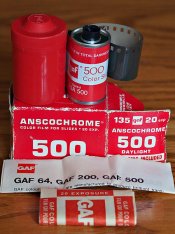
During its lifetime, GAF 500 was the world's fastest color film. Introduced mid-1967, it lasted ten years until GAF went out of the consumer photo business in June 1977. Modern Photography said in its April 1976 film test "despite coarse grain and little detail it appears amazingly sharp due to its high contrast". Blue skies tended to have a touch of violet, skin tones were tannish, probably because GAF 500's yellows were rendered well but reds were a bit dull. Greens tended toward brownish or a bit dull in it's two fast (200 and 500) films. IF GAF 500 had any slight color cast it was towards red. GAF 500 also had a very unusual characteristic when shot under the typical cool white fluorescent, it showed no (or very little) greenish cast at all, whites showed little or no greenish cast, skin tones tended toward an orangy tone.
I never shot much GAF 200 but it was warmer toned than Kodak's competing High Speed Ektachrome (ASA 160, which was Kodak's fastest color film at the time.) Skin tones were a bit towards brownish. It was not as contrasty side as GAF 500 was.
GAF slide films all resisted the tendency to go bluish in the shade, probably more than any other film of the time. K64 was very magenata/bluish in open shade, High Speed Ektachrome was bluish, Ektachrome-X a bit less. GAF films were much more neutral.
GAF was the first to make a Kodak process compatible color negative film (GAF Color Print) released late summer 1969. Believe it or not, they first released it in 126 format only as 126 was where all the film sales were for color print film. A year later in 1970 they came out with the 35mm. format. GAF Color Print was so good that my July 1970 Modern Photo said it would take an emulsion expert to tell GAF and Kodacolor-X apart; they exposed alike, developed alike, looked alike and they printed alike. With all the C-41 compatible films we had in the last 40+ years, it is hard to imagine a time when there were no Kodak-process compatible color negative films. Not until mid-1969 and GAF did it.
While it's true that Kodak introduced Kodacolor II in mid-1972, this is misleading without all the facts. Kodacolor II was only available in 110 size size for nearly 2 years. It wasn't until April 1974 that Modern Photo was able to get some 35mm Kodacolor II to test against Kodacolor-X. The results were not as one sided as you might assume. No improvement in actual grain, VERY slight increase in sharpness in a 20x print. In the 3x5 prints Kodacolor II had pinker, truer skin tones and less muddy, lighter colors. However when Modern had 11x custom enlargements made, they liked results from the older Kodacolor-X better. They also said that, in the past they had seen better, less muddy colors from Kodacolor-X than the comparison showed.
I shot several dozen rolls of GAF Color Print back in the mid 1970's. It had more tannish skin tones (which I liked) verses Kodacolor II which tended pinkish, especially skin tones. The magenta cast also affected greens (such as grass).
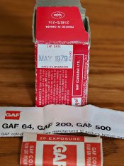
GAF did introduce a C-41 Color neg. film, my best guess would be about January 1977, I have rolls of 110, 126 and 135 GAF C-41 process color print film, they all have expiration dates of January to June of 1979. And yes, at the very end they did get rid of that ugly orchid and red color scheme they used on the older C-22 GAF Color Print (going for a solid red box) but it was too late for most of us to see.