• Welcome to Photrio!
    Registration is fast and free. Join today to unlock search, see fewer ads, and access all forum features.
    Click here to sign up

FP4+ in Rodinal, looking for advice

Millers Lane

A
Millers Lane

  • 1
  • 2
  • 27
Friends

D
Friends

  • 1
  • 0
  • 35

Recent Classifieds

Forum statistics

Threads
202,891
Messages
2,847,131
Members
101,531
Latest member
F2_User
Recent bookmarks
0

alex2293

Member
Allowing Ads
Joined
Aug 7, 2015
Messages
30
Location
Sherbrooke, Qc
Format
35mm
Hey guys,

I've been reading a lot on this forum, but I'm still looking for some advice regarding the lack of pure black, pure white, contrast in a lot of my pictures. They all look kind of "greyish".

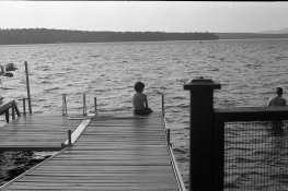
Here are some examples :

attachment.php

attachment.php


These photos are scanned negatives using an Epson V550.
The film was exposed at ISO 133 in a K1000 that was CLA this year.
They were developped using a 1:50 ratio for 14 minutes, recommended agitation.

I think that most of the pictures that lack contrast were taken in flat light. How to get great black, white and contrast in these situations?

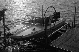
To have more often something like this one :
attachment.php


Any tips would be greatly appreciated.

Thanks,
Alex
 

Attachments

  • img467.jpg
    img467.jpg
    794.7 KB · Views: 397
  • img472.jpg
    img472.jpg
    913.5 KB · Views: 310
  • img464.jpg
    img464.jpg
    915.1 KB · Views: 332
Hi Alex,

I see nothing wrong with your pics, apart the last one which could have been slightly overexposed.
In situations as these, at the coast, you have to deal with a large amount of UV light, and a Yellow/K2 filter could had help. Also, there will be - possibly - a lost of definition in your photos with a narrow angle from the camera toward the sun, even you have done a good job with metering, correctly compensating the exposure given by your meter. Your photos could be easily adjusted with "curves" in PS after scanning.
I have made also a bunch of pics with FP4+ and dev. with Agfa Rodinal, that's a great combo, but the film I have prefered to work with the photos above would be first Fuji Across ISO 125 or T-Max 100, due to its increased tonal expansion capabilities with a immense contrast scene as shown. Pyro aficionados would even had prefered this, due to the great highlights detail retained with that developers. Remember you are not forced to have pure white and black in every single photo, that's just a matter of personal taste,

Cheers,

Renato
 
Printing your negatives on the correct grade of paper or using variable contrast paper and filters should allow you to achieve the blacks, whites and mid tone values you are looking for.
 
Your photos could be easily adjusted with "curves" in PS after scanning.

I remind you and Alex as well that this is a film forum.
You don't evaluate a film technical qualities by looking at a positive or a scanned image. You do it by looking at the negative.
For artistic purposes, then you look at a positive image.
Follow Gary's advice above.
 
Thanks for the comments.

I began using a UV filter and in some of the most sunny days on the lake, the skys/clouds and water have not much details. I'll try a yellow filter next summer.

You were also right regarding the use of PS curve adjustment to get the photo contrast to my taste. Here is a before/after:
attachment.php

attachment.php


I think I went a little heavy with the contrast on the after picture. But you see what I'm aiming for.

I like contrasty pictures and I just realized that with a flat light, if the shadows and the highlights are, say only 3 stops apart, I should push the film. Shorter exposure and longer development. This way the shadows will be closer to black, because they have been less exposed to light. The highlights will be closer to white because I developped them longer and they continue to develop a lot longer than the shadows do. The trades-off are bigger grains, lost of some details in the shadows and the midtones will represent a smaller part of the picture.

Does it makes sense?

Alex.
 

Attachments

  • img515.jpg
    img515.jpg
    826.2 KB · Views: 267
  • img515_original.jpg
    img515_original.jpg
    646.4 KB · Views: 245
I like contrasty pictures and I just realized that with a flat light, if the shadows and the highlights are, say only 3 stops apart, I should push the film.
...
Does it makes sense?

If you were shooting slide film, yes.

Not for negatives.

Adjusting film development, push/pull or plus/minus, does matter when you are using a single fixed grade paper in an enlarger. That's not what you seem to be doing, right?

This may seem odd, but with negatives there is no direct fixed absolute relationship between the camera exposure, the negative contrast (development), and the final print you make.

Since you use a variable contrast printing method the contrast is simply adjusted when preparing to print. A step that is normally required and that wasn't completed for the originals in the OP.
 
Yes, I'm using Ilford MG IV paper and use filters.

But is there any advantage to achieve the wanted contrast on the negative vs on the print using different filter grades?

If it does not make any difference, when would you push/pull?
 
If it does not make any difference, when would you push/pull?

I don't.

You will need to test for yourself. Only if you find that you can't correct with the paper would I suggest extra development.

One of the big advantages of not pushing the film is that you can mix your situations on a given roll. Shoot a few frames in a low contrast situation, a few in high contrast, the rest in normal contrast all on the same roll of film. The contrast adjustments are just done while printing.
 
Nothing wrong with your negatives. It's the printing that you need to improve on.
 
Keep in mind that the purpose of the negative is to record all the information in the scene. As such, it can be expected to be a little flat, as it is compressing all the visual information. Don't judge your photo by an unaltered negative scan.
As others have said, it is in the print (or a scan altered for curves in Photoshop) where you can make your photo more clearly represent what you had in mind when you shot the scene. As long the negative is properly exposed, it has done its job. Too many "hybrid" shooters expect their negative scans to look like finished prints. They shouldn't.
 
Photrio.com contains affiliate links to products. We may receive a commission for purchases made through these links.
To read our full affiliate disclosure statement please click Here.

PHOTRIO PARTNERS EQUALLY FUNDING OUR COMMUNITY:


Ilford ADOX Freestyle Photographic Stearman Press Weldon Color Lab Blue Moon Camera & Machine
Top Bottom