Font type used on Mamiya RB lenses ??

IMG_2142.jpeg

A
IMG_2142.jpeg

  • sly
  • May 20, 2025
  • 5
  • 1
  • 41
On The Mound.

A
On The Mound.

  • 1
  • 1
  • 55
Val

A
Val

  • 5
  • 2
  • 109
Zion Cowboy

A
Zion Cowboy

  • 8
  • 5
  • 98
.

A
.

  • 2
  • 2
  • 130

Forum statistics

Threads
197,791
Messages
2,764,358
Members
99,472
Latest member
Jglavin
Recent bookmarks
0

TheToadMen

Subscriber
Joined
Sep 18, 2012
Messages
3,570
Location
Netherlands, EU
Format
Pinhole
I recently got me a Mamiya RB 127 mm lens:

attachment.php
attachment.php


I like the font type they used. Check out the "f = 127 mm" writing.

So I wondered if anyone can tell what font type this is?

Thanks,
Bert from Holland
 

Attachments

  • Mamiya-RB67-127mm-001.JPG
    Mamiya-RB67-127mm-001.JPG
    437.9 KB · Views: 644
  • Mamiya-RB67-127mm-002.JPG
    Mamiya-RB67-127mm-002.JPG
    471.4 KB · Views: 616

flavio81

Member
Joined
Oct 24, 2014
Messages
5,063
Location
Lima, Peru
Format
Medium Format
Bert,

I see you are a real camera nerd just like me. I also appreciate that font, it is beautiful.
Also check out the font for the "mamiya-sekor" labeling on the 35mm Mamiya SX series of lenses; a different font and an interesting one.
 

Moopheus

Member
Joined
Dec 31, 2006
Messages
1,219
Location
Cambridge MA
Format
Medium Format
No, Helvetica is not very close at all. Futura is a little more like it, but it is not that. Or Univers Extended. Or Franklin Gothic. Or Century Gothic. You should have asked me 15 or 20 years ago when I used to have a bunch of specimen books.
 

Mick Fagan

Subscriber
Joined
Sep 13, 2005
Messages
4,406
Location
Melbourne Au
Format
Multi Format
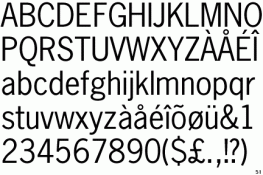
I agree, it isn't Helvetica, plus Helvetica is a new type face, or at least when the lens in question was being manufactured. It looks to be a bit of a mixture, really. A strong possibility may be that it stems from Germany, or at least partly. Whilst not Bauhaus by a long shot, there were many type faces based on Bauhaus altered enough to be almost different, yet seeming able to hold onto it's core base while at the same time looking very different.

My bet is that the particular letters were a design brief to a graphic artist to come up with something different. As such, they may possibly be slight alterations to an existing type face. Working in advertising in another life, I lived through the type face explosion of the seventies and eighties. In that period, starting in the sixties, fonts were altered sometimes so much one could have great difficulty determining just where they came from. We had a book with close to 3,000 fonts from about 250 typefaces (font families if you will). It was sometimes bewildering when you knew what you were looking for, but flipped pages and pages trying to determine just exactly what it was.

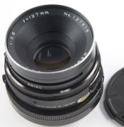
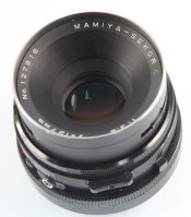
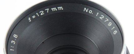
Very nice lettering though, almost worth buying the camera just for that alone!

Mick.
 

Trail Images

Member
Joined
Apr 7, 2010
Messages
3,212
Location
Corona CA.
Format
Multi Format
Bert, congrats on the recent purchase of the 127mm here. Looks really good even as old as these things are to date. I used my 127mm just last week and made a 3 image pano with it. Tomorrow, it's back to the 37mm fisheye for some similar type shots.

Enjoy the usage of the new lens. :D
 

snapguy

Member
Joined
Jan 1, 2014
Messages
1,287
Location
California d
Format
35mm
font of knowledge

Someone will come up with a font and others will make something similar but not exactly like the original. Somebody owns fonts and the other folks don't want to have to pay to use them so that is what they do. Heaven only knows what a font on a Japanese lens that is sold all over the world would be.
 

railwayman3

Member
Joined
Apr 5, 2008
Messages
2,816
Format
35mm
I remember when Japanese products generally started to become more readily available in the late 1960's and 70's, that the packaging and instruction leaflets often had unusual and attractive fonts, almost like an English adaptation of Japanese characters. But everything nowdays is the same, no indication of where things are designed or printed.

Some camera leaflets from the old GDR (East Germany) also used a characteristic font, quite dark and utilitarian. I wondered if they were using some early computer typesetting equipment from the then Eastern bloc, as the spacing and general layout was also rather basic.
 
OP
OP
TheToadMen

TheToadMen

Subscriber
Joined
Sep 18, 2012
Messages
3,570
Location
Netherlands, EU
Format
Pinhole
I ran it through Dead Link Removed and the closest matches were some variation of News Gothic (1908), possibly Monotype News Gothic.

New Gothic (1908) looks like this:
attachment.php


That may be close to the name "MAMIYA", but I meant the font used for "f = 127 mm" that is quite different. Look at the letter "f" and "m":

attachment.php


I guess they used different fonts?

The font used for Mamiya logo is Futura Heavy, which is a geometric sans serif font designed by Paul Renner and published by Linotype.
attachment.php
 

Attachments

  • font-NewsGothic.gif
    font-NewsGothic.gif
    14.6 KB · Views: 543
  • font-Mamiya-127-mm.jpg
    font-Mamiya-127-mm.jpg
    150.8 KB · Views: 471
  • Mamiya-logo.png
    Mamiya-logo.png
    39.7 KB · Views: 401
OP
OP
TheToadMen

TheToadMen

Subscriber
Joined
Sep 18, 2012
Messages
3,570
Location
Netherlands, EU
Format
Pinhole

eng1er

Member
Joined
Aug 19, 2008
Messages
105
Format
Multi Format
I suspect that it may be a proprietary typeface. The angled serifs might be a stylization popular in the industry in that era, compare the Canon logo which uses a similar angled serif in places. It may be a way to add some flair to characters, which by virtue of the milling process used to inscribe them, are best designed with a single, consistent stroke width. Chances are, it isn't even a complete font, rather just a f, =, m, and numbers. No sense building a jig for characters that won't be used. If it were a commercially available typeface, I'd be looking at the catalogs of the big foundries of the time: Berthold, Linotype, Monotype, et al.
 

EdColorado

Member
Joined
Feb 7, 2009
Messages
506
Location
Loveland, Co
Format
Multi Format
Interesting... I know next to nothing about fonts, but just a bit earlier today I was shooting some pictures of a few Mamiya RB lenses I want to sell, and was thinking how nice and how interesting the lettering was. In particular the f and the mms.

Gads I'm a gear junky! :tongue:
 

RobC

Member
Joined
Nov 5, 2007
Messages
3,880
Location
UK
Format
Multi Format
Last edited by a moderator:
OP
OP
TheToadMen

TheToadMen

Subscriber
Joined
Sep 18, 2012
Messages
3,570
Location
Netherlands, EU
Format
Pinhole
For the capitalised mamiya-sekor "Akzidenz-Grotesk Extended" and for the script "Horley Old Style Italic"

The script font is close but maybe not quite the same. The akzidenz font is almost identical except possibly the 1 in 127 which may be a font foundry difference. Another version of same font may be the same.

Now we're getting close!
Thanks, Rob
 

RobC

Member
Joined
Nov 5, 2007
Messages
3,880
Location
UK
Format
Multi Format
Now we're getting close!
Thanks, Rob

Actually I can't quite see from your photo if the mm is italicised or not. I'm sure I've seen a font looking just like the script font somewhere but I can't find it on my collection. I think it may have been a typewriter or monospce font but my memory may be playing tricks on me.
 

M Carter

Member
Joined
Jan 23, 2013
Messages
2,147
Location
Dallas, TX
Format
Medium Format
Everything about that font seems to me like is was designed for machining into metal. I doubt you'll find any sort of exact match - I doubt this was ever an available font for press.

There are people who could actually replicate a given font for you - but you only have 2 characters to go by!

(I was a so-so font designer and did hand-lettered headlines and logos in another, pre-computer life...)
 

RobC

Member
Joined
Nov 5, 2007
Messages
3,880
Location
UK
Format
Multi Format
These days if you want a custom font its pretty easy to do it yourself.

http://www.fontlab.com/font-editor/fontographer/

and if its just a very occasional edit to a font then the much cheaper

http://www.high-logic.com/font-editor/fontcreator.html

since most fonts are just vector graphics they can be loaded straight into one of these tools, tweaked and then saved as your own font.

You don't need to know anything about graphic design or fonts and the rules the font designers work to. That's not to say you should follow them but if all you want is some custom letters for a specific purpose then you don't need to.

So if you start with a font similar to what you want then it would be simple to make a few changes and its done.

Designing a new font from scratch is another matter altogether.

As to copyright, if you have chnaged just one glyph in each character, no matter how small the change, then its a new font.
 
Photrio.com contains affiliate links to products. We may receive a commission for purchases made through these links.
To read our full affiliate disclosure statement please click Here.

PHOTRIO PARTNERS EQUALLY FUNDING OUR COMMUNITY:


Ilford ADOX Freestyle Photographic Stearman Press Weldon Color Lab Blue Moon Camera & Machine
Top Bottom