- Joined
- Sep 15, 2012
- Messages
- 30
- Format
- Medium Format
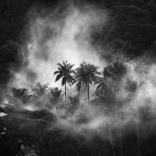
I'm completely new to B&W film. I would like to get into the "fine art" style; dramatic contrast:

I realize lighting is the biggest factor, but I also am not trying for a technically perfect exposure, meaning I don't want as much tonal detail as possible because that leads to a flatter image (from what I can tell).
I have some Pan F+ and some Acros 100. Do I need to push it in order to get this look?