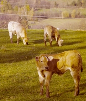
I have found a way to do something like a scanner calibration by editing in photoshop. I was getting wierd colors sometimes even with IT8 calibrated scanner.


(Before, after - Mamiya RB67, Kodak Portra 800)
The process is inspired by gum dichromate color printing, where you split the image in color channels and print it one by one. But making it work was half logic, half trial and error and half intuition.
The whole process can be made with a macro, so it is just one click. Then you need to remember few numbers and you just copy the settings to every image.
You should start with 16 bit scan, any editing of colors in 8-bits is quite pointless.
As a base layer I start with 50% gray
Then I reconstruct the image from individual channels for red, green, blue.
Then I add their complementary channels for cyan, yellow and I treat magenta channel as purple (magenta is a construct of our vision, the color doesn't have wavelenght) Each channel is in solid color, blend mode normal, opacity 10%. Purple opacity is at 20% because it complements the green channel and the greens from yellow and cyan channels. Each complementary channel has inverted color and mask.
(You could add as many color channels as you like by using blend mode difference for the masking, then the parts of the image containing the selected color will turn dark.)
Then I take the original image as a key on top, blend mode luminosity. (Interestingly it has different results if you use color image or its BW version. No idea what photoshop does there)
Under the key layer I add saturation (I add a little more to bright parts)

So then you have a tree like this.
From top: Original scan - hue/sat bw clipping layer for the key - key is original image with luminosity blend - then saturation layers (curves is saturation layer too in this case) - individual color channels with masks - 50% gray
And you get image like this, which is quite different from what we started with. Thats because we have added more color channels, for instance absence of green implies presence of purple and not just gray.

Now I can target each channel individually without affecting the other channels, also I got rid of magenta (which you can bring back if you want, I have found treating magenta channel as purple and treating purple channel as magenta works best for me)
So now I have two ways to edit each color channel. I can either manipulate the channel directly, or manipulate its complementary channel and this is very powerful for any precise image editing technique.
This one is too yellow, so I just turn down the Fill of the layer down until the yellow cast is gone (fill and opacity behave the same here, but fill is now a more finess adjustment), Then the image is purple-ish, so I turn down the purple channel fill. Or I can boost the greens, it will have slightly different effect.
Then I just write down the fill % settings down, press macro and do the same for next image. In most cases simple copy paste of the settings works great and in the worst case it is really simple to adjust it.
And the best thing is you can apply the same process to digital files too, so it is quite universal. You will end up with a slightly different colors, there will be colors where none were recorded, but it generally works and my feeling is I can this way produce much more naturally looking grading.
I have also applied the macro to my old digital files and it magically fixes the color grading in most cases.
To run the macro you first need to rename the scan to "original"
Download: https://marekkorbel.cz/wp-content/uploads/2025/11/channel split.ATN
Let me know if it worked well for you too!
(Before, after - Mamiya RB67, Kodak Portra 800)
The process is inspired by gum dichromate color printing, where you split the image in color channels and print it one by one. But making it work was half logic, half trial and error and half intuition.
The whole process can be made with a macro, so it is just one click. Then you need to remember few numbers and you just copy the settings to every image.
You should start with 16 bit scan, any editing of colors in 8-bits is quite pointless.
As a base layer I start with 50% gray
Then I reconstruct the image from individual channels for red, green, blue.
Then I add their complementary channels for cyan, yellow and I treat magenta channel as purple (magenta is a construct of our vision, the color doesn't have wavelenght) Each channel is in solid color, blend mode normal, opacity 10%. Purple opacity is at 20% because it complements the green channel and the greens from yellow and cyan channels. Each complementary channel has inverted color and mask.
(You could add as many color channels as you like by using blend mode difference for the masking, then the parts of the image containing the selected color will turn dark.)
Then I take the original image as a key on top, blend mode luminosity. (Interestingly it has different results if you use color image or its BW version. No idea what photoshop does there)
Under the key layer I add saturation (I add a little more to bright parts)
So then you have a tree like this.
From top: Original scan - hue/sat bw clipping layer for the key - key is original image with luminosity blend - then saturation layers (curves is saturation layer too in this case) - individual color channels with masks - 50% gray
And you get image like this, which is quite different from what we started with. Thats because we have added more color channels, for instance absence of green implies presence of purple and not just gray.

Now I can target each channel individually without affecting the other channels, also I got rid of magenta (which you can bring back if you want, I have found treating magenta channel as purple and treating purple channel as magenta works best for me)
So now I have two ways to edit each color channel. I can either manipulate the channel directly, or manipulate its complementary channel and this is very powerful for any precise image editing technique.
This one is too yellow, so I just turn down the Fill of the layer down until the yellow cast is gone (fill and opacity behave the same here, but fill is now a more finess adjustment), Then the image is purple-ish, so I turn down the purple channel fill. Or I can boost the greens, it will have slightly different effect.
Then I just write down the fill % settings down, press macro and do the same for next image. In most cases simple copy paste of the settings works great and in the worst case it is really simple to adjust it.
And the best thing is you can apply the same process to digital files too, so it is quite universal. You will end up with a slightly different colors, there will be colors where none were recorded, but it generally works and my feeling is I can this way produce much more naturally looking grading.
I have also applied the macro to my old digital files and it magically fixes the color grading in most cases.
To run the macro you first need to rename the scan to "original"
Download: https://marekkorbel.cz/wp-content/uploads/2025/11/channel split.ATN
Let me know if it worked well for you too!

Last edited:


 that is indeed an easier solution