Hi there,
What are you using to convert your colour digital originals to B&W? I've kept to Capture One, but am interested in what other people are using, and if they have any nuggets of wisdom or hard won experience to share. Samples encouraged!
Today I made a discovery (which is probably old news to everyone else) and the reason for this thread. What other slap-the-forehead things am I missing?
David Kachel wrote an article decades ago about the need to "always go too far" when working towards a fine print. His contention was that, like when manually focusing a lens where you have to go past perfect focus in both directions before you can be truly sure your chosen subject is sharp, the same is true when printing: you should go beyond what you think is perfect, just to be sure.
The 'Basic' colour sliders in Capture One's colour editor don't nearly go far enough when in B&W mode. Todays revelation is that you can go to the 'Advanced' colour editor and use the colour picker which gives more control. I'd prefer it to have even more effect and have written a request to Capture One to see if that could be included in a future update.
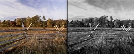
Here's the image where the discovery was made. In the first one, I didn't like the way the totem pole and Hemlock truck were so similar and was contemplating the use of a mask/layer to darken the tree trunk in a bit. The second one is after using the colour picker on the tree truck, then using the lightness slider to darken it.
The totem pole darkened a wee bit as well, but I already have a layer for the pole to increase contrast there, so can easily lighten it if need be.


What are you using? Tips?
What are you using to convert your colour digital originals to B&W? I've kept to Capture One, but am interested in what other people are using, and if they have any nuggets of wisdom or hard won experience to share. Samples encouraged!
Today I made a discovery (which is probably old news to everyone else) and the reason for this thread. What other slap-the-forehead things am I missing?
David Kachel wrote an article decades ago about the need to "always go too far" when working towards a fine print. His contention was that, like when manually focusing a lens where you have to go past perfect focus in both directions before you can be truly sure your chosen subject is sharp, the same is true when printing: you should go beyond what you think is perfect, just to be sure.
The 'Basic' colour sliders in Capture One's colour editor don't nearly go far enough when in B&W mode. Todays revelation is that you can go to the 'Advanced' colour editor and use the colour picker which gives more control. I'd prefer it to have even more effect and have written a request to Capture One to see if that could be included in a future update.
Here's the image where the discovery was made. In the first one, I didn't like the way the totem pole and Hemlock truck were so similar and was contemplating the use of a mask/layer to darken the tree trunk in a bit. The second one is after using the colour picker on the tree truck, then using the lightness slider to darken it.
The totem pole darkened a wee bit as well, but I already have a layer for the pole to increase contrast there, so can easily lighten it if need be.
What are you using? Tips?
Last edited: