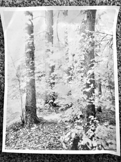
I have a 6x6 negative from my second ever roll of infrared film (Ilford SFX through a Hoya R72) that I really, really like. As I'm not anywhere near all the way dialed in on exposure and development for this film stock, this negative is very dense and very contrasty.
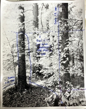
Yesterday I made a straight print as a starting point. As expected, by the time I got my white-ish foliage to the right tone, my tree trunks were significantly darker than I want them for a final print, even at grade 00.
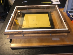
I lack the number of limbs necessary to simultaneously dodge all of the areas I'd like to lighten during exposure, so for the first time I think I'm going to need to do some masking. All the reading I've done so far says: get a thin frosted acrylic sheet above the negative and tape your mask over the top of that. I can do that. I just don't know what to use for my mask. I have some transparency film I use for alt process digital negs, so I could make a 6x6 inkjet mask. Or I could try a more traditional mask that I make by hand (maybe on the same material?)
How exactly do you go about actually creating dodge masks for enlargement? What materials do you use? How do you control density (is it just guess and check)?
Yesterday I made a straight print as a starting point. As expected, by the time I got my white-ish foliage to the right tone, my tree trunks were significantly darker than I want them for a final print, even at grade 00.
I lack the number of limbs necessary to simultaneously dodge all of the areas I'd like to lighten during exposure, so for the first time I think I'm going to need to do some masking. All the reading I've done so far says: get a thin frosted acrylic sheet above the negative and tape your mask over the top of that. I can do that. I just don't know what to use for my mask. I have some transparency film I use for alt process digital negs, so I could make a 6x6 inkjet mask. Or I could try a more traditional mask that I make by hand (maybe on the same material?)
How exactly do you go about actually creating dodge masks for enlargement? What materials do you use? How do you control density (is it just guess and check)?
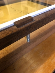
 I'll test this out. I think the biggest question is whether I'll have adverse effects from omitting the oft-recommended layer of frosted acrylic between the mask and the negative, but I suppose if such a layer ends up being necessary, it shouldn't be very hard to source.