I'm starting to play around with gum bichromate. I just made a few quick digital negatives to start with and I'm not sure I'm doing it right.
Here is the original negative, note that the histogram is fairly well distributed.

If you invert this you get a negative but apparently maybe too much tonal range for gum.

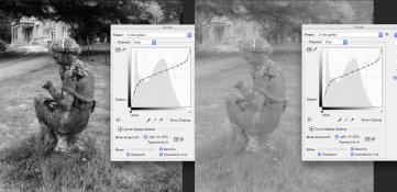
Note that I don't have Photoshop but I've managed to create Christina Anderson's suggested curve for gum negatives in Lightroom. If I apply her curve (note the shape) to the positive image it looks like this:

So looking at the histogram for the positive it's basically compressed the tones into the shadows more. So if I invert that curve it ends up looking like this:

Looking at the shape of the curve does this make sense? With the negative tones compressed into the highlights (shadows in the print) the negatives are looking pretty thin which has me wondering if the shadows will block up. I wonder if I should try flipping the curve for a more dense negative.
Any thoughts or feedback welcome.
Here is the original negative, note that the histogram is fairly well distributed.
If you invert this you get a negative but apparently maybe too much tonal range for gum.
Note that I don't have Photoshop but I've managed to create Christina Anderson's suggested curve for gum negatives in Lightroom. If I apply her curve (note the shape) to the positive image it looks like this:
So looking at the histogram for the positive it's basically compressed the tones into the shadows more. So if I invert that curve it ends up looking like this:
Looking at the shape of the curve does this make sense? With the negative tones compressed into the highlights (shadows in the print) the negatives are looking pretty thin which has me wondering if the shadows will block up. I wonder if I should try flipping the curve for a more dense negative.
Any thoughts or feedback welcome.