aconbere
Subscriber
Hi all,
There’s very little discussion of cuprotype and I thought I would drop an update with my own recent experience.
[Note: this is kind of a stub of a thread as advised by the mods to try because of some errors I'm getting when trying to post]
I became interested in cuprotype after watching the blended ferrocyanide thread develop. I followed that to Frank Gorga's excellent description of the process, and started the process of gathering supplies.
The first wrinkle I faced was finding a minimum exposure time. I found that there was an enormous toe to cuprotype, the more exposure I gave it, the darker the blacks got. There was no obvious “this is where d-max is” step. I usually use a stouffer step wedge to help me find my minimum exposure time and get a sense of the tonal scale of the process, but in this case I actually found it easier to print an image and then dial in exposure on that.

Top strip is 100min, bottom is 25. It’s hard to see but on the top strip every step from 11 down actually gets noticeably darker. But at some point you have to make a call. You can also see another wrinkle in this image, even though the bottom strip is only 2 stops less light it is far more than 2 stops less dark. This will come back up.
With a guess at my exposure time I printed a negative with Christina Anderson’s salted paper curve as was suggested. And tried out some test strips.

25min and 35minutes respectively. I the difference at 30min found it too dark and then did another at 20.

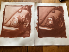
Apologies, the prints are flipped. Left 20min, right 30min. And here you can see another wrinkle. I find it hard to predict how dense a print will be. While my step wedges were consistent after a bit of practice, the prints were a bit wacky! I actually think part of what happened here is that the larger print area (these are 8x10 printed on 11x14 paper) meant I spent more time coating the paper and I actually had substantially more sensitizer absorbed. This lines up with my extra dark test strip, it was the first one I did and I wasn’t expecting the sensitizer to be so thin and I ended up needing to brush it around a lot to keep it from puddling. So my suspicion is that you can really impact the density of the age by varying the quantity of sensitizer used.

Here is the final print (again apologies for my inconsistent lighting and white balance, I blame the erratic weather). I’m pretty happy with it, however the blacks are slightly crushed and deserve a curve tweak. A theory is that the process is less self masking than silver and so needs the blacks protected a touch more.

Couple more notes while I’m here.
- There isn’t a lot of dry down with the process, mostly how dark it is in the wash is how it will look when dry. But there is a large tonal shift. The prints come out pink to orangey hued and then dry down to a more brick red brown.
- I tried using tween 20 in my sensitizer to see if I could get it more consistent but at 1 drop per ml it diluted the sensitizer and I got a much lighter print.
- I like the look of the complex toner but it takes so long to make a print. Between long exposure times and washing and toning and washing, it’s exhausting
- The complex toner is also the most expensive part of the process for me. It’s the 20g of potassium oxalate.
- The toner seems to last a good while and I used it across multiple days, but as time goes on the brown precipitate increases and that starts to become difficult to fully wash out. I haven’t tried filtering it yet but I’d consider it.
So … I did it? But where do I stand? I love the color, it makes nice clean prints with almost no staining and a very long tonal scale capable of very nice separation. But it’s so slow, it’s hard to get more than a single print made a day for me, which really hampers experimentation. I love the look of the complex toner but the cost and time it adds to the process makes it a tough sell.
I think I’m probably done for a bit, maybe I’ll come back and try to dial in the curve in the future. I have a recipe from Peter Friedrichsen that I’d like to try out which produces a more intense red and seems a little simpler with less washing.
There’s very little discussion of cuprotype and I thought I would drop an update with my own recent experience.
[Note: this is kind of a stub of a thread as advised by the mods to try because of some errors I'm getting when trying to post]
I became interested in cuprotype after watching the blended ferrocyanide thread develop. I followed that to Frank Gorga's excellent description of the process, and started the process of gathering supplies.
The first wrinkle I faced was finding a minimum exposure time. I found that there was an enormous toe to cuprotype, the more exposure I gave it, the darker the blacks got. There was no obvious “this is where d-max is” step. I usually use a stouffer step wedge to help me find my minimum exposure time and get a sense of the tonal scale of the process, but in this case I actually found it easier to print an image and then dial in exposure on that.
Top strip is 100min, bottom is 25. It’s hard to see but on the top strip every step from 11 down actually gets noticeably darker. But at some point you have to make a call. You can also see another wrinkle in this image, even though the bottom strip is only 2 stops less light it is far more than 2 stops less dark. This will come back up.
With a guess at my exposure time I printed a negative with Christina Anderson’s salted paper curve as was suggested. And tried out some test strips.
25min and 35minutes respectively. I the difference at 30min found it too dark and then did another at 20.
Apologies, the prints are flipped. Left 20min, right 30min. And here you can see another wrinkle. I find it hard to predict how dense a print will be. While my step wedges were consistent after a bit of practice, the prints were a bit wacky! I actually think part of what happened here is that the larger print area (these are 8x10 printed on 11x14 paper) meant I spent more time coating the paper and I actually had substantially more sensitizer absorbed. This lines up with my extra dark test strip, it was the first one I did and I wasn’t expecting the sensitizer to be so thin and I ended up needing to brush it around a lot to keep it from puddling. So my suspicion is that you can really impact the density of the age by varying the quantity of sensitizer used.

Here is the final print (again apologies for my inconsistent lighting and white balance, I blame the erratic weather). I’m pretty happy with it, however the blacks are slightly crushed and deserve a curve tweak. A theory is that the process is less self masking than silver and so needs the blacks protected a touch more.
Couple more notes while I’m here.
- There isn’t a lot of dry down with the process, mostly how dark it is in the wash is how it will look when dry. But there is a large tonal shift. The prints come out pink to orangey hued and then dry down to a more brick red brown.
- I tried using tween 20 in my sensitizer to see if I could get it more consistent but at 1 drop per ml it diluted the sensitizer and I got a much lighter print.
- I like the look of the complex toner but it takes so long to make a print. Between long exposure times and washing and toning and washing, it’s exhausting

- The complex toner is also the most expensive part of the process for me. It’s the 20g of potassium oxalate.
- The toner seems to last a good while and I used it across multiple days, but as time goes on the brown precipitate increases and that starts to become difficult to fully wash out. I haven’t tried filtering it yet but I’d consider it.
So … I did it? But where do I stand? I love the color, it makes nice clean prints with almost no staining and a very long tonal scale capable of very nice separation. But it’s so slow, it’s hard to get more than a single print made a day for me, which really hampers experimentation. I love the look of the complex toner but the cost and time it adds to the process makes it a tough sell.
I think I’m probably done for a bit, maybe I’ll come back and try to dial in the curve in the future. I have a recipe from Peter Friedrichsen that I’d like to try out which produces a more intense red and seems a little simpler with less washing.
Last edited:


