Critique me!

CK341

A
CK341

  • 0
  • 0
  • 29
Plum, Sun, Shade.jpeg

A
Plum, Sun, Shade.jpeg

  • sly
  • May 8, 2025
  • 0
  • 0
  • 40
Windfall 1.jpeg

A
Windfall 1.jpeg

  • sly
  • May 8, 2025
  • 2
  • 0
  • 37
Windfall 2.jpeg

A
Windfall 2.jpeg

  • sly
  • May 8, 2025
  • 1
  • 0
  • 34
Marsh, Oak Leaves.jpeg

A
Marsh, Oak Leaves.jpeg

  • sly
  • May 8, 2025
  • 0
  • 0
  • 35

Recent Classifieds

Forum statistics

Threads
197,610
Messages
2,761,930
Members
99,416
Latest member
TomYC
Recent bookmarks
0

EASmithV

Member
Joined
Aug 22, 2008
Messages
1,984
Location
Virginia
Format
Large Format
I really liked these three images, so I submitted them to that photovogue website for the hell of it. Needless to say, they were not approved, but I did not recieve any feedback from the editors.

I was wondering if you all could take a look and let me know what you think, and ways in which I could have improved.

All photos are handheld LF with a Graflex of some sort.
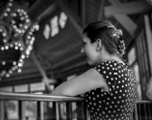
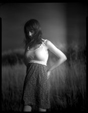
untitledUntitled-2 (3)-LRx.jpg untitled5959634168_1e53ea85da_o-LRx.jpg untitledUntitled-24-LRx.jpg
 
OP
OP
EASmithV

EASmithV

Member
Joined
Aug 22, 2008
Messages
1,984
Location
Virginia
Format
Large Format
Honest first impressions: 1) plain, boring. 2) certain mystique, but doesn't quite pop. The effect looks like a light leak. Not bad though. 3) Is she married? But seriously, you'd have the militant PC police on you for the cigarette. But you're at least making an effort.

Yeah, that was a light leak, my bellows had somehow come unclipped and I didn't notice, but I liked it anyway.

What would you suggest as improvements, if any?
 

dasBlute

Subscriber
Joined
Apr 12, 2008
Messages
421
Location
San Jose, CA
Format
Multi Format
I'll bite, not that I'm am expert of anything. But I'll be honest about my reactions, you are welcome to squawk back at me for them.

1) She's smiling, nice; but I can't see much of her face. The interesting lights in the upper corner compete for attention.
2) Ambiguous mood, her hair blocks her face enough where I'm not sure how she feels, could be joyful or sad. Her blouse draws attention away because of its brightness.
3) The eyes are good, a bit haughty, her hand and smoke somewhat block the face. Background competes for attention.

Each of these images have good aspects to them: 1) her dress and hair, 2) her body language, 3) her direct gaze.

But overall, I don't feel very much rapport with these women, they seem unaware, disinterested or aloof.
Sometimes I see the use of hands, hair, or other props to block the face and add some mystery, but usually when it's a closeup.

Please feel free to say, 'wtf do you know buddy?'

-Tim
 
Last edited by a moderator:
OP
OP
EASmithV

EASmithV

Member
Joined
Aug 22, 2008
Messages
1,984
Location
Virginia
Format
Large Format
Please feel free to say, 'wtf do you know buddy?'
-Tim

Nah, its cool. Clearly people view my stuff from a different perspective than I view my stuff. While I'm not going to go grovelling for approval I think it's important to learn how people view it and why.

I can see how these images can be viewed as uninvolved and a bit stoic, which may be a reflection on my interaction during the shoot, models training, or possibly the nature of large format.

I am really curious to see what people think, and their opinions on what I could have done / can do in the future better, so keep it coming, and don't sugar coat it! I'm actually trying to learn...

Seeing as how both of you have commented on the somewhat static nature of the shots, would you say the following is a better image?
18541159531_679fe0640e_k.jpg
 

RalphLambrecht

Subscriber
Joined
Sep 19, 2003
Messages
14,575
Location
K,Germany
Format
Medium Format
I really liked these three images, so I submitted them to that photovogue website for the hell of it. Needless to say, they were not approved, but I did not recieve any feedback from the editors.

I was wondering if you all could take a look and let me know what you think, and ways in which I could have improved.

All photos are handheld LF with a Graflex of some sort.
View attachment 111573 View attachment 111574 View attachment 111575

I like all three,the last being my favorite.I's just the right balance between lighting and contrast.One must always be careful of those pinholes of light in old buildings or wooded areas.I carry a dark cloth and some string with me to hide them in casw Icannot change my viewpint to make them disappear.Otherwise,they are very distracting.They are impossibleto burn in but can be spotted on the negative or the print.:smile:keep up the good work!
 

DannL.

Member
Joined
Oct 13, 2013
Messages
617
Format
Large Format
Every photograph has a story. Here's what I saw.

First image . . . "So, that's what happens when a three year old gets trampled by a pony."
Second image . . . "Ouch! I guess walking in tall grass with heals was a really bad idea."
Last image . . . "Virginia Slims. Why are these things so damn good?"

:D Just kidding. They're fine images.
 

jcc

Member
Joined
Jul 18, 2012
Messages
489
Location
Norman, Okla
Format
Multi Format
I really liked these three images, so I submitted them to that photovogue website for the hell of it. Needless to say, they were not approved, but I did not recieve any feedback from the editors.

I was wondering if you all could take a look and let me know what you think, and ways in which I could have improved.

All photos are handheld LF with a Graflex of some sort.

attachment.php
attachment.php
attachment.php

1. Clearly something has got her attention, but the framing does not give enough room for the eyes to wander or for my curiosity to be teased. The elbow behind her is distracting. Do we really need that much room on the right? What does it add to the story? The juxtaposition of the out of focus highlights with her polka-dot blouse is nice, but it's not quite center stage and does not feel deliberate. The focus seems to land on her back, and I have no idea why. The light on the subject's face does not seem flattering (to me).

2. Seems dreamy, with dark and muddy tones. The framing feels awkward. My eye is forced to look right in the middle of the frame (brightest spot) at her left breast and arm, and it really doesn't tell me anything. Looks like an out take photo from in between poses.

3. The framing is nice. Unlike the other two, we can see the eye, which allows the viewer to connect with the subject. The lack of catchlights in the eyes makes them feel dead or dull, but it could work since she looks to be sitting by a tombstone(? or monument of some sort). The tones on this one is far more balanced than the other two as well. The point of view elongates her legs, but makes her head seem tiny, specially next to the large sculpture behind her.

It looks like (solely my opinion) these photos were taken at safe/comfortable distances from the subjects. They feel mostly snapshot-ish to me. As an ensemble, there's not enough there for me to tell what you were going for.

[Disclosure: I'm no photo or art expert.]
 

Pioneer

Member
Joined
May 29, 2010
Messages
3,869
Location
Elko, Nevada
Format
Multi Format
I am really still learning myself but I find that the great majority of my failures are the light. Usually too much where it doesn't belong and not enough where it should be. Please take these as suggestions.

1. Not a terribly flattering pose and the lighting is all focused on her back. Women deserve to be flattered, particularly in photographs. If you could have somehow gotten just a bit more around toward the front and put some light on the front of her face it might have turned out better. Right now the out of focus lighting in the background and her nose are gathering my attention.
2. Get some light on her face and some highlights in her hair. It is all on her left breast. The light leak is definitely obvious and detracts.
3. Bright lights behind her to her right, not enough on her. The overhead lighting is causing her brow to shade her eyes. I think a snoot on her face from your right would highlight her eyes a bit.
 

NB23

Member
Joined
Jul 26, 2009
Messages
4,307
Format
35mm
Inexperience, lack of vision and no coherence
 

OptiKen

Member
Joined
Oct 31, 2013
Messages
1,055
Location
Orange County
Format
Medium Format
"I don't know art, but I know what I like"
I like all 3 shots. The fact that I can't see all of the girls face with the slight smile in photo #1 adds to the pic for me. It makes me wonder...is she smiling at something in front of her or has she just turned from 'me' so I wouldn't notice the smile she is trying to hide. Nice bokay, too. The light leak in photo #2 just makes that photo interesting to me where otherwise it might have been missed. This is like a spotlight had been shined on her. In Photo #3, the first thing I notice is the model's 'attitude'...the look on her face. My eyes are naturally drawn down the slender arm to the well formed legs (ok...i'm a dirty old man) but then I notice how well the curves of the model seem to mimic or flow with the harsh lines of the stone statue she is sitting on.
I cannot give you technical advice...I can only say what I like...what works for me. These pictures work.
What works for the judges? I have no clue. They can be just as subjective as the rest of us.
Keep shooting. You've got a good eye and know what it takes for composition, composition, and beautiful tones.
Please yourself. The critics can't tell you what you like.....only what they like.
 

NB23

Member
Joined
Jul 26, 2009
Messages
4,307
Format
35mm
Half-assed Candid shots.

Pros, experts, make their savant images look like candids. That's the whole beauty of it. Amateurs like the images and try to replicate blindly.

I think the images are ok but worlds away from what you thought you were shooting.
 

Sirius Glass

Subscriber
Joined
Jan 18, 2007
Messages
50,162
Location
Southern California
Format
Multi Format
The compositions are frankly not that interesting to me. Nothing personal and not a reflection of your abilities, I just do not care for them.
 
Last edited by a moderator:

TheFlyingCamera

Membership Council
Advertiser
Joined
May 24, 2005
Messages
11,546
Location
Washington DC
Format
Multi Format
I really liked these three images, so I submitted them to that photovogue website for the hell of it. Needless to say, they were not approved, but I did not recieve any feedback from the editors.

I was wondering if you all could take a look and let me know what you think, and ways in which I could have improved.

All photos are handheld LF with a Graflex of some sort.

View attachment 111573 View attachment 111574 View attachment 111575

Of the three, #3 is the most successful.

#1: although rather cruelly put by others, this does feel like a snapshot attempting to be more than that. First, the waist-level perspective works against you on this one- this needed to be shot eye level. Second, the depth-of-field being so shallow coupled with some softness from being hand-held weakens it. I'd have liked to see more contrast between what's sharp and not sharp to make her pop from the background more.

Her pose, as mentioned previously, is a problem. The way she leans in to the image makes her elbow, back and shoulder look like a polka-dotted mountain, when she should be more elegant. Her face is also getting lost in the scene so it lacks a certain emotional communication between the subject and viewer. I agree that because we can't see what she's looking at, we're not drawn in to the scene and we're left wondering why is she looking that way.

#2: Again, the lack of distinction between the background and subject re: sharpness is hurting this one. It's also a bit flat in tone- her white top isn't all that white, except for the blown-out area on the side. And, you have a lot of black spots on the image - they distract from the overall image and make you look either amateurish or lazy (amateur in you didn't know how to get rid of them, or lazy in that you have the skills but didn't bother).

#3 has a mood, the subject connects visually, and for the most part, what should be sharp is sharp and what shouldn't, isn't, although I would have liked to have seen her knees and feet be more in focus.
 

removed account4

Subscriber
Joined
Jun 21, 2003
Messages
29,833
Format
Hybrid
I really liked these three images, so I submitted them to that photovogue website for the hell of it. Needless to say, they were not approved, but I did not recieve any feedback from the editors.

I was wondering if you all could take a look and let me know what you think, and ways in which I could have improved.

All photos are handheld LF with a Graflex of some sort.

View attachment 111573 View attachment 111574 View attachment 111575

hi

sometimes portraits need a lead in to learn what you the photographer were thinking, doing, what subject you were photographing wanted as a portrait &c ..
the first one .. for me at least the busy-ness of the environment takes away from the portrait. i like the idea of a profile, almost like a "cameo" but
there is so much going on in the frame that it makes me wonder if it is a photograph of her or the environment.
while others have panned the 2nd view, i like this one an awful lot. the banding / light leak isn't too bad, it kind of reminds us/ emphasize the verticality of the print,
the dark soft tones and GLOWING body / image is a nice pictoral effect that i am a fan of. you might consider dodging the darkness on the right side to make the light leak
a little less visible, but still leave it there, it gives an architectural element for me when i look at it. the portrait looks like it could have been an album cover in the 1980s ...
the 3rd one has a nice tonality, and the printing is nice .. but the low camera angle/view emphasizes her dress+skirt, waistline. while a higher view might have been a pain
( i'm short so i'd be standing on something about 3-5 feet up i know you are tall, so ... ) i think it would have really helped with the composition.
nice mood in the last 2 images ! try the first one again but with a less busy background i am sure it will turn out nice ..
the more you use the graflexes you will get used to being high up -- keep shooting and keep having fun ! ( + good luck ! )
john
 

Alex Muir

Member
Joined
Dec 23, 2009
Messages
407
Location
Glasgow, Scotland
Format
Medium Format
The first picture doesn't say enough about the model or the setting. A different angle would have improved this one.
The second shot is an attractive model in clothing that does nothing for her. You need to consider all the details such as lighting, clothing, pose and setting.
The third picture works much better with a tighter crop, focusing interest on the model.
Alex.
 

Bill Burk

Subscriber
Joined
Feb 9, 2010
Messages
9,153
Format
4x5 Format
Is that a candy cigarette?

EASmithV, I loved them all.

The first shot shows that your lens has the "good" bokeh. Nothing you can do about that. But just so you know. It has it.

The middle shot was my favorite until you posted the bride in motion. You might have wished for better 'image quality', but it didn't hurt at all - in fact it helped. The dust - man, it probably bugs the heck out of you. Dust didn't help but it's just there now can't take back time. Vacuum those bellows and film holders for next time.
 

cliveh

Subscriber
Joined
Oct 9, 2010
Messages
7,492
Format
35mm RF
I think the best shot is number 3, but from a photographic technical point of view, all three shots could be improved with the use of a reflector.
 

RalphLambrecht

Subscriber
Joined
Sep 19, 2003
Messages
14,575
Location
K,Germany
Format
Medium Format
Nah, its cool. Clearly people view my stuff from a different perspective than I view my stuff. While I'm not going to go grovelling for approval I think it's important to learn how people view it and why.

I can see how these images can be viewed as uninvolved and a bit stoic, which may be a reflection on my interaction during the shoot, models training, or possibly the nature of large format.

I am really curious to see what people think, and their opinions on what I could have done / can do in the future better, so keep it coming, and don't sugar coat it! I'm actually trying to learn...

Seeing as how both of you have commented on the somewhat static nature of the shots, would you say the following is a better image?
View attachment 111578

Yes, much better but too busy for my taste.sometimes simplification is key,no need for the flowers and not so busy of a background would help;that's of course easier to control in a studio:smile:
 

Old-N-Feeble

Member
Joined
Feb 22, 2012
Messages
6,805
Location
South Texas
Format
Multi Format
We can offer constructive critiques... even those with not completely positive comments... without being A-holes about it. IMHO, the OP's images are quite nice. They can be improved but they're not bad at all.
 

tkamiya

Member
Joined
Oct 3, 2009
Messages
4,284
Location
Central Flor
Format
Multi Format
First
I think those lights are distractions. My eyes are drawn to them more than the subject. Maybe burn those in a little?

Second
I'd like this image better if it was cropped a little differently. I see more of 4x5 image that starts a bit above her head, include her elbow but not much more, cut a bit below her hand, and extend equally to the left. I don't think rest of the parts are contributing to the image.

Third
I think the view point is a bit off. I'd like it higher. As it is, my attention is not on her face. Too much arms and legs going on there and I keep focusing on right in the middle of the image where all those meets. I don't know why but face looks disproportionally small. (wide angle lens??)
 

eddie

Member
Joined
Jul 24, 2005
Messages
3,258
Location
Northern Vir
Format
Multi Format
It's too bad about the leak in number 2. I like what you were going for in the background grasses.

One thing you need to remember as you get some of the nastier critiques- you submitted the work, and you've openly asked for criticism here. I doubt a lot of the harshest responders have the cajones to do that. Good for you, regardless of the outcome.
 

removed account4

Subscriber
Joined
Jun 21, 2003
Messages
29,833
Format
Hybrid
i for one hope JD stays on-site and adds more to the conversation,
not only in this thread but the whole site and gallery.
if not it is too bad.

i couldn't agree more eddie !
 
Last edited by a moderator:
Photrio.com contains affiliate links to products. We may receive a commission for purchases made through these links.
To read our full affiliate disclosure statement please click Here.

PHOTRIO PARTNERS EQUALLY FUNDING OUR COMMUNITY:


Ilford ADOX Freestyle Photographic Stearman Press Weldon Color Lab Blue Moon Camera & Machine
Top Bottom