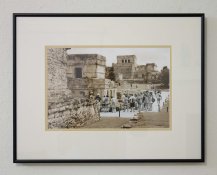
Color of matting for brown toned images

Roses

A
Roses

  • 3
  • 0
  • 77
Rebel

A
Rebel

  • 4
  • 2
  • 100
Watch That First Step

A
Watch That First Step

  • 1
  • 0
  • 69
Barn Curves

A
Barn Curves

  • 2
  • 1
  • 61
Columbus Architectural Detail

A
Columbus Architectural Detail

  • 4
  • 2
  • 66

Forum statistics

Threads
197,489
Messages
2,759,850
Members
99,517
Latest member
RichardWest
Recent bookmarks
0

tkamiya

Member
Joined
Oct 3, 2009
Messages
4,287
Location
Central Flor
Format
Multi Format
I am fully aware this is "it's all what you like" and "it depends".... but I would still like to solicit opinions.

I usually use a mat color called "Pearl white" from Frame Destinations (one of APUG sponsors). This color is more of a creamy off white which looks white by itself more or less, but against true white, it's definitely cream. I like using this one because with normal B&W image without toning or with light selenium toning, it brings out the white in the image and also the black. Visually, it adds "pop" to the image.

HOWEVER, I have an image that majority of the part is toned in deep brown with some near the center toned in selenium. I covered parts with rubber cement and toned in brown so it's not really a split toning or double toning but it's more of one part brown and another part selenium. With this image, this mat color didn't work so well. The mat looks a lot darker in cream than usual, and it doesn't help bring out the brown in the image. It sort of blends into the image rather than enhancing it.

Under these conditions, would you (personally) think pure white or white would work better? I typically don't like to use pure white because when combined with un-toned or selenium toned image, it's too stalk (sp) and I like warmer presentation. But I think it backfired on me this time.

By the way, the molding is metal matte black.

Again, I'm just interested in YOUR opinion either theoretically or from experience. I'm in uncharted territory for me. I could use help here. Thanks.
 

DWThomas

Subscriber
Joined
Jun 13, 2006
Messages
4,601
Location
SE Pennsylvania
Format
Multi Format
There are a lot of different whites in mat board. I generally use something that is designated "natural white." It's not that glaring ultra white, but isn't too far toward the creamy side. But then, I've not done exactly the toning you're describing either.
 
OP
OP

tkamiya

Member
Joined
Oct 3, 2009
Messages
4,287
Location
Central Flor
Format
Multi Format
It's amazing how many WHITE there are in matting materials...... you are right.
 

jordanstarr

Member
Joined
Apr 30, 2007
Messages
782
Location
Ontario
Format
Multi Format
I use an off-white for brown. It's a good transition into that tone and isn't too harsh. I also use it for warm-toned prints. It's a Peterboro PW572. You can go a little more "off" into a beige too and it works really well -that's what I use for my brown/walnut/cedar frames. For straight black and white that are selenium toned to a cool colour, I use a bright white PW521 Peterboro in a black frame. I know this doesn't necessarily apply to your scenario, but maybe you're thinking aobut it wrong. I like to draw the viewer in rather than pop the image out. It's my own preference to stick match with base tint rather than contrast. The image feels more as belonging to the frame rather than escaping it....if that makes any sense.
 

Jon Shiu

Subscriber
Joined
Dec 2, 2003
Messages
3,291
Location
Mendocino, California
Format
Plastic Cameras
I use the mat called Westminster Bright White rag board, it is not actually as bright as a paper mat white and it looks great and neutral/warm. I tried the natural white, but it kind of looks a sickly yellow and distracting when you see it on the gallery wall.

Jon
 

Vaughn

Subscriber
Joined
Dec 13, 2006
Messages
10,014
Location
Humboldt Co.
Format
Large Format
The board from the Light Impression of old was great -- I used Bright White for all my silver gelatin work -- including the Portriga Rapid (lightly selenium toned).

But their Natural White was great for my platinums and warm carbon prints. A perfect clean-looking light cream.

Another company's "Natural White" (don't know who), is way too yellow -- closer to what I have seen as "Antique White". I should have bought a sampler before buying 10 full (32x40) sheets of 8-ply of it! As Jon mentioned, a little sickly-looking. But I have used it for some very warm images (like the salt print I recently made) and it looks fine. And I will use it to re-mat the two Watkins 16x20 prints I have -- the color will work well with old albuman prints (bad spelling!).

Vaughn
 
OP
OP

tkamiya

Member
Joined
Oct 3, 2009
Messages
4,287
Location
Central Flor
Format
Multi Format
Hum....

This is going to be more difficult than I thought.... I remembered I had a mat board that is less creamy than the one I had so I went ahead and made a cut. The new board is more of a neutral white. Not the bright white but not so creamy as before - not that the board #1 was all that creamy to begin with.

It made a difference. The shade of "white" is so close that if I am not seeing them side by side, I won't be able to tell them apart but what a difference when combined with my print. The image came little more forward. It shows better. Before, I got the feeling, the image was "behind" the mat board little too far.

BUT, it's not quite right, yet. I'm not sure how to go about this either. I won't know until I put it together. I have a collection of L samples but it won't even come close to giving me the right impression.

Thanks everybody.
 
OP
OP

tkamiya

Member
Joined
Oct 3, 2009
Messages
4,287
Location
Central Flor
Format
Multi Format
Have any of you experienced the difference in shade of "white" from same company, same board, but different lot? That may be part of my problem. The original board is my standard selection. But this particular one seems to be a tad darker than what I used to get.
 
OP
OP

tkamiya

Member
Joined
Oct 3, 2009
Messages
4,287
Location
Central Flor
Format
Multi Format
I use an off-white for brown. It's a good transition into that tone and isn't too harsh. I also use it for warm-toned prints. It's a Peterboro PW572. You can go a little more "off" into a beige too and it works really well -that's what I use for my brown/walnut/cedar frames. For straight black and white that are selenium toned to a cool colour, I use a bright white PW521 Peterboro in a black frame. I know this doesn't necessarily apply to your scenario, but maybe you're thinking aobut it wrong. I like to draw the viewer in rather than pop the image out. It's my own preference to stick match with base tint rather than contrast. The image feels more as belonging to the frame rather than escaping it....if that makes any sense.


Thanks. It's entirely possible my approach is wrong. As I had it before, I had a distinct feeling there was a mat board and the image was inside it, sort of like an inch or so behind the board. The image was too far behind. In reality, it's just a 4 ply board so it's about 1/16" behind the board. It's the impression I had. When I used the board #2 which is less creamy, the image came little more forward.

You say, you draw your viewer INTO the image rather than to have the image pop out at the viewer. Do you care to elaborate on this, please if you would? Seems your approach is exact opposite of mine, so I'm curious.
 

jeffreyg

Subscriber
Joined
Jun 12, 2008
Messages
2,584
Location
florida
Format
Medium Format
For pt/pd prints I use natural white and for silver I use bright white. For metal sectional frames I use either silver, matte silver, flat black or contrast gray for silver prints and for pt/pd a German silver (a warm matte silver) frame. For wood frames I select from the framer's samples or use a museum frame in a warm black that he blended which works for both pt/pd and silver.

On the occasions of having an exhibition I try to keep one color of frame for all. If metal sectional and both pt/pd and silver prints I would use the German silver and if wood the warm black.

http://www.jeffreyglasser.com/
 

fdi

Advertiser
Advertiser
Joined
Nov 7, 2005
Messages
410
Location
Dallas, TX
Format
35mm
A very basic guideline for mat selction for photography, is to avoid using a white that is brighter than the brightest white in the image. That is why Pearl White in the Alphrarag line and Photo White in the Alphamat matboard line are so popular. Both are just a little off white but yet a cream.

In the case of sepia toning it gets more complicated since you no longer have any true whites. A couple other general guidelines are use of top mat that matches a color that is present in the image but only a little and that you would like to help bring it out more. Since you have two colors you are concerned about you might consider using a double mat. A couple things to try: Perhaps use Pearl as the top mat, but then use a browner bottom mat board. You can also try a browner top mat that is closer to a brown very prevalent in the image then use a Pearl mat as the bottom mat to help separate the image from the mat since they will tend to bleed together. I just took advantage of the bevel being white on a black mat to get a similar effect in this photo. Here this image is very low key and mostly black and I used black mat with a white core. The white core helps to separate the image from the mat. I could provide a more noticable separation with a white bottom mat.

http://www.framedestination.com/graphics/L_metal_frame_117_silver.jpg

This photo is very high key and mostly white so although the mat board is white I used one with a black core which is the same as using a black bottom double mat:
http://www.framedestination.com/graphics/L_wood_frame_502_gray.jpg


Make sure you get mat samples to lay on the image when trying to figure this out.

Cheers,
Mark
 
OP
OP

tkamiya

Member
Joined
Oct 3, 2009
Messages
4,287
Location
Central Flor
Format
Multi Format
Mark,

Thank you. Your Pearl White selection is my favorite. In fact, that's what I ordered for this image and all other B&W images. This particular one is a bit complicated as parts of the images are lightly selenium toned ONLY and the rest is toned in both lightly selenium and heavily brown.

Funny as you suggest double matting because that is what I am considering. Pearl as a top mat, and Almond (from AlphaMat) as bottom mat.

Another thing I'm thinking is, to float mount this image onto a white 2 ply mount board and use Pearl as an over-mat.

I kind of have to use Pearl as a top mat in any case as this will be one of the piece in a set.
 

fdi

Advertiser
Advertiser
Joined
Nov 7, 2005
Messages
410
Location
Dallas, TX
Format
35mm
That sounds like a great plan. You can do some cool stuff with double mats and intricate frames but it is really hard to do that and keep a gallery presentation theme intact.

In custom picture framing the frame package becomes an extension of the art and in ideal cases it becomes an extension of the place where the picture frame will be displayed. The photo becomes a part of a larger art piece...the room. Some times custom framers have to do things they feel hurt the image and use a mat or frame color that is wrong for the image but matches a sofa in the clients house. In gallery style framing the idea is the opposite. A simple white mat, black frame to set the image off the wall and highlight it without detracting from the image.

In your case your primary mat will be the same as the rest of the pieces in your display maintaining your theme but you will have small bottom mat that sets the image off from the Pearl White mat so that it is not distracting from the image.

Cheers,
Mark


Mark,

Thank you. Your Pearl White selection is my favorite. In fact, that's what I ordered for this image and all other B&W images. This particular one is a bit complicated as parts of the images are lightly selenium toned ONLY and the rest is toned in both lightly selenium and heavily brown.

Funny as you suggest double matting because that is what I am considering. Pearl as a top mat, and Almond (from AlphaMat) as bottom mat.

Another thing I'm thinking is, to float mount this image onto a white 2 ply mount board and use Pearl as an over-mat.

I kind of have to use Pearl as a top mat in any case as this will be one of the piece in a set.
 
OP
OP

tkamiya

Member
Joined
Oct 3, 2009
Messages
4,287
Location
Central Flor
Format
Multi Format
I am happy to report, the combination of Pearl White and Almond worked. Actually, I had to source the material locally so it's not exactly those colors but basically an identical combination.

Pearl white nicely separates the image from the wall and makes nice transition. Almond picks up the tone in the image and enhance but not over-power.

I'll see if I can take a photo of this and post....
 
OP
OP

tkamiya

Member
Joined
Oct 3, 2009
Messages
4,287
Location
Central Flor
Format
Multi Format
Please excuse the poor lighting technique. It was done in my living room. I color corrected it but that's all I can do.

This image was selenium toned first, then tourist, road, and posts were covered with rubber cement like material, then heavily brown toned. This is an image of Tulum ruins in Mexico.
 

Attachments

  • framed2.jpg
    framed2.jpg
    473 KB · Views: 110

Vaughn

Subscriber
Joined
Dec 13, 2006
Messages
10,014
Location
Humboldt Co.
Format
Large Format
Nicely done, tho it seems unfortunate that the "almond" board is not solidly colored and has instead a white core. A bit picky of me, and probably really not a real issue -- just something that caught my eye.
 
OP
OP

tkamiya

Member
Joined
Oct 3, 2009
Messages
4,287
Location
Central Flor
Format
Multi Format
Yes, I know.... The local store does not carry color-all-the-way-through kind. I'd prefer it if I had that choice.
 

jeffreyg

Subscriber
Joined
Jun 12, 2008
Messages
2,584
Location
florida
Format
Medium Format
I didn't notice mention of using acid free boards other than that of the old Light Impression Westminster boards. Which I used to use as well in the natural white and bright white. Since then I switched to the Print File (APUG supporter) products which meet archival standards. They are located in Florida and ship very promptly. You may want to check out their website.

http://www.jeffreyglasser.com/
 

Bob Carnie

Subscriber
Joined
Apr 18, 2004
Messages
7,734
Location
toronto
Format
Med. Format RF
Addressing Vaughn's point a bit.

One of the matt's you are using is not an archival matt and it seems to me that you are striving for excellence in printing with some of the threads I have been part of of late.
Today and for a few years to come that matt does not present any issues towards your print so if it is for short term display then my concern does not matter.
But if you plan to hang that print and not touch , in about 30 years the materials could indeed start attacking your image. The same apply's if you are using cardboard in your frame or even masking tape.

At our frame shop we have no coloured matts and it has been a very rare time a client has pushed us to use one, actually I cannot remember the last time.
What surrounds your image can/will possibly cause damage to a perfectly processed silver print.

When I first started making silver prints , I had absolutely no clue about framing and some of the prints I gave my brothers and father have been reframed 35 years later and the damage bad framing has been seen , the main culprit is cardboard as a packing substrate.


Nicely done, tho it seems unfortunate that the "almond" board is not solidly colored and has instead a white core. A bit picky of me, and probably really not a real issue -- just something that caught my eye.
 

jeffreyg

Subscriber
Joined
Jun 12, 2008
Messages
2,584
Location
florida
Format
Medium Format
I didn't notice mention of using acid free boards other than that of the old Light Impression Westminster boards. Which I used to use as well in the natural white and bright white. Since then I switched to the Print File (APUG supporter) products which meet archival standards. They are located in Florida and ship very promptly. You may want to check out their website.

http://www.jeffreyglasser.com/
 

fdi

Advertiser
Advertiser
Joined
Nov 7, 2005
Messages
410
Location
Dallas, TX
Format
35mm
I didn't notice mention of using acid free boards other than that of the old Light Impression Westminster boards. Which I used to use as well in the natural white and bright white. Since then I switched to the Print File (APUG supporter) products which meet archival standards. They are located in Florida and ship very promptly. You may want to check out their website.

http://www.jeffreyglasser.com/

There are many different levels of archival mat boards. The lowest level are paper mat boards which are considered suitable only for "decorative" framing, not conservative framing. A level up from that are mat boards mat of alpha cellulose. The Bainbridge Alphamat is such a mat board. It is acid and lignin free, and uses Artcare technology that allows it to actually neutralize acidic compounds entering the framing package. It is a little more achival than most other alpha cellulose mat boards. It is laminated with a color surface paper that has dye's that you would not use for museum quality framing but the surface paper is not in contact with the print. This is also the reason that the bevel on the core is not the same color as the surface. The primary mat board being referred to was the Bainbridge Alpharag Pearl White. This is the highest level of protection you can get, and a little better than the Westmister which is also very good. The Alpharag board is composed of cotton which is naturally inert. The board is acid free, lignin free and only very safe dyes are used. That is why the color selection of the musuem rag mat board is so limited and you never see any bright colors. It is also treated with the Artcare process and since Bainbridge purchased exclusive rights to the technology no other mat board companies can offer it. This board is composed of cotton layers that are dyed which is why the color will be uniform from the surface to back. All of these mat boards are buffered with calcium carbonate which helps make them even less acidic. Paper mat boards are often buffered also and then sold as acid free, however, since the substrate is naturally acidic they will return to being acid when the buffering wears off. I dont know how long that takes, but the general guideline I have heard is that if you want it to last longer than 5 years with no noticible damage, do not use paper mat boards.

Cheers,
Mark
 
OP
OP

tkamiya

Member
Joined
Oct 3, 2009
Messages
4,287
Location
Central Flor
Format
Multi Format
Addressing Vaughn's point a bit.

One of the matt's you are using is not an archival matt and it seems to me that you are striving for excellence in printing with some of the threads I have been part of of late.

Bob?

Do you see something I don't? I use all archival quality materials. The mat board I purchased locally were of acid-free, archival quality boards. They are made by Crescent and I use their SELECT series.

http://crescentpro.com/select.html
 
Photrio.com contains affiliate links to products. We may receive a commission for purchases made through these links.
To read our full affiliate disclosure statement please click Here.

PHOTRIO PARTNERS EQUALLY FUNDING OUR COMMUNITY:


Ilford ADOX Freestyle Photographic Stearman Press Weldon Color Lab Blue Moon Camera & Machine
Top Bottom