Color Correct

spain

A
spain

  • 0
  • 0
  • 9
Humming Around!

D
Humming Around!

  • 4
  • 0
  • 54
Pride

A
Pride

  • 2
  • 1
  • 103
Paris

A
Paris

  • 5
  • 1
  • 178

Recent Classifieds

Forum statistics

Threads
198,414
Messages
2,774,621
Members
99,610
Latest member
Roportho
Recent bookmarks
1

Nebbit

Member
Joined
Dec 2, 2019
Messages
26
Location
Toronto
Format
Hybrid
I've been scanning negatives and editing in Photoshop for several years. I often get results I am pleased with, sometimes almost right away even (love when that happens), however I feel like I have never mastered the art of color correction and color cast removal. I have used several methods and none have ever felt consistent, or reliable. What I end up doing most of time is using a mixture of curves and color balance adjustment layers and simply adjusting by eye. While this generally more time consuming I feel I get closer to my desired outcome than if I were to simply use curves layer and select the black, grey and white values. Of course however, there are always images where no matter what I just can't get it right.

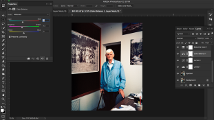
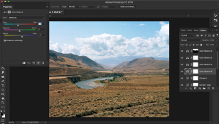
I'm including some images I took recently to show what I mean. I believe the first photo was taken on 120 Ektar, which is why I was able to push it so much. The second was on 4x5 Portra 160, so it is not just an issue of color cast from a single film stock. The first image itself is not the best starting place as it was taken indoors under poor light. The film was necessarily underexposed (no tripod) and the typical industrial overhead lights combined with the fact that I was pushing the film left a visible color in the lights and mid tones. Sometimes I still have this difficulty with perfectly fine exposures such as this desert scene which has a kind of tint that I cannot seem to get regardless. I also include screencaps of the working file to illustrate the approach I have been using. As you can see in the desert scene, it is a right mess. I had to use multiple stack color balance and curve layers with masks to get to where it is now, which is still not satisfying.

I realize there are likely many more efficient and repeatable methods than what I do, so that's why I'm looking for advice. I also realize this is fairly rudimentary for some, so any helpful words are greatly appreciated!

Thanks!

Bill_2_Colour_Web.jpg


Cache_Creek_Web.jpg


Screen Shot 2020-04-30 at 3.54.57 PM.png Screen Shot 2020-04-30 at 3.56.15 PM.png
 

Lachlan Young

Member
Joined
Dec 2, 2005
Messages
4,907
Location
Glasgow
Format
Multi Format
I've attached an outline of my negative inversion methodology - the first section does have generic application across other scanners, and I tend to use the methodology I wrote up in the 'alternatives' section as my first preference now, unless there are colour crossovers in the negative (from overexposed Ektar etc). The main thing that needs done is getting rid of the colour correction mask in the right way - get that wrong & that's where most people's trouble starts.
 

Attachments

  • Manual_Colour_Inversion.pdf
    53.9 KB · Views: 118

Adrian Bacon

Subscriber
Joined
Oct 18, 2016
Messages
2,086
Location
Petaluma, CA.
Format
Multi Format
Hmm... reading your PDF @Lachlan Young illustrates why I do my process in raw color.

@Nebbit (and potentially @Lachlan Young) A couple of notes based on my own experience that you might find helpful:

1) Each channel has its own gamma. A good C-41 generic starting place is: R=0.38, G=0.45, B=0.52. Those are averages from every emulsion I've created a scanning profile for (pretty much everything you can buy in the U.S. today), baby changes go a long way. The best way is to measure the gamma with a set of +2 and -2 exposures of a gray exposure card. You can optionally do a full set of exposures from -6 to +6 (or more) in full stops, but +2 and -2 gets you over 90% of the way there. Failure to correctly linearize each channel results in color casts.
2) Each channel is also a different speed, this differs from one emulsion to the next. After linearization, it's helpful to have a way to apply per channel exposure multipliers to get a correctly exposed middle gray card to neutral gray. If you correctly did bullet point 1, this step results in little to no color casts anywhere, assuming the color temperature matched the emulsion and there were no process control problems.
3) If bullet points 1 and 2 were done correctly, you don't actually have to do anything about the orange mask as it will actually totally disappear all by itself, along with most any other color cast, again, assuming there were no process control problems, and the WB matches the emulsion.
4) Burn a roll and shoot a grey exposure card -2, 0, and +2, then shoot a Macbeth chart under daylight or studio strobes. Make multiple exposures of each exposure and average them. At least 6 of each is good. Use this to measure what the emulsion is *actually doing* in your chosen workflow. If you don't, you're flying blind and doing it with your eyes, which lie to you all the time. Even if you don't make a full on raw scanning profile, the plus and minus exposures are invaluable to use for knowing where those points generally are in relation to each other so you can make adjustments with a tone curve in PS.
5) I don't do clipping of anything ever. I've never found a need to, though, this might be an artifact of my process as I output floating point scene referred linear.

Your process has an awful lot of steps. I've distilled mine down to just a handful:

0) take a raw picture of the frame with a DSLR and strobe.
1) do step one above. Apply the gamma and invert at the same time with a lookup table, the lookup table output should preferably be floating point so you keep all the sample precision in the following steps.
2) Do step two above.
3) Apply a per-hue angle hue rotation map to get the colors to correspond where they're supposed to be for my chosen color space. This is done with a lookup table.
4) Apply a per-hue angle saturation adjustment to get the per hue saturation levels where they're supposed to be for my chosen color space. This is done with a lookup table.
5) Apply a per-hue angle brightness adjustment to get the per hue brightness levels where they're supposed to be for my chosen color space. This is done with a lookup table.
6) Apply an output white balance adjustment to go from 5000K (the native WB of my chosen color space) to whatever the white balance of the image is.
7) write the file out, you're done.

Steps 3-5 don't really have a PS equivalent, and really only matter if you're in raw color. If you're in a color managed environment, those have already effectively been done for you.
Steps 1-2 are fraught with problems if you're already in a color managed environment, which is why I don't go there, and why pretty much everyone struggles with this, simply because you're trying to get to correct color through the lens of a color space that has some pretty hard and fast rules about the way it works, which aren't very helpful when trying to get correct color out of something that is essentially a raw image.
 
Last edited:
OP
OP

Nebbit

Member
Joined
Dec 2, 2019
Messages
26
Location
Toronto
Format
Hybrid
Thanks @Lachlan Young for the information on your approach! I'll definitely try that out with the portrait as I have the rebate scanned in the original .fff file. Unfortunately, the second is 4x5 and no rebate, so I'll have to wait on that one.

Cheers!
 

jeffreyg

Subscriber
Joined
Jun 12, 2008
Messages
2,629
Location
florida
Format
Medium Format
I rarely use color and when I do it is digital capture and most often changed to monochrome so I can't comment on techniques. You might want to check out ON1 editing software. They have free trials and many tutorials. It may make things easier for you without too many steps. It is compatible with PhotoShop and Lightroom as well as a stand alone.

http://www.jeffreyglasser.com/

http://www.sculptureandphotography.com/
 

Anon Ymous

Member
Joined
Feb 7, 2008
Messages
3,661
Location
Greece
Format
35mm
...
1) Each channel has its own gamma. A good C-41 generic starting place is: R=0.38, G=0.45, B=0.52. Those are averages from every emulsion I've created a scanning profile for (pretty much everything you can buy in the U.S. today), baby changes go a long way. The best way is to measure the gamma with a set of +2 and -2 exposures of a gray exposure card. You can optionally do a full set of exposures from -6 to +6 (or more) in full stops, but +2 and -2 gets you over 90% of the way there...
So, you are basically saying that the characteristic curves for the separate channels aren't parallel, right? This contradicts with what the datasheets show, but more or less reflects my experience. I usually bracket a gray card with exposures -5, -3, -1, +1, +3, +5, or -4, -2, 0, +2, +4. I've used several homebrew formulae, as well as commercial chemicals. Some were better than others, but I never had perfectly parallel curves. Of course, my technique and my (primitive) gear might cause problems, but I find it rather hard to believe that it's only my fault. Even a commercially processed film had the same characteristics, with the red channel lagging behind quite a lot, but this could be fairly iffy in this day and age with very low throughput.
 

Adrian Bacon

Subscriber
Joined
Oct 18, 2016
Messages
2,086
Location
Petaluma, CA.
Format
Multi Format
So, you are basically saying that the characteristic curves for the separate channels aren't parallel, right? This contradicts with what the datasheets show, but more or less reflects my experience. I usually bracket a gray card with exposures -5, -3, -1, +1, +3, +5, or -4, -2, 0, +2, +4. I've used several homebrew formulae, as well as commercial chemicals. Some were better than others, but I never had perfectly parallel curves. Of course, my technique and my (primitive) gear might cause problems, but I find it rather hard to believe that it's only my fault. Even a commercially processed film had the same characteristics, with the red channel lagging behind quite a lot, but this could be fairly iffy in this day and age with very low throughput.

the data sheets at first glance look parallel, but upon closer inspection, they actually are not. If you take an image of the data sheet chart into photoshop and collapse them down on top of each other, they’re not parallel. Each has a different slope.

the red lagging off quite a lot can be a temperature control problem. Whoever ran that film did’t have it hot enough.
 

Anon Ymous

Member
Joined
Feb 7, 2008
Messages
3,661
Location
Greece
Format
35mm
the data sheets at first glance look parallel, but upon closer inspection, they actually are not. If you take an image of the data sheet chart into photoshop and collapse them down on top of each other, they’re not parallel. Each has a different slope.

the red lagging off quite a lot can be a temperature control problem. Whoever ran that film did’t have it hot enough.
I just checked with the curves from Kodak Gold 200 and you're right, they're not parallel. One strange observation was when I developed a Gold 200 along with a Superia Xtra 400 in the same tank. Both films had bracketed gray card shots and both were fresh. Rather surprisingly, Gold 200 had a much more problematic red channel compared to the Superia.
 

Adrian Bacon

Subscriber
Joined
Oct 18, 2016
Messages
2,086
Location
Petaluma, CA.
Format
Multi Format
I just checked with the curves from Kodak Gold 200 and you're right, they're not parallel. One strange observation was when I developed a Gold 200 along with a Superia Xtra 400 in the same tank. Both films had bracketed gray card shots and both were fresh. Rather surprisingly, Gold 200 had a much more problematic red channel compared to the Superia.

one thing I’ve noticed with Fuji color negative films is that they are significantly tighter to tolerance than Kodak films generally are with respect to color channel performance, at least with respects to their consumer films.
 

Lachlan Young

Member
Joined
Dec 2, 2005
Messages
4,907
Location
Glasgow
Format
Multi Format
@Adrian Bacon bear in mind that I don't usually have to debayer or relinearise a camera sensor & I am generally working off what is essentially a fairly linear 3x CCD output or similar - which I have taken up to pretty huge sizes (48x60" at 300ppi on occasion & bigger) without visible quantization or other various potential errors & with colour that can be matched to optical (enlarger) c-types. Interestingly I note that the Portra 160 samples you have on your website show a characteristic colour cast I also had problems with on Portra 160 until I stopped attempting to correct for colour crossover that didn't exist! While several aspects of your approach are useful, I think that seeking to re-linearise the film characteristic curves (as opposed to the sensor response) essentially sets out to forcibly undo the designed-in characteristics of the emulsions & having read quite extensively about the design and manufacturing control processes used on Kodak materials, the curve characteristics you and @Anon Ymous are noticing are intentional in their purpose - both to give the colours & tonality that people 'think they remember' (in the case of Gold 200) & likely to compensate for process deviations in the processing that the average amateur user would have encountered (again in the case of Gold 200).

I think there are a number of interesting experiments potentially worth carrying out in the camera scanner environment, especially in terms of the use of filtration at the time of scanning - in particular seeing if a 50R (or equivalent filtration to compensate for the mask) eliminates the need for certain corrections.
 

Adrian Bacon

Subscriber
Joined
Oct 18, 2016
Messages
2,086
Location
Petaluma, CA.
Format
Multi Format
@Adrian Bacon bear in mind that I don't usually have to debayer or relinearise a camera sensor & I am generally working off what is essentially a fairly linear 3x CCD output or similar - which I have taken up to pretty huge sizes (48x60" at 300ppi on occasion & bigger) without visible quantization or other various potential errors & with colour that can be matched to optical (enlarger) c-types. Interestingly I note that the Portra 160 samples you have on your website show a characteristic colour cast I also had problems with on Portra 160 until I stopped attempting to correct for colour crossover that didn't exist! While several aspects of your approach are useful, I think that seeking to re-linearise the film characteristic curves (as opposed to the sensor response) essentially sets out to forcibly undo the designed-in characteristics of the emulsions & having read quite extensively about the design and manufacturing control processes used on Kodak materials, the curve characteristics you and @Anon Ymous are noticing are intentional in their purpose - both to give the colours & tonality that people 'think they remember' (in the case of Gold 200) & likely to compensate for process deviations in the processing that the average amateur user would have encountered (again in the case of Gold 200).

I think there are a number of interesting experiments potentially worth carrying out in the camera scanner environment, especially in terms of the use of filtration at the time of scanning - in particular seeing if a 50R (or equivalent filtration to compensate for the mask) eliminates the need for certain corrections.

the camera sensor is extremely linear for most of it dynamic range. With canon cameras, they put metadata in the raw file to tell you where it stops being linear, typically densities above 4.0, so as long as you stay below that, it’s very linear. I also don’t debayer the sensor data. There’s no need to. The DNG files I generate are bayer samples.

as far as the samples on my website go, those are quite old at this point and I’m in the process of updating them with sample images reflecting my current process.
 
Photrio.com contains affiliate links to products. We may receive a commission for purchases made through these links.
To read our full affiliate disclosure statement please click Here.

PHOTRIO PARTNERS EQUALLY FUNDING OUR COMMUNITY:


Ilford ADOX Freestyle Photographic Stearman Press Weldon Color Lab Blue Moon Camera & Machine
Top Bottom