Color Carbro Printing by Gerard Anière

Sparrow.jpg

A
Sparrow.jpg

  • 0
  • 0
  • 14
Orlovka river valley

A
Orlovka river valley

  • 2
  • 0
  • 62
Norfolk coast - 2

A
Norfolk coast - 2

  • 3
  • 1
  • 62
In the Vondelpark

A
In the Vondelpark

  • 4
  • 2
  • 139
Cascade

A
Cascade

  • sly
  • May 22, 2025
  • 6
  • 6
  • 117

Recent Classifieds

Forum statistics

Threads
197,834
Messages
2,765,256
Members
99,485
Latest member
zwh166288
Recent bookmarks
0

holmburgers

Member
Joined
Aug 13, 2009
Messages
4,439
Location
Vienna, Austria
Format
Multi Format
This printer was brought to my attention by Charles Berger. Attached (in 2 jpegs) is an article about Gerard Anière from the World Journal of Post-Factory Photography, 2004.

Mssr. Anière has developed a home-grown method to produce modern color-carbro prints.

In case the details of carbro are fuzzy, allow me to defuzz briefly. The process uses tissues that are identical (generally speaking) to carbon tissues, but the method of "exposure" is different. Instead of sensitizing in dichromates and exposing to UV light under a negative, a carbon tissue and a black & white bromide print (hence car-bro) are squeegeed into intimate contact in a solution of potassium dichromate, potassium ferricyanide, potassium bromide & chromic acid. This is a carbro bleach. This solution bleaches the bromide print and its byproducts migrate to and tan the gelatin of the pigment tissue. E. Howard Farmer discovered this property, and his name lends itself to what we know as Farmer's Reducer. The exposed carbro tissue is transfered and developed just like a carbon print.

The most cited obstacle to carbro is the unsuitable nature of most modern day b&w papers and their gelatin supercoat. To overcome this Gerard is using a home-made silver emulsion that appears to have been inspired by Jim Browning's dye-transfer emulsion. He coats this onto large sheets of clear polyester and these become his "bromides". Apparently his digital negatives are created by Tod Gangler in Seattle; Art & Soul. The beauty of carbro is that you don't need enlarged negatives, and this allows him to make very large carbro prints.

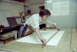
Anyways, there's much more in the article and a big thanks to Charles for sending me a picture of Gerard in action!
 

Attachments

  • Gerard Aniere by Charles Berger.jpg
    Gerard Aniere by Charles Berger.jpg
    877.1 KB · Views: 791
  • PFP Gerard Carbro 2 of 2.JPG
    PFP Gerard Carbro 2 of 2.JPG
    833.2 KB · Views: 656
  • PFP Gerard Carbro 1 of 2.JPG
    PFP Gerard Carbro 1 of 2.JPG
    980.5 KB · Views: 617
OP
OP
holmburgers

holmburgers

Member
Joined
Aug 13, 2009
Messages
4,439
Location
Vienna, Austria
Format
Multi Format
p.s. Once you open the article JPEGS, click on them again and it will open them in their own window/tab. Then you might have to click one more time to zoom them to full size, but trust me that they are large enough to read, and even print out if you'd prefer. Let me know if you have trouble viewing them.
 
OP
OP
holmburgers

holmburgers

Member
Joined
Aug 13, 2009
Messages
4,439
Location
Vienna, Austria
Format
Multi Format
I encourage you to Tom and I'd be happy to help in any way that I can.
 
OP
OP
holmburgers

holmburgers

Member
Joined
Aug 13, 2009
Messages
4,439
Location
Vienna, Austria
Format
Multi Format
Absolutely, and everything I've learned has come from books, online sources and only a few nuggets have been "private wisdom" from individuals. So everything is out there, but if you have trouble finding something let me know.
 
OP
OP
holmburgers

holmburgers

Member
Joined
Aug 13, 2009
Messages
4,439
Location
Vienna, Austria
Format
Multi Format
Well modern might be a stretch, but Luis Nadeau has several books from the 80's that are quite comprehensive. Particularly the 'History of Carbon Proceses' (IIRC) discusses carbro, carbon and color. It's considered 'the bible' by many and it's still completely relevant.

There are several other books that have good reputations, but as far as digital negatives and that kind of thing, no one has covered anything that modern.

So that being said, it's a case of taking from many sources what you need to know and creating your own workflow. Everything has been covered, but not in one place.
 

Bob Carnie

Subscriber
Joined
Apr 18, 2004
Messages
7,731
Location
toronto
Format
Med. Format RF
Chris
I for one would be interested in a step by step guideline as you see it on colour Carbon, I have been following this thread with interest and also been privately talking about making film with others.
But you seem to be holding on to this like a dog with a bone and would love to see how you would approach making a colour carbon print , in a perfect setting.
What would you need, where do you see the pitfalls , what is easy and so forth.
FYI I am proceeding with duotone , tri tone and tritone with a black using film I have made myself on the Lambda and when I have made a few prints that I like I will post them.. At this point I am not aiming for full realistic colour like Todd G and John B but rather a less realistic version.
Bob


Well modern might be a stretch, but Luis Nadeau has several books from the 80's that are quite comprehensive. Particularly the 'History of Carbon Proceses' (IIRC) discusses carbro, carbon and color. It's considered 'the bible' by many and it's still completely relevant.

There are several other books that have good reputations, but as far as digital negatives and that kind of thing, no one has covered anything that modern.

So that being said, it's a case of taking from many sources what you need to know and creating your own workflow. Everything has been covered, but not in one place.
 
OP
OP
holmburgers

holmburgers

Member
Joined
Aug 13, 2009
Messages
4,439
Location
Vienna, Austria
Format
Multi Format
Hi Bob, I will definitely give this a shot...

Keep in mind, I have actually never made a color carbon print, or even a dye-transfer print, although I speak as an authority on both topics. I'm only an authority in the sense that I'm well read on the topics and am taking steps to make these prints in the future. Plus, they fascinate me! At the moment I kind of consider myself a "pied piper" of these processes and approach them from an academic standpoint. But, photoraphy as art is where my interest lies and where my aims point, and it is with this in mind that I pursue these processes. If only there were more time in the day where I'm not stuck behind a desk...

In mechanics, creating a color carbon print is no different than creating a monochrome carbon print, with the exception of registration. Numerous graphic arts punches have been made throughout the years, and these are all quite expensive. My goal is to use simple office punches, and I have reason to believe that these will be adequate.

The first thing to do is obtain the pigments that are necessary for color reproduction; cyan, magenta and yellow. I got a pint of each of these pigment powders from a place called Lansco Colors, for free as samples.

Here's (there was a url link here which no longer exists)describing the pigments, and here are the ones I got from Lansco. Cyan, Magenta, Yellow. The cyan and magenta are the proper pigments, the yellow was more of an educated guess but I would guess that it should work ok. APUG member mdm has suggested using painter's tints which are conveniently supplied as liquid dispersions.

The tissues are made just like monochrome tissues, but the trick would be in calibrating the 3 colors to create a neutral gray scale when overlayed. Chances are that this would entail a balancing of pigment concentration, gelatin concentration and sensitizer concentration. Furthermore, since carbon relies on UV light and the different colors absorb/reflect this light to different degrees, matching the contrasts is further complicated. This wouldn't be a problem with carbro. Luis Nadeau specifically addresses this and mentions that is most pronounced with cyan.

It sounds daunting, but one place to start would be to make small batches of "glop" containing the 3 pigments at various concentrations. So, let's say you make 10, 20 and 30 (totally arbitrary numbers) grams/liter of each color pigment in 10% gelatin. Now pour these over one another in all the possible combinations. The combination that creates the most neutral gray might be a good place to start regarding pigment concentration. Then, sensitizer affects could be investigated to bring the 3 colors to the proper contrast and scale.

Finding the proper proportions for each color tissue would be the most important and intensive step in a workable color-carbon scheme, methinks. But frankly, it sounds kinda fun!

Now, you need to consider your color separation negatives. This is where my expertise is lacking, but fortunately this is where there is a plethora of information. From classic analog controls via developers and masking to QTR profiles and digital inkjet negatives, there's no shortage of knowledgable people on this topic. Dye-transfer would be a good place to look for sensitometric information and methods for analog separations and masking.

Color corrective masking would be important in an analog scheme and equally important but trivial in terms of effort with digital.

At this point you've got your negatives and your tissues. Assuming double-transfer, you will find yourself with a suitable temporary support be it dichromated albumen coated on mylar (excellent document explaining this on the Yahoo! Carbon Transfer group) or just plain melinex that has been washed and scrubbed with Comet (as per the UltraStable instructions). You'll want to punch this support and you'll need a registration board with pins that matches your punch to hold the temp-support and tissues throughout development. The board might be the only piece of specialized equipment you need, besides maybe a Meyer rod for coating.

Yellow is the most opaque pigment, so this will be transfered to the temporary support last, placing it at the bottom of the final support. There is an excellent video posted by Charles of Tod G. doing this whole process.

This is a pretty basic explanation, and perhaps I've left out some crucial information (?) but in reality I think that anyone could tackle this, and the more people that do it the more the collective knowledge will grow. All we need is a starting point.
 
Last edited by a moderator:

Bob Carnie

Subscriber
Joined
Apr 18, 2004
Messages
7,731
Location
toronto
Format
Med. Format RF
Chris

Keith Taylor has listed cmy pigments of choice for his process, do you not see them working well with tissue??
 
OP
OP
holmburgers

holmburgers

Member
Joined
Aug 13, 2009
Messages
4,439
Location
Vienna, Austria
Format
Multi Format
Hi Bob,

I can't find his recommendations; what does he recommend? The impression that Nadeau gives is that the watercolor CMY set is a bit of a compromise; more historical than technical. That's not to say of course that it's incapable of beautiful pictures.

This set listed above (save perhaps for the yellow azo 155), as far as I know, is the best set available today. Keep in mind, I'd love to be wrong and shown a better set. But I know for a fact that the quinacridone 122 is used in UltraStable and Tod Gangler's tissues and I suspect the phtalo blue 15:3 is too. They are highly transparent, light-fast and approximate the ideal minus-red, minus-green & minus-blue complementary colors.

Interestingly enough, Liquitex acrylic Ink! has an ideal CMY set in their catalog. The pigments are listed on the back and they're the same ones from above. I'm curious though if the acrylic nature would make them unsuitable for carbon tissues? It'd be a relatively expensive way to get the pigments though.
 

Bob Carnie

Subscriber
Joined
Apr 18, 2004
Messages
7,731
Location
toronto
Format
Med. Format RF
Hi Chris

Well my question is this,, high quality pigments are used in both processes, carbon and gum, differences in application, but I cannot see any reason why one process would be considered more archival than the other, unless of course if the pigments used in ultrastable are more stable. This is a question I would think worth researching, as there is a lot of research and workers in gum who would say their prints are ever so much archival as Carbon Prints.

Kind of like the who has the bigger one, and I am thinking both processes are as stable as each other , but I certainly do not have this answer and enquiring minds need to know.

thanks Bob
 
OP
OP
holmburgers

holmburgers

Member
Joined
Aug 13, 2009
Messages
4,439
Location
Vienna, Austria
Format
Multi Format
I'm pretty certain that they're both completely archival. I would've never thought otherwise; considering that it all comes down to the pigments and the paper.

I think gelatin & gum arabic are like Thelma & Louise.... they'll go out of this life together. . . .:laugh:

I'm just not personally that interested in gum, solely for its look. I can appreciate a good gum print for sure, but it ain't really my bag.
 

Bob Carnie

Subscriber
Joined
Apr 18, 2004
Messages
7,731
Location
toronto
Format
Med. Format RF
I am thinking the same, but if you ask workers in each process they will swear theirs is better than yours.
when are you coming to Toronto?

btw you just eclipsed me in posts
 
OP
OP
holmburgers

holmburgers

Member
Joined
Aug 13, 2009
Messages
4,439
Location
Vienna, Austria
Format
Multi Format
Hmmm... well they're probably wrong. I'll see if I can't find some hard data on it though.

I'll be in Toronto on the 6th and 7th of October! I'm pretty psyched.

As for my post count, that's an average of 4 per day for the last 2 years! I've been here for 5 years less than you... that's kinda depressing honestly, but I swear I do have a life outside of APUG. In fact, I'm only here while I'm at work, which might make you wonder well what the hell does he do?, but I'm an administrative assistant at a small executive placement firm and I manage to do my work and keep my boss pleased all while studying photography.
 

donbga

Member
Joined
Nov 7, 2003
Messages
3,053
Format
Large Format Pan
I'm just not personally that interested in gum, solely for its look. I can appreciate a good gum print for sure, but it ain't really my bag.

What look are you speaking of? Grainy, hazy, unsharp prints?

Tri-color or full color gums need not look like that. I've seen gum prints that are just as sharp as carbon prints.

Don Bryant
 

donbga

Member
Joined
Nov 7, 2003
Messages
3,053
Format
Large Format Pan
Yeah, I guess the "pictorialist" look; to use a worn out term.

This would be an example of a gum print that I really like -> http://www.flickr.com/photos/hansbazar/3065718313/in/faves-ceholmburgers/

But in general, the carbon process just seems more versatile and perfect to me. I'm open to the possibilities of gum though.

Gum is just a flexible as carbon if not more so and can be just a sharp if not more so. Tri-Color can be quite stunning as well.

Take a look at Keith Taylor's work for example.

http://www.keithtaylorphoto.com/gum.html

http://unblinkingeye.com/Articles/3CG2/3cg2.html


Don
 

Bob Carnie

Subscriber
Joined
Apr 18, 2004
Messages
7,731
Location
toronto
Format
Med. Format RF
I wish everyone I worked with could multitask as well as you, but think how valuable you would be without the internet thing, you would get a raise, hell you may replace him/her.
Look forward to seeing you in Toronto.
Hmmm... well they're probably wrong. I'll see if I can't find some hard data on it though.

I'll be in Toronto on the 6th and 7th of October! I'm pretty psyched.

As for my post count, that's an average of 4 per day for the last 2 years! I've been here for 5 years less than you... that's kinda depressing honestly, but I swear I do have a life outside of APUG. In fact, I'm only here while I'm at work, which might make you wonder well what the hell does he do?, but I'm an administrative assistant at a small executive placement firm and I manage to do my work and keep my boss pleased all while studying photography.
 
OP
OP
holmburgers

holmburgers

Member
Joined
Aug 13, 2009
Messages
4,439
Location
Vienna, Austria
Format
Multi Format
Thanks Bob, I'm looking forward to meeting you as well.

Truthfully, when I got this job they told me I'd have a lot of free time and I said, "that's ok, I've got hobbies!" It's a small family office, the work is minimal, I answer phone calls and input data. And I have gotten a raise believe it or not! :wink:

But I do see your point as well...

Honestly, I'm cultivating my true interests here on APUG and elsewhere with photography, and I'm taking very real steps to make it my real work. Gearing up for grad school and doing free-lance and pro-bono stuff on the side.

I refuse to exert my life's energy in pursuits that I don't really care about, that only equate to "making a living".

Ok, but enough about me.
 

Photo Engineer

Subscriber
Joined
Apr 19, 2005
Messages
29,018
Location
Rochester, NY
Format
Multi Format
Bob;

Hopefully, when Chris meets you in Toronto, he will have a bundle of Azo type contact prints with him that he made from scratch in class. He will be bubbling over with enthusiasm and will tell you all about the workshop!

:D

I hope! :wink:

PE
 
OP
OP
holmburgers

holmburgers

Member
Joined
Aug 13, 2009
Messages
4,439
Location
Vienna, Austria
Format
Multi Format
I would suspect that to be an accurate prophecy Ron... :joyful:
 

PVia

Member
Joined
Oct 3, 2006
Messages
1,057
Location
Pasadena, CA
Format
Multi Format
What look are you speaking of? Grainy, hazy, unsharp prints?

Tri-color or full color gums need not look like that. I've seen gum prints that are just as sharp as carbon prints.

Don Bryant

Absolutely, just look at Keith Taylor's work...hard to find any better than his.

Ahh, Don beat me to it, I see...!

Well, here's more: http://www.cydecosse.com/galleries/gum_fl_foods.html
 
Photrio.com contains affiliate links to products. We may receive a commission for purchases made through these links.
To read our full affiliate disclosure statement please click Here.

PHOTRIO PARTNERS EQUALLY FUNDING OUR COMMUNITY:


Ilford ADOX Freestyle Photographic Stearman Press Weldon Color Lab Blue Moon Camera & Machine
Top Bottom