Color carbro - color balance

CK341

A
CK341

  • 0
  • 0
  • 41
Plum, Sun, Shade.jpeg

A
Plum, Sun, Shade.jpeg

  • sly
  • May 8, 2025
  • 2
  • 0
  • 60
Windfall 1.jpeg

A
Windfall 1.jpeg

  • sly
  • May 8, 2025
  • 5
  • 0
  • 51
Windfall 2.jpeg

A
Windfall 2.jpeg

  • sly
  • May 8, 2025
  • 1
  • 0
  • 50
Marsh, Oak Leaves.jpeg

A
Marsh, Oak Leaves.jpeg

  • sly
  • May 8, 2025
  • 1
  • 0
  • 48

Recent Classifieds

Forum statistics

Threads
197,611
Messages
2,761,955
Members
99,416
Latest member
TomYC
Recent bookmarks
0

73764

Member
Joined
May 31, 2013
Messages
8
Format
35mm
In "Handbook of photography" on page 634 Olindo O. Ceccarini writes: "It's a well-known fact that the color balance of a blue pigment (spectral reflecting power) is much less than that of a magenta and yellow pigment." Because of this he suggests that - in order to achieve correct color balance - the magenta and yellow bromides need to be printed darker than blue bromide and the magenta and yellow tissues need to sensitized longer (in a one-bath carbro solution) than blue tissue. Is this still necessary today because of the nature of the process, or does for example digitally adjusted negatives offer control that didn't exist in 1939?

I suppose it would be desirable to be able to give equal exposures to the bromides and sensitize the tissues in an identical way but I'm thinking whether the use of a silver gelatin print in the "exposure" of the tissue require the color separation negatives of equal density and contrast.

Maybe this has been posted before, but the book can be read and downloaded for free here https://archive.org/details/handbookofphotog00henn
 

DREW WILEY

Member
Joined
Jul 14, 2011
Messages
13,741
Format
8x10 Format
Such generalities are questionable. Carbro was a pigment process, and the specific pigment set one might choose today might well be totally
different than those of a specific worker in 1939, not to mention all the numerous other variables which could hypothetically come into play.
You would be essentially re-pioneering the whole process, unless someone else is currently doing it in a fashion you could partially copy.
 

Bob Carnie

Subscriber
Joined
Apr 18, 2004
Messages
7,731
Location
toronto
Format
Med. Format RF
I have the ability to make four Black and White silver gelatin separations on Galerie G 4 . I think these would work for this process, or the RC version is also possible.

I have made this offer to any worker out there to provide the prints, I do not have enough time in my life right now to go into the process farther than this.
The worker would have to figure out how to register the supplied prints and then go from there.

I can be reached at bob@elevatordigital.ca for any serious worker wanting to try four colour carbro... not to be confused with carbon.
 

DREW WILEY

Member
Joined
Jul 14, 2011
Messages
13,741
Format
8x10 Format
The last I heard, someone was resorting to coating their own bromide paper to get around the supracoat that makes the process difficult on conventional papers. But yeah, it would more likely work as a quad process (CMYK). I don't know if Richard Kaufman is still alive. He might be
the last living link to carbro from back in its glory days.
 

Hexavalent

Member
Joined
Nov 19, 2009
Messages
592
Location
Ottawa, Onta
Format
Multi Format
Contrast masks were often used for high-end colour carbon and carbro. The masks were "tuned" to correct for colour poisoning ofthe specific pigments employed. The contrast, not just density is the critical part. There is a complete description in one of Luis Nadeau's book.

If you are going the digital route, although software can create 4-colour separations, they are usually geared to screened offset-printing, which doesn't always translate well to carbon/carbo processes unless you are using the same pigments, and can achieve the correct contrast.

Been there, done that, and lived to tell :smile:
 

Bob Carnie

Subscriber
Joined
Apr 18, 2004
Messages
7,731
Location
toronto
Format
Med. Format RF
I have made four colour separations on silver film , recently , adjustment can be easily manipulated, but this is for cont tone negatives to print over a main exposure. I have never made four colour silver bromides but would be easy, I have no desire to use these further into the carbro process but as stated would be interested in experimenting with a serious worker who is interested in carbro.

I am about to make four colour negs to make plates for intaglio printing, four colour using my image setter. Lambda.

In both cases the contrast modifications of the negatives is quite easy, relatively speaking, as one needs to print out and see where changes are to be made.Then going back into the curve and adjusting.

This is an area not easily spoken about here on APUG but an area I am very interested in and have been experimenting for the last three years , going down quite a few wormholes..


Contrast masks were often used for high-end colour carbon and carbro. The masks were "tuned" to correct for colour poisoning ofthe specific pigments employed. The contrast, not just density is the critical part. There is a complete description in one of Luis Nadeau's book.

If you are going the digital route, although software can create 4-colour separations, they are usually geared to screened offset-printing, which doesn't always translate well to carbon/carbo processes unless you are using the same pigments, and can achieve the correct contrast.

Been there, done that, and lived to tell :smile:
 

DREW WILEY

Member
Joined
Jul 14, 2011
Messages
13,741
Format
8x10 Format
Color-correction masking is integral to all high-quality "assembly" color processes, and even single-pack ones like Ciba. But with patience, a much better set of process colors could be put together nowadays than back in the good ole days. Frankly, some of the pigments recommended
in the old manuals were atrociously off.
 
OP
OP

73764

Member
Joined
May 31, 2013
Messages
8
Format
35mm
Thank you all! Is the color-correction masking what's described in "Photography - its materials and processes", p. 480-481? (available here https://archive.org/details/photographyitsma001646mbp)

"...the color corrections that most need to be made depend on the spectral absorptions of the dyes or pigments used in the color synthesis. As with other subtraetive colorants, the major adjustments to be made are due to the unsatisfactory green reflectance of the cyan colorant and the unsatisfactory blue reflectance of the cyan and magenta colorants".

In the case of carbro, I understand it so, that
1. because of the the unwanted green density in the cyan colorant, the negative for the magenta bromide (green-record negative) is masked with a positive made from the negative for the cyan bromide (red-record negative), and
2. because of the unwanted blue densities in the cyan and magenta colorants, the negative for yellow bromide (blue-record negative) is masked with a positive made from the negative for the cyan bromide (red-record negative) or magenta bromide (green-record negative) or "for better correction this mask can be made from a special negative exposed with a yellow analysis filter".

As for the pigment set, I suppose one could experiment with the pigments used by Keith Taylor, found in the article http://unblinkingeye.com/Articles/3CG2/3cg2.html (Daniel Smith watercolors Cadmium yellow light, Quinacridone rose and Pthalo blue red shade) or the pigments said to have been used in the Ultrastable process and by Todd Gangler: (there was a url link here which no longer exists).
 

DREW WILEY

Member
Joined
Jul 14, 2011
Messages
13,741
Format
8x10 Format
Working with watercolor pigments can be risky because they often contain preservatives which will "poison" the gelatin with crosslinking. It's
also difficult to acquire them in consistent volume or sufficient purity. We once had a very skilled local carbon (not carbro) printer who used
them, but just for small prints; and he was, by any measure, certainly a starving artist, who relied on donated products and used his own
tenement bathtub to develop the images in. There are a number of good technical resources for color carbon printing, including the people originally involved in Ultrastable and Evercolor, Todd Gangler, and Sandy King, who host a whole forum dedicated to carbon printing of various
sorts. Carbro per se is going to be trickier for you to resurrect, but people keep trying. But back to pigments - powder pigments used in the
auto paint trade are generally going to more lightfast than those in art stores, and Richard Kaufmann once published a list of the ones he
used back then. I have been dabbling in the subject and have a good idea of the holy grail of these things, which if it ever arrives, will involve some radically new industrial technology, way above the league of photographer per se to invest in. But there is some hard research
money going into it. ... the point being a set of truly transparent pigments, and not dyes, lakes, or opaque pigments. But that's an involved
story, and you're going to have to do a LOT of homework to get any of this cat in the bag.
 

Hexavalent

Member
Joined
Nov 19, 2009
Messages
592
Location
Ottawa, Onta
Format
Multi Format
I'll chime in on what Drew wrote. Watercolour paints can be excellent, but you do get what you pay for. Cheap "student" paints are often full of chalk, starch, and a mish-mash of pigments/dyes. Look for paints containing single pigments, not blends. Dry pigments can be a real pain in the *** to disperse without specialty wetting agents. The same wetting agents however can render the gelatin mixture very fluid and tricky to coat - though one dried, they behave normally. Fortunately, tubes of watercolour paints are much more reliable and consistent than they were in the past. Note also that a pigment or paint that contains "UV protectants" is going to wreak havoc with carbon prints.
 

DREW WILEY

Member
Joined
Jul 14, 2011
Messages
13,741
Format
8x10 Format
I can get industrial colorants superior to anything in the art store in terms of consistency, volume pricing, and even permanence - all already
dispered (and yeah, doing that right is a whole other trick) - BUT I'm still fiddling with an ideal process set. Getting close, but there is always
the possibility of some sort of incompatibility in the workflow. I'm not a pigment printer myself, so have to extrapolate some of the potential results until someone can do some hard testing. The real holy grail of transparent process colors is still a long ways off, but I do know of
serious R&D interest in it. I personally inherited some of the finest watercolor pigments ever, which are also the purest and most lightfast I've
ever seen, but nobody will ever be able to replicate these in even the modest volumes necessary to pigment printing. For example, you can
buy exceptional grades of lapis blue if you know where to go, but it costs more per ounce than gold. I have enough trouble keeping my
ceiling patched, and hardly have the income to decorate the ceiling of the Sistine!
 

CMB

Member
Joined
Mar 17, 2011
Messages
117
Location
Santa Cruz,
Format
Multi Format
I don't know if Richard Kaufman is still alive. He might be
the last living link to carbro from back in its glory days.

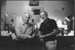
Richard Kauffman passed away in 1998. As you wrote, he was among the last living links to the heyday of the carbro print. Attached is a photo of Richard (on the left) along with Harry Baskerville, who was the director of the Carbro program at McGraw Colorgraph. The knowledge and experience these two men had of color carbro cannot be equalled today. I was supremely fortunate to have them as my guides to the process.

Charles Berger
 

Attachments

  • RNK_HB.jpg
    RNK_HB.jpg
    358.3 KB · Views: 119
Photrio.com contains affiliate links to products. We may receive a commission for purchases made through these links.
To read our full affiliate disclosure statement please click Here.

PHOTRIO PARTNERS EQUALLY FUNDING OUR COMMUNITY:


Ilford ADOX Freestyle Photographic Stearman Press Weldon Color Lab Blue Moon Camera & Machine
Top Bottom