• Welcome to Photrio!
    Registration is fast and free. Join today to unlock search, see fewer ads, and access all forum features.
    Click here to sign up

Change local contrast, how?

Cyanotype stereo card

A
Cyanotype stereo card

  • 0
  • 0
  • 0
IMG_0025.jpeg

A
IMG_0025.jpeg

  • 0
  • 1
  • 0

Forum statistics

Threads
203,125
Messages
2,850,234
Members
101,690
Latest member
nisherii
Recent bookmarks
0

brummelisa

Member
Allowing Ads
Joined
Jan 1, 2006
Messages
148
Location
Jönköping, S
Format
4x5 Format
Hi,

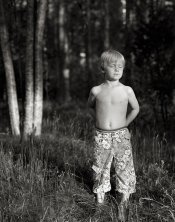
I just wonder how you guys change the local contrast in an image.

Let say that I have printed this image with grade 2.5.
But I want some more black in the boy's pants, but I don't want just to burn because the white may be destroyed.

So, would you do the whole image with 2.5 and then burn with a higher grade or would you dodge his pants for let say 1/3 of the time and then change filter to a higher grade and then do the rest of the time with higher filter (and maybe increase the time because the filter requires it?

Or would you dodge the pants totally and then burn with a higher grade?

/ Marcus
 

Attachments

  • william.jpg
    william.jpg
    191.9 KB · Views: 251
Swapping filter grades is the way I've done it.

Don't think you need to totally dodge the pants.

Hard to judge from a digital jpeg on a computer screen, but looking at your attachment makes me think you're obsessing. The pants are not the important detail of the image, so a viewer will over look whether a 2 1/2 filter makes the pants a 'little' gray.

You may simply want to pop a 4 filter in, and give the pants a little burn to punch up any blacks in the pants. The 4 filter is dense enough not to effect the lighter areas of the pants during a short burn.
 
keep the image as you have printed it if that's how you like it, then burn the trousers at grade 5 after carrying out a test strip to get the right amount - the use of the grade 5 is unlikely to effect the highlight tones in the trousers, but will definitely change the mid tones there. be careful not to overspill the burn onto the back group though or it will become too obvious.
 
Thanks for your replies. Maybe I should say that the image was just an example. I just wonder how you increase the contrast locally.

Do you give a burst with 4 or 5 or do you hold back the light a bit and then increase with let say 3 or 4 if a 2 was said as normal filter

/ Marcus
 
The thing is that I have started to think that many times one burn a bit extra to get the black more black, but on the same time the white will be blacker too. So shouldn't one instead of burn use more contrast locally (now speaking generally)?

/ Marcus
 
Marcus

I think you have already explained a good technique.

Main exposure for the boys skin, dodge slightly in the main exposure the pants and then burn in with 4 or 5 filter to bring out the details.
Just isolate the area you want to pop or soften , do a bit of a dodge, and then change the filter, add a diffuser if you want , put a texture screen over the area if you want and then burn in.

This is the beauty of VC paper, with its ablity to split print and locally adjust contrasts or effects.
 
Change the pants and shoot again!! (Just kidding). I would go with Bob Carnie. If you don't dodge in the main exposure too much (and you probably don't want to), and you don't hit it too hard with #4 (or even #5) it should blend ok.

Try it - just work with that area on a test strip size paper till you get it right. Do several at a time with different times per filter (mark them in pencil on the back to keep track of times) then develop them all at once.
 
g'day brum

you already know the techniques, just give them a try, develop your own aesthetic

learn not just the techniques but more importantly when to use the techniques

it doesn't need to be complicated

in fact in the attached image the pants detail is not the obvious problem

the most glaring and obvious contrast/detail problem with this image is the bright tree trunks in the background, they draw the eye from the boy, worrying about the pants detail does nothing to overcome that

Ray
 
Thanks again for your replies.

Ray: The image is always different in other people eyes. I like the bright trees because they are vertical and bright and so is the boy.

But anyway I will try to change the contrast locally (in another picture).

/ Marcus
 
Book I can recommend:
Black&White Photographic Printing Workshop from Larry Bartlett & Jon Tarrant.

Many many examples how to burn, dodge, bring details up etc. This is really a must for printing and is cheap. I got mine over abebooks from USA.
 
You lost me there. How should I use the hot water and q-tip?

/ Marcus

You can also use warm stock developer and a Q tip or small spong, as the print developes swap the are you want to punch up with warm stock developer to increase contrast. In the old days some newpaper printers kept stock developer on a hot plate.
 
Have you tried split contrast printing?

For a print like the one you posted, I would do a test strip (I usually use a full sheet of paper) at grade ~5 (200M) to determine the proper density for the blacks. The second test sheet is exposed at grade 5 for the time determined in the first test strip. Then I expose it a second time with grade 0 (200Y) in test strip fashion to determine the highlight exposure.

By dong this, you can get a good sense about dodging and burning. That is why I like to use full sheets because I often discover areas that could be dodged/burned with either filter to affect local contrast. In a portrait I try to carefully balance the density of skin with the grade 0 filter but sometimes clothing, eyes, hair, etc. need a bit of punch from the grae 5 filter.
 
Photrio.com contains affiliate links to products. We may receive a commission for purchases made through these links.
To read our full affiliate disclosure statement please click Here.

PHOTRIO PARTNERS EQUALLY FUNDING OUR COMMUNITY:


Ilford ADOX Freestyle Photographic Stearman Press Weldon Color Lab Blue Moon Camera & Machine
Top Bottom