linearization
I don't know it I'll be any help here.
I wasn't familiar with the instrument you referenced, but that's not important.
Non-linear data can be made to 'look' linear by plotting it on the appropriate scale.
If you take sets of numbers like the numbers 1-10 and the base-10 logarithm of each of those numbers and plot them on linear graph paper you get a noin-linear graph paper, you get a non-linear graph. If you plot them on, um, probably semi-logarithmic paper (linear on one axis, logarithmic on another), you get a straight line. You haven't changed the non-linear relationship between the numbers and the 'output' of the logarithmic function. You've only changed you way of looking at it.
f-stops and EV are scales or units to effectively linearize a range of light over a wide range, for convenience or usability. Very old meters just used an absolute measurement of foot candles or some other scaled unit, but that didn't immediately indicate what setings to use on a camera.
I didn't want to interpret what numbers should have been plotted against the ones you gave. To see their linearity or non-linearity one needs to see the pair of numbers making up each point (input and output).
I know there is an implied exponential or logarithmic (or both) relationship in measurements utilizing f-stops, but would have been second-guessing the actual raw numbers.
I made up some data pairs using your numbers just to see how they'd look with curve fitting (I use Curve Expert).
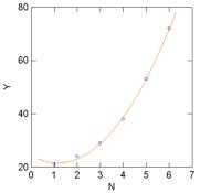
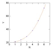
1) I simply numbered the data: (1,21),(2,24),(3,29),(4,38),(5,53),(6,72)
2) I used an exponential spacing analogous to f-stops, 1, 1.414, 2, 2.828, etc
3) I used powers of 2 (1, 2, 4,8,16, 32)
I don't understand why I almost always get best results with polynomial curve fits, even where the data has a logarithmic function, but that's what happened. Using a 4th-order polymnomial, it gave the best results.
What you could do with this is end up with a function that allowed you to recreate the curve that produces your data above and allows you to interpolate (read between the data points) over the range of data you've collected.
I don't know if this answers your question, but it points out why a previous respondent implied the question is a bit open ended, a bit ambiguous. You've already implied there is some ambiguity in the relationship between the points. I implied you can screw up the scaling to make it 'look' linear, but it probably isn't, at it's core.
I don't understand what kind of solution you need.
I think the sensor in the instrument is probably intentionally non-linear because it's a way of making a very wide range of data fit a practical range. That's the way it is in nature, measuring physical phenomena like light, sound etc.
If this helps you fine tune the question , maybe we can fine tune an answer.
If it's just to explore the phenomenon, that's fine. I do that alot, where other people use Sunny-16 and produce more images than me.
Do you see the point that the data may be linear or non-linear depending on the relationship of the units of input and output?
If you looked at a table of EV versus foot-candles or foot-lamberts (some spotmeters used to have such a table in the manual), the EV 'input' is linear and the output is not.


")


