Blue hour and assumptions about color reproduction on color negatives

Recent Classifieds

Forum statistics

Threads
198,695
Messages
2,779,410
Members
99,681
Latest member
magisterludi
Recent bookmarks
0
Joined
Jul 17, 2024
Messages
19
Location
Boulder CO
Format
35mm
Hey folks!
For whatever reason, I have always been most interested photos that primarily feature blues, pinks, and magentas, and my favorite photos usually combine all three in even lighting. Obviously, blue hour is the time of day to make these pictures, but all of my prior experience has been shooting in either studio lighting, or hard lighting from the sun, and I'm having trouble "predicting" how my colors will look. Effectively, I need help understanding how to "read' the light.
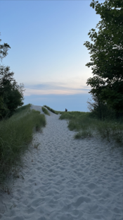
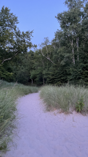
Yesterday I escaped to the beach to try and make some photos. Facing west, I took a picture with my iphone camera to remember how the light looked at that time, and took another picture facing east (both attached). The west photo gave generally a pretty accurate reproduction of what the scene looked like, but in the east photo, the sand became a lovely shade of pink, definitely not how it looked in real life. Why did this happen? Post-processing error? I unfortunately did not take a photo on my SLR to compare.
My understanding has always been that (unless you're shooting velvia or some high saturation pro film like Ektar) that you're hardly ever going to get colors that aren't present to the naked eye. In essence, taking a picture of a softly lit sky at sunset won't magically reveal shades of magenta and pink that aren't 'actually there'. Is this assumption correct?
However, when I look at landscapes at blue hour (particularly the work of Alex Burke, who rarely uses color filters), it's hard to imagine the scene actually looking like that in real life. It makes me wonder what photographic tricks there are to accentuate these colors naturally, and if my phone picture is a step in the right direction to achieving those kinds of scenes.
I guess my question is this:
1: What happened in my phone photo with the sand?
2: Are there colors that will be visible on a long(ish) exposure that won't be visible to the naked eye? If so, how can I "see" these?
3: How can I 'read' the sky (clouds, combination of sun, direct light at sunset vs filtered through clouds, etc.) to promote these colors?
 

Attachments

  • Screenshot 2024-07-23 at 1.19.15 PM.png
    Screenshot 2024-07-23 at 1.19.15 PM.png
    1 MB · Views: 66
  • Screenshot 2024-07-23 at 1.19.34 PM.png
    Screenshot 2024-07-23 at 1.19.34 PM.png
    1.2 MB · Views: 63

koraks

Moderator
Moderator
Joined
Nov 29, 2018
Messages
22,602
Location
Europe
Format
Multi Format
the sand became a lovely shade of pink, definitely not how it looked in real life.

It might have been quite pink, in fact. The thing is, how something looks is pretty heavily influenced with how your brain interprets visual input. The human visual system tends to balance towards neutral quite effectively under most circumstances.

Is this assumption correct?

No, I don't think so. It's common for colors to render much more vividly on camera (film or digital) when the sun is low in the sky and under artificial light.

1: What happened in my phone photo with the sand?

I think in part it's closer to reality than you might think, and in part it may be tilted towards magenta a bit by Apple's color correction algorithm being thrown off by the green foliage. But I bet it's closer to reality than you might imagine!

2: Are there colors that will be visible on a long(ish) exposure that won't be visible to the naked eye? If so, how can I "see" these?

This depends heavily on the idiosyncrasies of the recording medium. Especially long exposures on film can do 'funny' (sometimes quite beautiful) things, color-wise. Long exposures on Fuji Velvia are a somewhat extreme example.

3: How can I 'read' the sky (clouds, combination of sun, direct light at sunset vs filtered through clouds, etc.) to promote these colors?

Experience. Photograph lots. I don't think there's really any other way.
 

MFstooges

Member
Joined
Feb 10, 2010
Messages
955
Format
35mm
I never use iPhone but my guess is like all the phones which are created for casual shooter it defaults to Automatic White Balance. So when the scene changes then the algorithm recalculate the "proper" white balance where it can really throw off the real color.
If you shoot film it will behave the same as long as the light source is the same.
 

koraks

Moderator
Moderator
Joined
Nov 29, 2018
Messages
22,602
Location
Europe
Format
Multi Format
If you shoot film it will behave the same as long as the light source is the same.

An important caveat is that when film is scanned, frame-by-frame compensation will still introduce variations. As a result, color negative film often appears much more inconsistent than it really is to those who use a hybrid workflow.
 

Steven Lee

Member
Joined
Jul 10, 2022
Messages
1,416
Location
USA
Format
Medium Format
My view on scanning print film is even more cynical. How the scene looked "in real life" doesn't matter. Color correcting filters don't matter. Even your choice of film hardly matters. When you have a high quality 16-bit image without any clipping, you dial in any colors you please, assuming you mastered digital image editing. And it's a beautiful thing IMO.

What comes out of smartphones and scanning software should be ignored. That's just computer algorithms making color balancing choices to please the programmer who coded them, not you.
 

wiltw

Subscriber
Joined
Oct 4, 2008
Messages
6,438
Location
SF Bay area
Format
Multi Format
In any given light, there is ONE setting for WB and Tint which best captures things in a neutral setting, for optimum balance across the spectrum.
However, any camera in AWB setting will seek the best 'average' setting of WB and Tint, and that color balance will change as the mix of objects seen in the photo changes. This is illustrated with this series, all shots taken within a very short time period under fairly undeviating sunlight...

AWBexample.jpg


I did this AWB test way back in 2011 using a Canon 7DII...Then I used Auto White Brightness (AWB) and aimed the camera around the scene and took 16 JPG images very shortly before the control shot, in which I aimed at an 18% gray neutral card to determine the correct WB setting in that light. I read all the images, and recorded the AWB value for each of the shots. 60% of the shots deviated from the ideal value (determined by gray card shot). Values from 4424K thru 5895K resulted (vs. the 'ideal' 5000K value. determined from gray card). That is rather poor consistency from shot to shot, although all shot in identical illumination (sunlight) at the brief time of the test.

IMG_6021, when color balanced to 'neutral', has a WB value which should work 'best' for all 16 other shots, yet each shot has a different WB value, only a FEW of which matched IMG_6021 in value..
Your two shots were considerably different only because it sensed different content, and set itself in each for what it determined to be 'best', just as my first series had every photo different (and only a few matching the 'neutral' setting.

The range of deviation in WB from the one 'ideal' is even wider in variation as shown in this series...

AWBexamplebias.jpg


due to the high saturation colors in the frame. This second series (B) was shot under identical circumstances to series A, and the deviation from 'ideal' is far wider in series B than it was in series A. Ten shots in AWB, with same light, with results of WB range from 2028K thru 5916K, in 5000K light. An 80% error rate, and the greater deviation from the ideal (5000K in this lighting)

You can play with WB and Tint and other controls found in postprocessing software, to see what combinations are possible and which one(s) are pleasing to your eye. I randomly did this simply to illustrate...

colorbal.jpg
 
Last edited:

MattKing

Moderator
Moderator
Joined
Apr 24, 2005
Messages
52,821
Location
Delta, BC Canada
Format
Medium Format
FWIW, that sand looks more blue to me than it does magenta, but given how many variables are involved, that isn't a reliable indicator.
However it is always important to remember that iPhones or other complex processing systems will always introduce their own variables.
I include in "complex processing systems" our own built-in visual systems - our brains and our visual systems
 

Mr Bill

Member
Joined
Aug 22, 2006
Messages
1,481
Format
Multi Format
Hi, I think there have been a number of good comments/explanations made so far. But I question whether your "color foundation" is good enough to make practical sense or use of them all. So perhaps it's worth a brief primer.

First off, this whole thing about human color vision and color reproduction (as in photography) can go anywhere from relatively simple to a deep rabbit hole. People have made careers studying this sort of thing. Fwiw, strictly speaking, "color" is a human perception but I'm gonna explain it as also a characteristic of light and objects.

Regarding outdoor scenes, etc., the "color" of the light can vary a lot during the day. The sunlight and daylight are generally pretty consistent aside from an hour or two away from sunrise and sunset, but even then the direction of the sun along with shadows can be significant. The way we technically specify the color of the light is with a "color temperature," or more properly a "correlated color temperature" (CCT). (Plenty of info via online search.) Loosely speaking if we heat something up enough it will begin to glow reddish. Heating more it will get brighter and become more "white," and then bluish. The so-called color temperature is very roughly the temperature of the heated object. Roughly an old style incandescent 60 Watt light bulb has a color temperature a little lower than 3000K (the filament is not allowed to get hot enough to melt.). Direct sunlight, mid-day, is around 5000K, more or less, and the blue sky upwards of 8000 or 10000K. "Photographic daylight" is defined, as I recall, as about 5500K, and is a mix of sunlight and skylight. And most current color films are designed for use under this color temperature. Although color negative films have a substantial tolerance.

Now, one may wonder why they don't see such differences. Well actually we can see that the sky is blue, but things lit by the blue sky, only, don't look blue - they look pretty normal. It seems that the human eye/brain just automatically adapts so that we don't see much color change. (If you carry around a magazine with color photos under different types of lighting the white pages are always gonna look mostly white, and the color photos are always gonna look sorta normal.) So... it's hard for us, as humans, to know exactly what the "color of the light" really is. But photographic film does not have this ability to adapt; it reacts to the color of the light actually there. (Although color negative film can be substantially "corrected" at the scanning or printing stage.)

Lastly a few words about digital cameras. They typically have three color-sensing functions, roughly red, green, and blue. Each of these essentially has an "amplifier" that can be separately adjusted, either automatically or manually. This is often called the white-balance setting whereby the digital camera can make a piece of white paper look white, whatever the color of the actual lighting.

All this to say that your phone camera is most likely using an auto white-balance routine which is trying to guess how YOUR EYE sees these scenes. If you really want to get these things under your control you sorta need to develop an understanding of what the actual color of the light is, and manually set the white-balance of the digital camera appropriately. (This is kinda the entrance into the rabbit hole.)

FWIW photographers tend to consider light as consisting of a mix of reddish, greenish, and bluish light. Color film has three different light-sensitive layers, each layer loosely being sensitive to one of these colors. Each of these colors has an "opposite" color (more properly called "complementary") which are called cyan, magenta, and yellow, respectively, for red, green, and blue. The dyes used in traditional color photography ARE cyan, magenta, and yellow, as are the colored filters used in traditional color printing. So it is pretty standard for experienced color photographers/printers to put everything in terms of those six colors. While a normal person may say the sand looks pinkish, the photographer wants to say it has a "magenta" tinge. (Magenta is the complementary color to green, or alternatively a cross between red and blue.) It's just the way color photography evolved and consequently is probably a more precise way to specify color adjustments. (You may note that Matt King, who has substantial color printing experience, remarks that the sand looks more blue to him than it does magenta, so he is roughly saying it is somewhere BETWEEN blue and magenta, so color correction is not limited to exactly one of the six named colors.)
 
Joined
Aug 29, 2017
Messages
9,429
Location
New Jersey formerly NYC
Format
Multi Format
If digital, shoot RAW and adjust the colors when editing to your preference. If film, try shooting different emulsions to see what works best for you. After scanning, again adjust the colors to your liking when editing. Use a calibrated monitor.

Note that negative color film is difficult to begin with since you're dealing with an orange mask and can't see the color directly like you can with positive chrome-type emulsions.

I like using Velvia 50.
 

Tel

Subscriber
Joined
May 9, 2011
Messages
964
Location
New Jersey
Format
Multi Format
Wall by terry, on Flickr

Ditto to most everything posted above: this is a complex concept dealing with how our (different) brains process the perception of wavelengths. Best solution is to shoot a lot of film and look at the results. Here’s a shot I made a couple of months ago, Portra 160, grab-shot as I was walking around Seattle one evening.

The film was long expired when I shot it and the camera was bouncing around in my shoulder bag with a bunch of sketching equipment and the exposure setting had gotten bumped so this shot and several others were wildly underexposed. I noticed this as I was winding up the roll and thought these frames were toast and I shouldn’t expect anything from them. So I was surprised when there were images and very much surprised when they had this strong blue/magenta cast that I actually liked. Pure serendipity but nice all the same. I might try intentionally underexposing some Portra if I feel it’s appropriate for the shot sometime in the future—it’s just another tool in the arsenal.

PS: I’m not sure how much the expiration of the film affected the outcome—in my experience with Portra, expired stock tends to shift to the green side. So it’s likely the underexposure that did it. Maybe. There are a lot of variables when you shoot color….
 
Last edited:

guangong

Member
Joined
Sep 10, 2009
Messages
3,589
Format
Medium Format
It might have been quite pink, in fact. The thing is, how something looks is pretty heavily influenced with how your brain interprets visual input. The human visual system tends to balance towards neutral quite effectively under most circumstances.


No, I don't think so. It's common for colors to render much more vividly on camera (film or digital) when the sun is low in the sky and under artificial light.


I think in part it's closer to reality than you might think, and in part it may be tilted towards magenta a bit by Apple's color correction algorithm being thrown off by the green foliage. But I bet it's closer to reality than you might imagine!


This depends heavily on the idiosyncrasies of the recording medium. Especially long exposures on film can do 'funny' (sometimes quite beautiful) things, color-wise. Long exposures on Fuji Velvia are a somewhat extreme example.


Experience. Photograph lots. I don't think there's really any other way.

Ditto. The brain adjusts the colors. It takes a lot of conscious training for an artist to see the actual colors in an environment. The camera and film is too stupid to make the corrections made by the mind.
 

Vaughn

Subscriber
Joined
Dec 13, 2006
Messages
10,077
Location
Humboldt Co.
Format
Large Format
Ditto. The brain adjusts the colors. It takes a lot of conscious training for an artist to see the actual colors in an environment. The camera and film is too stupid to make the corrections made by the mind.
Which is why when I was doing some RA4 I always used the same set of lights (that the print will be displayed under) to judge the color of the tests and prints. My brain needed all the help it could get.
 

reddesert

Member
Joined
Jul 22, 2019
Messages
2,395
Location
SAZ
Format
Hybrid
In addition to what everyone else has said:

- As others said, our brains adjust to somewhat neutralize color casts. You often don't notice the cast without a reference. For ex, if you have two screens, like an old laptop and a new one, or laptop and tablet - if you use them one at a time for a half-hour you'll probably see each as neutral, but if you put the two side by side you'll likely see that they have different color casts.

- Digital cameras and phones each have white balancing and color processing algorithms with their own strengths and weaknesses. Of course film also has imperfections in color rendering, but it's harder to make the immediate comparison. For ex, I recall taking a digital camera out at "golden hour" and seeing that its AWB rendered the light too much golden, practically orange.

- One also has to consider the intentions of the designer of film or digital rendering. Phone cameras are marvels of digital processing, and they do a fair amount of dynamic range reduction and color enhancement to make the colors look punchy, especially because phone images are likely to be viewed on a small screen. I sometimes take the same landscape picture on a phone and a digital camera and see that the phone compresses the dynamic range more effectively, nearly like HDR imaging; it looks punchier but it sometimes verges on artificial. On the other hand, because they dial up the saturation, phone cameras can oversaturate delicate features like skin tones, or overdo it on highly colored flowers. Which is a longwinded way of saying that sometimes, yes you will get pink sand at sunset.
 
Photrio.com contains affiliate links to products. We may receive a commission for purchases made through these links.
To read our full affiliate disclosure statement please click Here.

PHOTRIO PARTNERS EQUALLY FUNDING OUR COMMUNITY:


Ilford ADOX Freestyle Photographic Stearman Press Weldon Color Lab Blue Moon Camera & Machine
Top Bottom