


Robin Guymer
Member
I have a photographer mate (she worked in a studio lab in the '70s & '80s) who is extremely critical of my prints from my amateur darkroom efforts. She says they are flat and grey. But I think my prints are starting to be quite acceptable with good blacks and whites using split grade printing. I'm maybe thinking that her perception is based on using old grade paper that maybe showed no shadow detail and was more along the lines of punchy high contrast studio portraiture rather than the more outdorsy type photos that I take.
The differences
Her photography was studio based using Hasselblads and 50 or 100asa film developed in D76 and printed on single Grade paper.
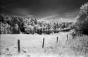
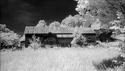
My photography is from a collection of 35mm cameras using 100 or 400asa film developed in Xtol 1:1 and printed on Ilford Multigrade paper using split grade method of grade 0 and grade 5. My split grade method is to test strip at grade 0 to establish the whites and then do another test strip at grade 0 by xx seconds and then use that same strip to test at grade 5 for blacks, then use those times on the final print.
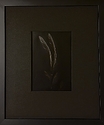
Do you think these differences in paper and developer would explain the criticism? I suppose I could post an image but then that is a scan which is not a true representation of the actual image on the paper.
The differences
Her photography was studio based using Hasselblads and 50 or 100asa film developed in D76 and printed on single Grade paper.
My photography is from a collection of 35mm cameras using 100 or 400asa film developed in Xtol 1:1 and printed on Ilford Multigrade paper using split grade method of grade 0 and grade 5. My split grade method is to test strip at grade 0 to establish the whites and then do another test strip at grade 0 by xx seconds and then use that same strip to test at grade 5 for blacks, then use those times on the final print.
Do you think these differences in paper and developer would explain the criticism? I suppose I could post an image but then that is a scan which is not a true representation of the actual image on the paper.


