APUG Confrence Entry Form/Brochure Critique V. 2.5

Table for four.

H
Table for four.

  • 6
  • 0
  • 51
Waiting

A
Waiting

  • 2
  • 0
  • 58
Westpier

A
Westpier

  • 1
  • 2
  • 57
Westpier

A
Westpier

  • 3
  • 0
  • 44
Morning Coffee

A
Morning Coffee

  • 7
  • 0
  • 85

Recent Classifieds

Forum statistics

Threads
197,586
Messages
2,761,497
Members
99,409
Latest member
Skubasteve1234
Recent bookmarks
0

jd callow

Moderator
Moderator
Joined
Jan 31, 2003
Messages
8,466
Location
Milan
Format
Multi Format
Hello all, Here I go again. I am asking those who have a minute to look these pdf's over and give me your opinion.

They are the outside cover (imagine it folded in half) and the inside pages. It is a classic example of 10lbs of poop in a 2lb bag.

We will be printing out 10k of these many will go to APUGers to distribute and the bulk will go to a good friends at J and C to stuff into customer's bags as they leave the shop (sort of).

As you may notice I am still missing one image -- should have that tomorrow.

Thanks in advance...

<edit=1>Made a few changes please give it a go..</edit>

<edit=1.5> minor changes to the inside</edit>
 

Attachments

  • entryform-cover.pdf
    647 KB · Views: 161
  • entryform-inside.pdf
    57 KB · Views: 128

mark

Member
Joined
Nov 13, 2003
Messages
5,698
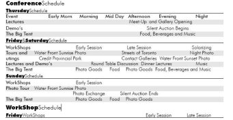
Looking at the inside I had only one issue. The schedule gets jumbled together. SInce I have Dislexyia this became bothersome. Is there a way to tighten them up, maybe give defined columns? I know doing this adds space.

Good luck. Looks like a good time. Wish I could be there.
 

rrankin

Member
Joined
May 27, 2005
Messages
865
Location
La Plata, Mi
Format
Large Format
It's much easier to sit here on the sidelines and complain... but you asked. I can't read the word 'Carbon' for Carbon Printing. Sandy Kings photo doesn't fit with the others in his row. I know this has been raised, but that subway car doesn't say 'Canada' to me. I lived in Manhattan for years, but I don't think it would say Canada or Toronto or photography to anyone. And lastly, that looks like one expensive brochure with all that color. I suspect a large portion of us are B&W shooters and printers and you'd never know that from a glance at the brochure. Although I found it visually overwhelming, it did say "a lot going on' to me, which, I guess would get me to read it more closely.

MHO, FWIW, Cheers, Richard
 

Bob F.

Member
Joined
Oct 4, 2004
Messages
3,977
Location
London
Format
Multi Format
Observations...

Outside:

The Carbon Printing image is the only one that seems to have a frame around the image.

The text to the right of the images could do with more whitespace between it and the images. And, perhaps the 1st lines be level with the top of the images?

"The Apug Photographic Exhibi-tion is open to all..." Would it look better to lose the hyphen and put "Exhibition" all on the next line?

Iassumeyouareweddedtothealternatingtextstyle? :wink:

Might want to emphasise "The exhibition is part of the Contact 2006 Photography Festival." ?


Inside:

Again, might want to avoid the hyphens...

Comma after "Elevator Gallery" in 1st para.

"ConferenceSchedule" heading: "Schedule" is higher on the line.

ConferenceSchedule columns do not seem to line up on my Acrobat.

Mostly pedantry, but you did ask.... :wink:

Cheers, Bob.

[edit]
P.S. Typical of me, I forgot the good bits.... Like the overall layout - looks very clean despite the amount of detail inside which is well organized and clear. Nicely done.
 

Loose Gravel

Member
Joined
Feb 28, 2003
Messages
963
Location
Santa Barbar
I prefer serifed fonts in the text bodies as they help guide the eye. Sans-serif is fine for bold titles, headers, and the like. [How do I change this font?]
 

Bob F.

Member
Joined
Oct 4, 2004
Messages
3,977
Location
London
Format
Multi Format
Loose Gravel said:
I prefer serifed fonts in the text bodies as they help guide the eye. Sans-serif is fine for bold titles, headers, and the like. [How do I change this font?]
Type your text, select it all and then select the font from the drop down selection box in the top left corner of the editor - . Not sure how well it works on non-Windows boxes though.
 
OP
OP
jd callow

jd callow

Moderator
Moderator
Joined
Jan 31, 2003
Messages
8,466
Location
Milan
Format
Multi Format
I agree serifed fonts make better reading and are more appropriate for body text. It makes this document visually difficult to navigate.

Sandy's image came to me w/ a border, I am uninclinded to edit it his photo. I may try reversing the text, although it should print legible as black.

I can't do anything about the train -- sorry.

The TextSandwichesServeACouplePurposes one very important purpose is saving much needed space.

Meanwhile, I'm seeing what can be done with those godawfultables

Thanks guys I'll be posting in few...
 
OP
OP
jd callow

jd callow

Moderator
Moderator
Joined
Jan 31, 2003
Messages
8,466
Location
Milan
Format
Multi Format
Made some changes...
Couldn't shade the columns so I shaded the rows in the schedule let me.. know

see the attachments on OP.
 

sanking

Member
Joined
Mar 26, 2003
Messages
5,437
Location
Greenville,
Format
Large Format
I don't understand the problem. Can someone send me an image that shows what we are talking about?

As for the border, many of my images have a border around them which is part of the print. It is not an artificial frame, but a part of the image created by extending the clear areas of sheet film.

Sandy

mrcallow said:
I agree serifed fonts make better reading and are more appropriate for body text. It makes this document visually difficult to navigate.

Sandy's image came to me w/ a border, I am uninclinded to edit it his photo. I may try reversing the text, although it should print legible as black.

I can't do anything about the train -- sorry.

The TextSandwichesServeACouplePurposes one very important purpose is saving much needed space.

Meanwhile, I'm seeing what can be done with those godawfultables

Thanks guys I'll be posting in few...
 

Bob F.

Member
Joined
Oct 4, 2004
Messages
3,977
Location
London
Format
Multi Format
OK - I think I have been misreading the Conference Schedule... or not... I find it confusing, especially Friday&Saturday. I'm not sure if the items are supposed to line up under "Early Session", "Late Session" etc... I'm now thinking, not... But, if not, why are they spread out across the row? Like I said, I'm confused (nothing new there then...).

Third line in Friday&SaturdaySchedule starts with "utings".

Cheers, Bob.

[edit] Attached screenshot of what I see in Acrobat Reader 7.
 

Attachments

  • pdf1.jpg
    pdf1.jpg
    36.5 KB · Views: 84
OP
OP
jd callow

jd callow

Moderator
Moderator
Joined
Jan 31, 2003
Messages
8,466
Location
Milan
Format
Multi Format
sanking said:
I don't understand the problem. Can someone send me an image that shows what we are talking about?

As for the border, many of my images have a border around them which is part of the print. It is not an artificial frame, but a part of the image created by extending the clear areas of sheet film.

Sandy

Sandy, Look at the 2nd attachment on the original post. The 3rd picture in from the left is your carbon print that has the equivalent of a verification border. I have no problem with keeping it as is. I include a verification border on most of my images and feel they are part of the image.
 
OP
OP
jd callow

jd callow

Moderator
Moderator
Joined
Jan 31, 2003
Messages
8,466
Location
Milan
Format
Multi Format
Bob F. said:
OK - I think I have been misreading the Conference Schedule... or not... I find it confusing, especially Friday&Saturday. I'm not sure if the items are supposed to line up under "Early Session", "Late Session" etc... I'm now thinking, not... But, if not, why are they spread out across the row? Like I said, I'm confused (nothing new there then...).

Third line in Friday&SaturdaySchedule starts with "utings".

Cheers, Bob.

[edit] Attached screenshot of what I see in Acrobat Reader 7.

Bob the problem may be that there are 2 schedules the first set is for the conference as a whole the second set is for just the workshops.

The early sessions/late sessions on the first set refers to the workshops as a whole and are relative to all the other goings on.

The second set of schedules (the workshop schedule) is what workshops are going on which days and in which session (early or late).

If I have to explain it than I have a problem...
 
OP
OP
jd callow

jd callow

Moderator
Moderator
Joined
Jan 31, 2003
Messages
8,466
Location
Milan
Format
Multi Format
I made some slight adjustments... see if it helps.
 

Bob F.

Member
Joined
Oct 4, 2004
Messages
3,977
Location
London
Format
Multi Format
The Workshop Schedule is fine - I don't have any problems understanding those - very clear. It's only the Conference schedule that is tripping me up...

Ok - I see now... What is confusing me is the way the Tours and Outings etc are spread out across the line instead of being immediately next to each other separated by commas etc. I guess you are actually showing their approximate position in the day? Perhaps if you put the start time in front of each (though I guess you may not be sure of all of them yet)... ho hum....

Of course, it may just be me! Where is everyone else???

Cheers, Bob.
 

sanking

Member
Joined
Mar 26, 2003
Messages
5,437
Location
Greenville,
Format
Large Format
OK, I see the picture. The border on that print is definitely part of the image. When mounted, I would leave a space of about 1/4" on the outside of the border to accentuate the fact that the border and print are inseparable. As I mentioned, the border is part of the pigmented gelatin image, formed by leaving a clear border on the negative around the body of the image.


Sandy


mrcallow said:
Sandy, Look at the 2nd attachment on the original post. The 3rd picture in from the left is your carbon print that has the equivalent of a verification border. I have no problem with keeping it as is. I include a verification border on most of my images and feel they are part of the image.
 
Photrio.com contains affiliate links to products. We may receive a commission for purchases made through these links.
To read our full affiliate disclosure statement please click Here.

PHOTRIO PARTNERS EQUALLY FUNDING OUR COMMUNITY:


Ilford ADOX Freestyle Photographic Stearman Press Weldon Color Lab Blue Moon Camera & Machine
Top Bottom