Ain't no Blue, like the Kallitype Blues

$12.66

A
$12.66

  • 5
  • 3
  • 88
A street portrait

A
A street portrait

  • 0
  • 0
  • 127
A street portrait

A
A street portrait

  • 1
  • 2
  • 110
img746.jpg

img746.jpg

  • 6
  • 0
  • 100
No Hall

No Hall

  • 1
  • 4
  • 109

Recent Classifieds

Forum statistics

Threads
198,796
Messages
2,781,017
Members
99,707
Latest member
lakeside
Recent bookmarks
0

R Shaffer

Member
Joined
May 9, 2007
Messages
436
Location
Santa Cruz,
Format
Multi Format
So I stumbled across Judy Siegels suggestion for an Iron Blue toner for kallitype the other day. So I had an almost-bin print that was too good to throw away, but not good enough for anything other than experiments.

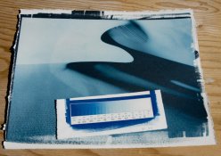
I have to say the blue is really good, the blacks are very dense and tones are very smooth. Vastly better then my typical cyanotype. Definitely intensifies, so this should be good for an underexposed print. I'll have to see if I can get a paper white.

I mixed up my own version of the formula using vinegar as follows:

200ml Heinz White Vinegar
5ml Stock 'A' traditional cyanotype
5ml Stock 'B' traditional cyantotype
100ml tap water

I'll play with this some more and am thinking that a short tone in pd to lock in the highlights and then tone in this could be a very interesting split tone.

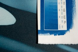
OH yea, I put a step wedge from traditional cyanotype on the print to show the difference in tone.
 

Attachments

  • blue-kalli (1 of 2).jpg
    blue-kalli (1 of 2).jpg
    86.8 KB · Views: 182
  • blue-kalli (2 of 2).jpg
    blue-kalli (2 of 2).jpg
    80.7 KB · Views: 171

gmikol

Subscriber
Joined
Mar 2, 2009
Messages
633
Location
Vancouver, W
Format
35mm
Rob--

Looks good, but next to the cyanotype, this looks really green, on my calibrated monitor.

Do you have a link to the original article?

--Greg
 
OP
OP

R Shaffer

Member
Joined
May 9, 2007
Messages
436
Location
Santa Cruz,
Format
Multi Format
Rob--

Looks good, but next to the cyanotype, this looks really green, on my calibrated monitor.

Do you have a link to the original article?

--Greg

Not much of an article ( on toning ), just a mention of it towards the bottom of this link:

Kallitype


I would agree that there is a lot of green in this blue, but it is blue. I was having a hard time time trying to figure out just what kind of blue it was. Been a while since I calibrated, but it looks pretty close.

And if any are interested, original print was developed in sodium citrate and cleared in 2% citric acid.
 
OP
OP

R Shaffer

Member
Joined
May 9, 2007
Messages
436
Location
Santa Cruz,
Format
Multi Format
Can't get a split with Iron Blue/Pd

So I've attached a before & after image of a kallitype that I was trying to get a split. Maybe you guys with more chemistry knowledge can help me out.

I had figured ( erroneously ) that if I partial toned first in pd, until the highlights were toned and partway through the midtones. That those tones would not change if later toned in Iron Blue.

Not the case, if anything, it looks like the partial toning locked in the shadows.

Now it did alter considerably the final color of the print, which is now more of a grey blue vs a turquoise of 1st try. And quite attractive I might add.

My process was develop in sodium citrate, fully clear in citric acid, partially tone in pd, fix, dry & fully tone in iron blue.

I would like to get warm black highlights and blue shadows.
 

Attachments

  • Iron Blu Kalli (1 of 2).jpg
    Iron Blu Kalli (1 of 2).jpg
    80.4 KB · Views: 125
  • Iron Blu Kalli (2 of 2).jpg
    Iron Blu Kalli (2 of 2).jpg
    94.1 KB · Views: 152
Photrio.com contains affiliate links to products. We may receive a commission for purchases made through these links.
To read our full affiliate disclosure statement please click Here.

PHOTRIO PARTNERS EQUALLY FUNDING OUR COMMUNITY:


Ilford ADOX Freestyle Photographic Stearman Press Weldon Color Lab Blue Moon Camera & Machine
Top Bottom