Additive Prussian Blue Toning of Silver based Prints

Recent Classifieds

Forum statistics

Threads
199,077
Messages
2,785,909
Members
99,800
Latest member
GriffinBK
Recent bookmarks
0

nmp

Member
Joined
Jan 20, 2005
Messages
2,029
Location
Maryland USA
Format
35mm
Earlier I outlined a process by which a silver based prins such as salt, POP, VDB, kallitypes etc including traditional silver gelatin can be toned in cyanotype like chemistry without losing the underlying silver image.

https://www.photrio.com/forum/threads/van-dyke-over-cyanotype.177290/page-2 (msg # 27)

A number of efforts have been made over the years to combine cyanotype with other alternative processes. One of my favorite is cyanotpye over platinum/palladium. There is some great work out there with this combination - the good thing about this is that the underlying platinum/palladium image is inert to the cyanotype process so you get two superimposed layers, one atop the other. The same is not true with a silver image like that of a salt print or a VDB print as the first layer. The obvious problem here is the ferricyanide in the cyanotype chemistry bleaches the silver, so once you get the blue layer, you have to do something to bring back the missing silver layer. Bronson Dugnutt described his process where he used conventional silver gelatin developer such as HC-110 to redevelop silver:

https://www.photrio.com/forum/threads/van-dyke-over-cyanotype.177290/page-2 (msg #26)

Most conventional develpers are alkaline which means now the Prussian blue is bleached.
Printing cyanotype first and then VDB is no better with some funky results (unless that is what you are looking for):

https://www.alternativephotography.com/vandyke-over-cyanotype-special-effects/


The question is: Instead of coating two sensitizers and two expose, develop, etc., why not simply use the very well established blue-toning procedure that gives the end result that is chemically identical to the cyanotype i.e. Prussian blue (unless there is a creative need to selectively tone some parts of the image and not others by use of different negative for each layer - something this approach will not do.)

In the traditional blue toning, silver is oxidized with potassium ferricyanide to form insoluble silver ferrocyanide and potassium ferrocyanide. The latter then combined with a ferric salt in the toner to form Prussian blue.

4Ag + 4K3Fe(CN)6 ---> Ag4Fe(CN)6 (s) + 3K4Fe(CN)6

3K4Fe(CN)6+ 4FeX3 ---> Fe4[Fe(CN)6]3 (s) + KX

Silver ferrocyanide is white so the resulting image is simply made of Prussian blue.

If we have KBr in the toning medium, we will have:

Ag4Fe(CN)6 + 4KBr ---> 4AgBr + K4Fe(CN)6

Potassium ferrocyanide generated this way will react with ferric salt to form more Prussian blue.

Over all, the brominating bleach + blue toning reaction is:

3Ag + 3K3Fe(CN)6+ 3KBr + 4FeX3 ---> Fe4[Fe(CN)6]3 + 3AgBr + 12KX

Every 3 silver atoms result into 1 Prussian blue and 3 silver bromide molecules.

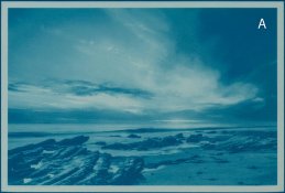
The image turns blue (See A in the attachment.)


2020-08-28-0001.jpg


Now to convert the silver bromide back to image forming silver, either it can be converted to silver sulfide using an indirect toner such as one containing sodium sulfide or reduced to silver using a developer. I chose the latter with a simple ascorbic acid (vitamin C) developer with sodium carbonate as the alkali, primarily as I have it on hand and its easy to deal with.

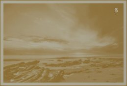
Before reducing silver bromide, I did a separate sodium carbonate bleach to convert first the Prussian blue to ferric hydroxide which is yellowish (B on the attachement.)

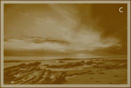
Next step is to blanket expose in daylight and develop with ascorbic acid / carbonate developer bringing back the original silver image, which is now accompanied by a weak yellowish ferric hydroxide (C on the attachement.)

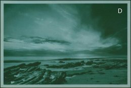
Finally, regenerate Prussian blue from ferric hydroxide by treating with acidic ferric ferrOcyanide and you end up with green tone - combination of reddish brown and blue (D on the attachement.)


I will give starter recipes and conditions with a real image print in an another post.


Comments welcome....
 
Last edited:
OP
OP

nmp

Member
Joined
Jan 20, 2005
Messages
2,029
Location
Maryland USA
Format
35mm
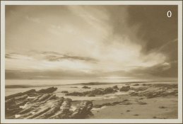
Here is the original image as printed on Chicago Albumen Works Centennial P.O.P. (size: approximaely 3”x5”) which I used to demonstrate the process:

2020-08-25-0003.jpg


Recipes and conditions provided here are based on or adapted from other similar recipes in literature but no attempt has been made to optimize them. Like-wise, treatment times are just guesstimates for the reaction to complete, most likely they are longer than necessary. The amounts are based on 100 ml solutions more than enough for the size of print at hand. Scale up or down to own liking.


Step A: Brominating Bleach + Blue Tone

Recipe:
Water, 80 ml
Potassium Ferricyanide, 0.2 g
Poassium Bromide, 0.2 g
Citric Acid, 5 g
Ferric Ammonium Citrate, 1 g
Water to 100 ml


The solution won't keep too long after adding FAC, so add it last just before use. Wash the print thoroughly beforehand to make sure there is no residual fixer. Place it in the toner solution. The print will start changing to a blue tone immediately which will continue to get deeper for a few minutes. I left it for 5 minutes to make sure full conversion has been achieved. Rinse / wash thoroughly to remove all chemicals particularly FAC as it will be a source of stain or fog in the paper later on. Compare wet before treatment image (0) with after treatment (A):

_NIK7446.jpg _NIK7447.jpg


Step B: Prussian Blue Bleach

Recipe:
Sodium Carbonate (monohydrate), 1 g
Water to 100 ml


Bleaching will start immediately. Print will go through color changes from blue to purple etc, ultimately it will be all pale yellow. Stop when this is evident. Rinse a couple of times. The print at this point looks like:

_NIK7448.jpg


Step C: Silver Development


Recipe:
Sodium Carbonate (monohydrate), 0.5 g
Ascorbic Acid, 0.5 g
Water to 100 ml


Leave out the print in the ambient light for some time before pouring the developer. Agitate as the print will darken to a brown tone. 10 minutes were sufficient in this case for achieving maximum brown color. The print gets darker than the original print having an extra pigmentation due to yellow ferric hydroxide as seen below in image C:

_NIK7449.jpg

Rinse well here as the next step requires acidic environment.


Step D: Prussion Blue Regeneration

Recipe:

Potassium Ferrocyanide (trihydrate), 0.2g
Ascorbic Acid, 0.1g
Citric Acid, 1 g
Water to 100 ml


A couple of minutes seem to be enough to change the color to reddish brown towards green. The print turns purer green over time. This is due to reducing action of ascorbic acid on Prussian blue which is green. I have not figured out what this substance is (ferrous ferrocyanide? although that is white.) Without ascorbic acid, there is bleaching of silver resulting in loss of density, which I am theorizing is due to the tendency of potassium ferrocyanide to oxidize in solution to ferricyanide which in turn oxidizes silver. Presence of ascorbic acid prevents this from happening. Image D shows how the wet print looks like at this stage:

_NIK7450.jpg

The color will revert to blue once more as it dries. So overall, when superimposed with the original reddish brown silver image, the tone shifts more towards bluish green with shadows getting much darker than the original print. Here is the final print after drying:

2020-08-28-0002.jpg
 
Last edited:

koraks

Moderator
Moderator
Joined
Nov 29, 2018
Messages
23,242
Location
Europe
Format
Multi Format
This is very interesting and I applaud the detailed explanation. Very informative indeed, and I think the end result shows there is definite potential for creative application.
 
OP
OP

nmp

Member
Joined
Jan 20, 2005
Messages
2,029
Location
Maryland USA
Format
35mm
This is very interesting and I applaud the detailed explanation. Very informative indeed, and I think the end result shows there is definite potential for creative application.

Thanks koraks...writing is how I like to keep my own thoughts in order. Distilling it down to useful coherent length is a challenge.

This may not be for everyone - may be not even me. I never thought I will make a blue print, let alone a green one....:smile: But it is nice to have it in the repertoire just in case it suits the subject.

:Niranjan.
 
OP
OP

nmp

Member
Joined
Jan 20, 2005
Messages
2,029
Location
Maryland USA
Format
35mm
I am curious if you couldn't just simplify by using an acidic amidol second developer directly after the first blue toning.. Just throwing that out there in case it could work.

Yes that was proposed by Bronson Dugnutt for cyanotype over VDB process in the first link I showed. That might as well work. I don't have amidol on hand (nor a conventional darkroom.) If you have some, try it if you can and let us know. That would indeed simplify the process.
 

J 3

Member
Joined
Feb 1, 2016
Messages
147
Format
Medium Format
Yes that was proposed by Bronson Dugnutt for cyanotype over VDB process in the first link I showed. That might as well work. I don't have amidol on hand (nor a conventional darkroom.) If you have some, try it if you can and let us know. That would indeed simplify the process.
That's what I was thinking when you wrote "Most conventional develpers are alkaline which means now the Prussian blue is bleached.". Amadol will develop in an acidic solution and has no secondary stain (does have tons of other problems though).

The other option would be just put the image in strong sunlight an let it solar print out I'd think (isn't the Potassium ferrocyanide re-haliginating, thus if the original image was fixed, the only halides should be image halides).

You do have to be careful the Potassium ferrocyanide doesn't get too acidic I'd think. I'm not sure where the Ph limit is near room temperature.

Really interesting look on the images BtW. I'll have to look closer at this when I get some spare time.
 
OP
OP

nmp

Member
Joined
Jan 20, 2005
Messages
2,029
Location
Maryland USA
Format
35mm
That's what I was thinking when you wrote "Most conventional develpers are alkaline which means now the Prussian blue is bleached.". Amadol will develop in an acidic solution and has no secondary stain (does have tons of other problems though).

The other option would be just put the image in strong sunlight an let it solar print out I'd think (isn't the Potassium ferrocyanide re-haliginating, thus if the original image was fixed, the only halides should be image halides).

You do have to be careful the Potassium ferrocyanide doesn't get too acidic I'd think. I'm not sure where the Ph limit is near room temperature.

Really interesting look on the images BtW. I'll have to look closer at this when I get some spare time.

Thanks for you comments.

Apart from going to the route of amidol, I also wondered early-on if the alkali can be simply left out of a developer recipe. If I understand correctly, the role of alkali primarily is to give speed and contrast to the developer. Perhaps speed can be managed (with longer times) and selective contrast is not required here as we are simply doing silver bromide reduction to completion (you are right that all halides are image halides.) With that in mind, I tried plain ascorbic acid without the sodium carbonate and did find it to be active – I needed some more work to find an optimum concentration but decided to go with route I presented here. I kind of liked the deconstructed process where one can follow exactly what is going with the various components. I might pursue the 100% ascorbic acid some more now that I know what I am looking for.

Just sunning the print may not work since there is no excess silver nitrate here to create printing out effect. Silver bromide by itself would be ultra slow – it would be like lumen printing.

Regarding the pot ferrocyanide, it should be safe here with a dilute/weak organic acid like citric – not a strong/concentrated acid associated with potential hazard of splitting the cyanide group.

:Niranjan.
 
Last edited:

J 3

Member
Joined
Feb 1, 2016
Messages
147
Format
Medium Format
I really like the green look of these. I just wish there way to achieve the look with something a little more stable than a salt print. Looking at cyan over Pt/Pd, those seem to very between cyanotype with deeper darks to a platinum print with a split tone effect depending on how far the cyan chemistry is pushed. No green.

Maybe a ziatypw with its color controls could get the green against its cyanotype if one of the very warm color controls was used?
 
OP
OP

nmp

Member
Joined
Jan 20, 2005
Messages
2,029
Location
Maryland USA
Format
35mm
I really like the green look of these. I just wish there way to achieve the look with something a little more stable than a salt print. Looking at cyan over Pt/Pd, those seem to very between cyanotype with deeper darks to a platinum print with a split tone effect depending on how far the cyan chemistry is pushed. No green.

Maybe a ziatypw with its color controls could get the green against its cyanotype if one of the very warm color controls was used?

Regarding the longevity of salt + cyanotype combination, I think cyanotype is probably the weak link, although if the print is not washed well, ionic iron salts are not good for the health of the silver. You can potentially add some longevity by using an indirect sulfide toner to make a more stable silver sulfide instead of the develop step above. Classic green-toning formula for silver gelatin uses this approach.

Cyanotype over pt/pd is different in that you are coating two different sensitizers with two negative exposures etc in succession whereas the method described here, the Prussian blue is formed in situ at and in proportion to the silver image on a global scale without the need of a negative exposure.

More palladium in the conventional Pt/Pd print also gives warmer image as I understand, and it can also be pushed further towards yellow/red scale with a sodium citrate developer (so I have read.) I wonder though how much of a role is played by where spatially the blue pigment is in relation to to the base metal (silver and pt/pd respectively) in the final color of the image. In other words if you have a pt/pd print that has the same tone as a salt/POP print would you end up with the same green color with blue layer on top of it rather than beside it. Is there some additive vs subtractive color theory at play here – I do not know...have to do the experiment.

:Niranjan.
 

J 3

Member
Joined
Feb 1, 2016
Messages
147
Format
Medium Format
Cyanotype over pt/pd is different in that you are coating two different sensitizers with two negative exposures etc in succession whereas the method described here, the Prussian blue is formed in situ at and in proportion to the silver image on a global scale without the need of a negative exposure.
That is a huge advantage. Having to deal with registration on paper that's been processed is something I'd prefer to avoid without clear reason to need to.

More palladium in the conventional Pt/Pd print also gives warmer image as I understand, and it can also be pushed further towards yellow/red scale with a sodium citrate developer (so I have read.) I wonder though how much of a role is played by where spatially the blue pigment is in relation to to the base metal (silver and pt/pd respectively) in the final color of the image. In other words if you have a pt/pd print that has the same tone as a salt/POP print would you end up with the same green color with blue layer on top of it rather than beside it. Is there some additive vs subtractive color theory at play here – I do not know...have to do the experiment.
The image with palladium is a little warmer than platinum. The effect by my eye the effect is exaggerated by photography. Pure palladium looks like a warm tone paper / developer not a sepia toned image in person IMHO. I've not tried sodium Citrate, or heating the developer yet. A lot of the really warm platinum images from the pictorialists were done with mercury salts and all that entails.

The two photos on the left on the lead photo here show what I'm pretty sure is the effect of opacity of cyanotype and platinum (maybe I'm wrong how these were made). The both seem semi-opaque with order very much mattering - http://www.lilymayfield.com/blog/2014/9/8/cyanotypes-platinum-palladium-prints

This image:
https://images.squarespace-cdn.com/...LOWY/MiddleIslandTreescaled2.jpg?format=1500w

From this gallery is the split tone effect I was mentioning:
http://www.dhbloomfield.com/landscape
 
Last edited:
OP
OP

nmp

Member
Joined
Jan 20, 2005
Messages
2,029
Location
Maryland USA
Format
35mm
The two photos on the left on the lead photo here show what I'm pretty sure is the effect of opacity of cyanotype and platinum (maybe I'm wrong how these were made). The both seem semi-opaque with order very much mattering - http://www.lilymayfield.com/blog/2014/9/8/cyanotypes-platinum-palladium-prints

From the text, they look like all cyanotyes with various amounts of toning/bleaching - does not seem to be any pt/pd + cyanotypes combination. Wish there was labeling on each individual photos to make it easy to follow, though.


The trouble with looking at these images is we don't know how these were made. Since two (or more) coatings can be used, you can tailor them in any combination you like. If I have to make a guess, the photograph in the link looks like pt/pd layer lacked full shadow density while cyanotype had the shadows but not much elsewhere. So the end result is cold blue shadows and warm highlights. Again, with tailored negatives and process, one can get many choices of combinations of split-tones or none. Here is an example of platinum primarily in the shadows with rest in cyanotype (one of my favorites):

https://kenroizu.com/portfolio/blue-still-life/

Still no green, though. For that, you will have to make a near orange pt/pd/zia print somehow and print a cyanotype over it and see if you get similar results like the additive toning here - no one has specifically addressed this.

:Niranjan.
 
Photrio.com contains affiliate links to products. We may receive a commission for purchases made through these links.
To read our full affiliate disclosure statement please click Here.

PHOTRIO PARTNERS EQUALLY FUNDING OUR COMMUNITY:


Ilford ADOX Freestyle Photographic Stearman Press Weldon Color Lab Blue Moon Camera & Machine
Top Bottom