a question of ideal negative contrast

Chiaro o scuro?

D
Chiaro o scuro?

  • 0
  • 0
  • 213
sdeeR

D
sdeeR

  • 5
  • 1
  • 249
Rouse St

A
Rouse St

  • 2
  • 0
  • 270
Untitled

A
Untitled

  • 3
  • 4
  • 315

Recent Classifieds

Forum statistics

Threads
199,204
Messages
2,787,787
Members
99,835
Latest member
Onap
Recent bookmarks
1

David Lyga

Member
Joined
Nov 25, 2007
Messages
3,445
Location
Philadelphia
Format
35mm
The notion that one should process a B&W negative such that when it is laid upon a newspaper the newsprint is still visible through the negative's highlights is a concept that I have never been comfortable with. My negatives are usually a bit harder, thus unable to succeed with that test.

I often wondered if there was, in fact, an ideal gamma (contrast index) to adhere to (assuming modification for condenser vs diffusion printing) and was always told that an amount somewhat less than '1' was ideal. However, through the years, I often wondered about that. And in pondering, I have also wondered why American authors on technical aspects of photography have usually been too terrified to NOT remain tethered to truisms, whereas the British authors seem to be the most comfortable with promulgating what they actually find through discovery, even if such discovery leads to inferences of iconoclasm within the comforts of the photographic community. Thankfully, those Brits do not care whose toes they step on, even if it is the toe of the characteristic curve. Sorry about my prejudices, folks, but I have read too many books by Brits, in and out of photography, to not state this positive divergence boldly. (Sorry, Greece, but without this 'confiscation', the Parthenon (Elgin) Marbles would not exist in the condition that they are in today.)

You will rarely find this pragmatic divergence from the status quo with American authors; instead, the mantra keeps getting repeated almost as 'duty'. No, really, not so even with Ansel Adams. Sorry, folks, but I have waited and patiently searched for years, perhaps decades, to find this truth in print. '"Photographic Chemistry" (1963) I found while looking through the photography books at Temple University's Paley Library. Tailoring a negative's contrast to a normal paper does not necessarily provide for the best print. Thank you Drs John and Field of (former) May & Baker Ltd for confirming what I have always felt in my heart.

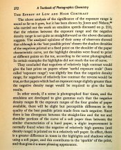
In essence, a softer paper offers a more balanced, extended straight line within the characteristic curve so that the toe and shoulder areas do not become, suddenly, too crowded and tonally undifferentiated. That subtlety speaks volumes. The final paragraph from page 272 is the denouement.

And for those who will refute all this by warning about that excess grain from the excess gamma: save your efforts, as the softer paper handily mitigates this negative threat.

But, seriously, any comments, pro or con? - David Lyga
 

Attachments

  • cover page PC.JPG
    cover page PC.JPG
    197.4 KB · Views: 128
  • page 272 PC.JPG
    page 272 PC.JPG
    638 KB · Views: 157
Last edited by a moderator:

Paul Howell

Subscriber
Joined
Dec 23, 2004
Messages
9,739
Location
Scottsdale Az
Format
Multi Format
Best print is subjective, Although I develop my negatives for "normal contrast paper grade 2" the old trick of using newprint is useful as it mean you have shadow detail and printable highlights. But I usally print at grade 3 or 4, it is my "style".
 
OP
OP
David Lyga

David Lyga

Member
Joined
Nov 25, 2007
Messages
3,445
Location
Philadelphia
Format
35mm
Style is one thing. Ideal is quite another.

I am not refuting you PDH, merely bringing up 'objective vs subjective', perhaps. - David Lyga
 

jp498

Member
Joined
Oct 5, 2009
Messages
1,525
Location
Owls Head ME
Format
Multi Format
And in pondering, I have also wondered why American authors on technical aspects of photography have usually been too terrified to NOT remain tethered to truisms, whereas the British authors seem to be the most comfortable with promulgating what they actually find through discovery, even if such discovery leads to inferences of iconoclasm within the comforts of the photographic community. Thankfully, those Brits do not care whose toes they step on, even if it is the toe of the characteristic curve. Sorry about my prejudices, folks, but I have read too many books by Brits, in and out of photography, to not state this positive divergence boldly. (Sorry, Greece, but without this 'confiscation', the Parthenon (Elgin) Marbles would not exist in the condition that they are in today.)

Because Ken Rockwell has to stand on someone's shoulders. People read this stuff to get from novice to above average, not to go from good to masterful.

The era and styles of photography are where the innovation is and that can vary from country to country depending on the decade.
 
Joined
Jan 21, 2003
Messages
15,708
Location
Switzerland
Format
Multi Format
It is all a matter of how the negative prints, and the arbiter of that is YOU - the person who prints it. When you get a print in the darkroom that you like, based on experimenting with negative exposure and development, then you have the perfect contrast.

More technically, your paper and paper developer have a curve, and the film is malleable too. Ideally the negative should fit the paper, so my philosophy isn't to worry about the negative until I know what my paper needs. That is why I always use the same photo paper (although Ilford shoved a new paper down my throat when they reformulated the Multigrade paper) - to know how I must shoot and process my film to eke the maximum performance out of it.
I even go so far to say that it isn't until you take this dynamic relationship between paper, film, lighting, technique, and chemistry into consideration, and view it as one big system that you are even able to get the maximum performance out of your materials.
But in here lies the difference to the approach of the authors - they give a general view of what is best, but they can't take into account personal taste. We, as printers, decide what our prints need to look like, not somebody else (unless they employ us print a certain way, of course).

The extreme example of this is potentially Ralph Gibson. He shot his Tri-X at something like EI 100, exposed for the highlights, and developed the hell out of the film for a very dense negative, and then printed on Grade 5 Brovira. That was photography as he saw it, but you won't find that in any text books - because he figured that out for himself. And that is what we should all aspire to do.
 

gone

Member
Joined
Jun 14, 2009
Messages
5,504
Location
gone
Format
Medium Format
Well, there is no ideal of course. Everyone has different likes and dislikes, different preferences, different ways of seeing, and none of them are ideal, right, or wrong. I too like more contrasty stuff, others like less. A neg developed in Diafine will need different printing (to me) than one developed in Acufine, Rodinal, D76, etc. Since it's a visual thing we're involved in there is a lot of room for individual interpretation. Otherwise everyone would have the same stuff. Sort of like today's newspapers. You've seen one, you've seen them all, because they are all giving the same company line.

I wasn't aware of Ralph Gibson's methodology, so thanks for that Thomas. I shoot it at 100 often too (but expose for the middle value), and develop it normally and give it more contrast in the printing. I'd thought of giving it more development, but Tri-X is just such a great film, you can do all sorts of things w/ it and still get good negs.
 
Last edited by a moderator:

darkosaric

Member
Joined
Apr 15, 2008
Messages
4,568
Location
Hamburg, DE
Format
Multi Format
and developed the hell out of the film for a very dense negative

For me the worst think is thin negative. They say "when in doubt overexpose", I would say when in doubt overexpose and overdevelop :smile:. Better expose print in darkroom for 20 minutes than have a thin, empty negative. But usually I always develop for grade 2 papers, because for years (until downfall of Fotokemika) I was using Emaks grade 2 double weight paper for 95% of my work.
 

Jim Noel

Member
Joined
Mar 6, 2005
Messages
2,261
Format
Large Format
The "Ideal" negative is dependent on how the final print is to be made. Even your preferred grade of silver gelatin paper. While most people view Grade 2 as the ideal paper upon which to print, some very good printers aim for Grade 3. The print developer used also enters into the picture, no pun intended.
Those of us experienced in so-called alternative printing processes know that each of the processes requires a different "ideal' negative. A negative which produces a beautiful kallitype print, will not do so in making a salted paper print.
So the answer to the original question has to be, it depends on what you want to do with the negative.
 

Paul Howell

Subscriber
Joined
Dec 23, 2004
Messages
9,739
Location
Scottsdale Az
Format
Multi Format
Style is one thing. Ideal is quite another.

I am not refuting you PDH, merely bringing up 'objective vs subjective', perhaps. - David Lyga

The advice is "develop for contrast (relative high gamma) and print on relative soft contrast paper, contributes to the sparkle of the print and thus gives it a more pleasing appearance.”

Objectivley I dont know that relative high gamma is, I dont know what a relative soft contast paper was in 1963, we had grade 1, so is grade 2 relative soft, without examples I dont know what sparkle is, or what a pleasing apperance was to the writter, seems to be subjective to me.

An ideal negative is a negative that has printable shadow details and texture in the highlights, then it is up the printer to fine tune the print to express his/her experaince.
 
Joined
Jan 21, 2003
Messages
15,708
Location
Switzerland
Format
Multi Format
An ideal negative is a negative that has printable shadow details and texture in the highlights, then it is up the printer to fine tune the print to express his/her experaince.

An alternative approach is to completely abolish these known 'standards' and go out on a limb, push the boundaries, and try something different.

I have tried the Ralph Gibson approach I mentioned above, and of course my prints aren't going to look like his, because he's a much better photographer than I am. But it was an interesting exercise to print negatives that I otherwise might have considered unprintable, and to see that something really cool could come out on the other end.

Today I make negatives with highlight densities that most people would probably shy away from (for silver printing and scanning anyway), because after I work hard to print those highlights down, I find that I end up liking the results better. A straight print at any grade would render no highlight detail at all and the shadows have way too much information in them.

I guess it's all about intent, as mentioned by several here. You have to push boundaries and go beyond what you think is possible to see what's there, and sometimes you make interesting discoveries. Like thinking outside the box, but perhaps even disregard the box all together.
 

Chris Lange

Member
Joined
Aug 17, 2009
Messages
770
Location
NY
Format
Multi Format
I read lots about the "tailor negative to paper" thing, but I basically just split-grade 99% of the time and, provided the silver is in the negative, arrive at the print I want without too much labor. I also do a lot of dodging and burning.

Maybe I accommodated my papers by accident, but I like making photographs a whole lot more than practicing my sensitometry.
 

Paul Howell

Subscriber
Joined
Dec 23, 2004
Messages
9,739
Location
Scottsdale Az
Format
Multi Format
I have tried the Ralph Gibson approach I mentioned above, and of course my prints aren't going to look like his, because he's a much better photographer than I am. But it was an interesting exercise to print negatives that I otherwise might have considered unprintable, and to see that something really cool could come out on the other end.

I agree, as a former PJ I dont consider any negative with any infomration to be unprintable, if a story is on the line you had better get a pirnt one way or the other, and unintended results can be exciting.
 
Joined
Jan 21, 2003
Messages
15,708
Location
Switzerland
Format
Multi Format
I read lots about the "tailor negative to paper" thing, but I basically just split-grade 99% of the time and, provided the silver is in the negative, arrive at the print I want without too much labor. I also do a lot of dodging and burning.

Maybe I accommodated my papers by accident, but I like making photographs a whole lot more than practicing my sensitometry.

:smile: What's a sensitometer?

I like printing too, and while I've been able to markedly improve my print quality, I've at the same time managed to reduce my darkroom waste to about half.
 

Chris Lange

Member
Joined
Aug 17, 2009
Messages
770
Location
NY
Format
Multi Format
:smile: What's a sensitometer?

I like printing too, and while I've been able to markedly improve my print quality, I've at the same time managed to reduce my darkroom waste to about half.

The curves I spend most time with certainly aren't ones on technical publications or graph paper :wink:
 
Joined
Jan 21, 2003
Messages
15,708
Location
Switzerland
Format
Multi Format
The curves I spend most time with certainly aren't ones on technical publications or graph paper :wink:

:smile: I would hope not! There are curves much more interesting than that, for sure.
 

cliveh

Subscriber
Joined
Oct 9, 2010
Messages
7,553
Format
35mm RF
David as I am a Brit may I give you my take on this. As the density and contrast are effected by an enormous number of permutations from exposure to print, not least a subjective and personal preference element, together with what the picture is/context/mood/etc., an ideal negative can’t really be defined. Having said that, for me and I should imagine for most people (but perhaps not all those on APUG), an ideal negative is one that is easy to print with little or no intervention. So with a consistent processing procedure and printing usually on a condenser enlarger, I find a negative slightly on the thin side is usually ideal.
 

snapguy

Member
Joined
Jan 1, 2014
Messages
1,287
Location
California d
Format
35mm
Negs

And just where would one obtain a newspaper these days? Maybe you can get an app for that.
Back in the 1960s and 1970s I attended an official Leica-sponsored Leica Flying Short Course a couple of times. Leica techs/True Believers would fly around the county and give talks to pro photographers. One tech would literally stand on a Leica M rangefinder camera body to demonstrate how the camera backs were super-rigid vs those sissy Nikon and Canon camera bodies with their flimsy removable backs.
The techs also preached that you should expose and develop your negs so they needed to be printed with a single grade # 4 printing paper.
I loved my M2R Leica but thought the "experts" were slinging baloney. Still do. What is important is what works for you.
 

MattKing

Moderator
Moderator
Joined
Apr 24, 2005
Messages
53,252
Location
Delta, BC Canada
Format
Medium Format
The "newspaper text" test is a really good one - for novices.

It also serves as a check on process for those who are more experienced.

If someone who is relatively new to this gives the film enough exposure to have detail in the shadows, and then develops it enough to be able to read newspaper text through the highlights, they will be able to get a decent, pleasing print out of the result. That is a great place to be, and to progress from.
 

Maris

Member
Joined
Jan 17, 2006
Messages
1,576
Location
Noosa, Australia
Format
Multi Format
...I read lots about the "tailor negative to paper" thing, but I basically just split-grade 99% of the time and, provided the silver is in the negative, arrive at the print I want without too much labor. I also do a lot of dodging and burning...

Chris has it right. In these days of high quality variable contrast paper the concept of laying a particular negative gamma on a particular paper grade is obsolescent. Different parts of the final image can be assigned different contrasts by burning and dodging during split grade enlarging.
 

cliveh

Subscriber
Joined
Oct 9, 2010
Messages
7,553
Format
35mm RF
I read lots about the "tailor negative to paper" thing, but I basically just split-grade 99% of the time and, provided the silver is in the negative, arrive at the print I want without too much labor. I also do a lot of dodging and burning.

Maybe I accommodated my papers by accident, but I like making photographs a whole lot more than practicing my sensitometry.

If you are split grade printing 99% of the time and do a lot of dodging and burning, how does this constitute without too much labour?
 

Chris Lange

Member
Joined
Aug 17, 2009
Messages
770
Location
NY
Format
Multi Format
If you are split grade printing 99% of the time and do a lot of dodging and burning, how does this constitute without too much labour?

Clive, as we discussed in Stone's thread a while ago, the dodging and burning is for expressive characteristics, not corrective ones. I find split-grade printing to be very fast, and very intuitive, and I prefer that approach over using single grades because I like to dodge and burn at different contrasts to mold the print to my preference. It's not very labor intensive at all...I make one or two test squares with an extra stop of over/under exposure after identifying where I want my values to fall, so that I can see how much leeway I have with dodging and burning, and then I go for it...rarely does it take more than 2 or 3 full sheets to get it right when it's not an overly complex composition. If it is, then I may be balancing a lot of different areas, exposure-wise, just to get the dynamic range I want with the midtone contrast I like.

I like a lot of snap to my mids, and bone-dry highs, very rich blacks. I'm not a big fan of middle grey. If I had to describe the way I like to print much of the time, it's with the dynamic range of a 2 or 3 and the snap and bite of a 5.
 

cliveh

Subscriber
Joined
Oct 9, 2010
Messages
7,553
Format
35mm RF
Clive, as we discussed in Stone's thread a while ago, the dodging and burning is for expressive characteristics, not corrective ones. I find split-grade printing to be very fast, and very intuitive, and I prefer that approach over using single grades because I like to dodge and burn at different contrasts to mold the print to my preference. It's not very labor intensive at all...I make one or two test squares with an extra stop of over/under exposure after identifying where I want my values to fall, so that I can see how much leeway I have with dodging and burning, and then I go for it...rarely does it take more than 2 or 3 full sheets to get it right when it's not an overly complex composition. If it is, then I may be balancing a lot of different areas, exposure-wise, just to get the dynamic range I want with the midtone contrast I like.

I like a lot of snap to my mids, and bone-dry highs, very rich blacks. I'm not a big fan of middle grey. If I had to describe the way I like to print much of the time, it's with the dynamic range of a 2 or 3 and the snap and bite of a 5.

Thanks Chris, but in order to understand this better, I would be interested to view one of your prints as a straight print and after expressive characteristic correction of split grade and dodging.
 

ic-racer

Member
Joined
Feb 25, 2007
Messages
16,562
Location
USA
Format
Multi Format
The slope of the curve of most modern printing papers grade 2 is greater than 1 and the negatives for these papers will have an overall contrast (ie highest to lowest value) of less than one.

Most importantly, however, is the observation that 'best prints' match the negative contrast to the paper contrast. This was shown by the following graph published by Jones. He looked back at the "best prints" and measured the contrast of the negative and paper. As you can see most of the "best prints" were printed on a paper grade that perfectly matched the negative (as indicated by the straight line). Again, another reason I use multigrade paper; to get those subtle in-between grades.

negandprintcontrast.jpg

Journal of the
OPTICAL SOCIETY of America
VOLUME 38, NUMBER 11
NOVEMBER, 1948
Control of Photographic Printing: Improvement in Terminologyand Further Analysis o fResults*
LOYD A. JONES AND C. N. NELSON
Eastman Kodak Company, Rochester 4, New York


Check out Todd and Zakia http://www.amazon.com/Photographic-...=sr_1_3?s=books&ie=UTF8&qid=1394151242&sr=1-3 and the Kodak workbook for sensitometery http://motion.kodak.com/motion/uplo...en_motion_education_sensitometry_workbook.pdf for more information on the subject.
 
Last edited by a moderator:

markbarendt

Member
Joined
May 18, 2008
Messages
9,422
Location
Beaverton, OR
Format
Multi Format
(there was a url link here which no longer exists)

The ideal is what works for you.
 
Joined
Jan 21, 2003
Messages
15,708
Location
Switzerland
Format
Multi Format
Clive, as we discussed in Stone's thread a while ago, the dodging and burning is for expressive characteristics, not corrective ones. I find split-grade printing to be very fast, and very intuitive, and I prefer that approach over using single grades because I like to dodge and burn at different contrasts to mold the print to my preference. It's not very labor intensive at all...I make one or two test squares with an extra stop of over/under exposure after identifying where I want my values to fall, so that I can see how much leeway I have with dodging and burning, and then I go for it...rarely does it take more than 2 or 3 full sheets to get it right when it's not an overly complex composition. If it is, then I may be balancing a lot of different areas, exposure-wise, just to get the dynamic range I want with the midtone contrast I like.

I like a lot of snap to my mids, and bone-dry highs, very rich blacks. I'm not a big fan of middle grey. If I had to describe the way I like to print much of the time, it's with the dynamic range of a 2 or 3 and the snap and bite of a 5.

I do this too, except I don't split grade everything. Most of my negatives I don't have to, although I will use a 4 or a 5 sometimes to burn in certain areas. I also use diffusion quite a lot if I'm printing negatives of excessive contrast. It gives an effect similar to pre-flashing.

I believe that a negative that has been exposed and developed with care, considering the output, will be easier to 'get in the zone' quickly, and if I'm printing from the same roll of film I can sometimes need 2 or 3 sheets to get the first one right, but subsequent prints from the same roll is usually very simple to get 'almost there' on the very first sheet.

My desired tonality is different from yours, though. I like all of the tones, and love good mid-tone separation, but sometimes will leave shadows completely empty on purpose, to strengthen a composition or hide something ugly.

To liken the photographic process to tennis; to have a really good serve is like having a good negative - it gives you an advantage in the rest of your game. It doesn't really take longer to make negatives that are better suited to the paper than those who are not, and that's what's so slick about it. On a low contrast day I shoot a roll of HP5+ at 800 and push a 30%. On a medium contrast day I shoot the same film at 500 and develop normal. On a high contrast day I shoot it at 250-320 and develop normal -20%. That gives me negatives that work well for me. I'll add that I will change film mid-roll if the lighting changes. Exposing in hugely varying conditions doesn't work well for me. With the Hasselblad it's easy to carry around two or three backs.
 
Photrio.com contains affiliate links to products. We may receive a commission for purchases made through these links.
To read our full affiliate disclosure statement please click Here.

PHOTRIO PARTNERS EQUALLY FUNDING OUR COMMUNITY:


Ilford ADOX Freestyle Photographic Stearman Press Weldon Color Lab Blue Moon Camera & Machine
Top Bottom