120 negs lacklustre

Lacock Abbey detail

A
Lacock Abbey detail

  • 0
  • 1
  • 21
Tyndall Bruce

A
Tyndall Bruce

  • 0
  • 0
  • 39
TEXTURES

A
TEXTURES

  • 4
  • 0
  • 65
Small Craft Club

A
Small Craft Club

  • 2
  • 0
  • 60
RED FILTER

A
RED FILTER

  • 1
  • 0
  • 51

Recent Classifieds

Forum statistics

Threads
198,905
Messages
2,782,826
Members
99,743
Latest member
HypnoRospo
Recent bookmarks
0

jgcull

Member
Joined
Jul 11, 2003
Messages
920
Location
nc
I've got a few I like, but in general my 120 negatives don't look as nice as the 35mm ones. I'm assuming it's something with my exposure. I just processed a roll of Tri-X in D76 1:1. I think it was 9 min. 45 sec, if I remember correctly.

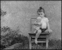
I've printed an image and it does have a lot of the same mid-tones, but the child has on a white t-shirt. They look gray to me. I've printed them a few different ways, once with more magenta for contrast than without. They still look blah.

The paper is old Kodak glossy. I've had some problems with some of the old paper I've got, but the borders are white as can be. Does that necessarily mean the paper's ok?

I should try printing another negative on the same paper and see what I get, I guess.

When I meter (using a Minolta IVF on ambient) I always give it another stop exposure. Should I give more than that? What could my problem be?

It's not just this paper. My 120 negatives look dull and flat to me.

Thanks!

Janet
 
OP
OP

jgcull

Member
Joined
Jul 11, 2003
Messages
920
Location
nc
I think I'm wrong about this particular roll. I looked again at the negatives and they look pretty alright. I'm gonna try different paper and see if there's a difference. Still, I'm generally less impressed with my 120s and realize that shouldn't be! For now I'll leave this alone, try another paper, and keep working on the exposure thing (in the future - tonight I'm printing).

Thanks.
 

David A. Goldfarb

Moderator
Moderator
Joined
Sep 7, 2002
Messages
19,974
Location
Honolulu, HI
Format
Large Format
If it's not just the light, exposures are good, and your MF negs are generally low in contrast, try increasing your development time.

As for flat negs that you already have, try toning the negs in Kodak Rapid Selenium Toner 1+3 for about 8 minutes to get about a one zone expansion in contrast. That should push up the highlights to where you want them.

If you don't want to tone your negs, another option is to print a little dark and bleach the prints with Farmer's Reducer for an overall contrast boost.
 
OP
OP

jgcull

Member
Joined
Jul 11, 2003
Messages
920
Location
nc
Hasselblad. I was so wrong! I used another paper and it looks pretty good! I'm pleased. I don't know what papers I'm using because I've just got them in the black plastic bags, but this one makes all the difference. They're both old and have been frozen for years, but I think the first was just too old. Or something!

When it dries I'll post it here.

Still I'll take any advice you can offer to make them better. I'm rarely (if ever) completely happy. I can always find something wrong. That's both good and bad, isn't it? Keeps me reaching... and discontent. hm. Something wrong with that. I'll find the balance, surely.
 
OP
OP

jgcull

Member
Joined
Jul 11, 2003
Messages
920
Location
nc
Oops. David, I think we were posting at the same time. I didn't know you could tone negatives. If there are any I'm wild about, I'll try that. I've got silenium. Thanks. Bleach scares me. Don't know why... just another process I haven't tried.

My husband asked me tonight, "if money were no object and you could do anything you wanted, what would it be?" My answer was that I'm pretty much doing what I'd want to do (I really like my life. What a blessing!), except that I'd find darkroom workshops or school, go and get better. He already knew the answer.
 

Zathras

Subscriber
Joined
Nov 9, 2004
Messages
819
Location
SF Bay Area
Format
Multi Format
I've got a few I like, but in general my 120 negatives don't look as nice as the 35mm ones. I'm assuming it's something with my exposure. I just processed a roll of Tri-X in D76 1:1. I think it was 9 min. 45 sec, if I remember correctly.

I've printed an image and it does have a lot of the same mid-tones, but the child has on a white t-shirt. They look gray to me. I've printed them a few different ways, once with more magenta for contrast than without. They still look blah.

The paper is old Kodak glossy. I've had some problems with some of the old paper I've got, but the borders are white as can be. Does that necessarily mean the paper's ok?

I should try printing another negative on the same paper and see what I get, I guess.

When I meter (using a Minolta IVF on ambient) I always give it another stop exposure. Should I give more than that? What could my problem be?

It's not just this paper. My 120 negatives look dull and flat to me.

Thanks!

Janet

Hi Janet,

Which version of Tri-X are you using? Are you using Tri-X 400 or the "Professional" Tri-X that is factory rated at ISO 320? I have found that for me, Tri-X Professional is kinda dull looking compared to the non "Professional" Tri-X.

Mike Sullivan
 
OP
OP

jgcull

Member
Joined
Jul 11, 2003
Messages
920
Location
nc
It says, "Professional Tri-X 400". 400TX. I'm confused. Are you saying the 400 works better for you? Do they both say, "professional"?

I've printed several, trying to get it just right. I've found that the "better" paper (still old from the freezer. I mean *many years* old!) is only better, but not perfect. When I expose it long enough to get detail in the brightest places, there is mottling a bit still. But it's not as gray as the first old stuff I used. I sound like a real cheapskate, don't I?

I tried to think if I have any new paper at all. I don't think I do. Doggone-it, for all the time and chemicals I use, I'm gonna have to buy some more new paper. Enough of these deals!
 
OP
OP

jgcull

Member
Joined
Jul 11, 2003
Messages
920
Location
nc
Can you see in her legs & arms that it looks splotchy? She's not splotchy. I guess that's my old paper's fault. Anyway, here it is. Sort of drab and not as sharp as I think it should be. That's not the paper's fault.

I see that line across the top and I don't know if it's because that's a scratch coat on the house or if I did something wrong.

Is there some advice you can offer about the exposure or is it impossible to tell with the print on this paper?

Thanks.
 

Attachments

  • Molly&babydoll.jpg
    Molly&babydoll.jpg
    77.2 KB · Views: 259

Arvee

Member
Joined
Aug 23, 2006
Messages
976
Location
Great Basin
Format
Multi Format
Looks like pretty flat lighting to me, maybe 4 stops max. In lighting with a low SBR (the number of stops between the textured dark tones and the textured light tones) you would want to increase your development time to give more sparkle to the whites. The low tones and the mid tones look fine; the negs could have stood another minute or so to bring up the whites.

Just my .02,

Fred
 

k_jupiter

Member
Joined
Feb 3, 2004
Messages
2,569
Location
san jose, ca
Format
Multi Format
P.S. Underdeveloped. You can tell by the shirt.

Meter on her face, add a stop, give yourself 10% more development time and see what happens.

tim in san jose
 

Ole

Moderator
Moderator
Joined
Sep 9, 2002
Messages
9,245
Location
Bergen, Norway
Format
Large Format
Old paper tends to lose contrast, especially in the highlights. The whites may not be fogged even if the paper is almost dead.

I suggest you invest in a pack of new paper before you try anything else. Also make sure you develop the paper to completion - sometimes developing the print face down can help avoid pulling it too early. A good print will look too dark and contrasty in darkroom lighting.
 
OP
OP

jgcull

Member
Joined
Jul 11, 2003
Messages
920
Location
nc
>>>Looks like pretty flat lighting to me, maybe 4 stops max. In lighting with a low SBR (the number of stops between the textured dark tones and the textured light tones) you would want to increase your development time to give more sparkle to the whites. The low tones and the mid tones look fine; the negs could have stood another minute or so to bring up the whites.<<<

Thank you, Fred. You're right, it does look very flat. How did you know another minute would be right? That won't make the negs too heavy & overdeveloped? How do I determine such things? Do I need a spot meter to know there's a 4 stop difference? Is there a rule of thumb for compensating without a spot meter? (And the last question: are these too many questions?)

Tim, when you say the shirt tells you it's underdeveloped, do you mean the print of the negative? It sounds from what you and Fred are saying, you have a spot meter in mind. Is that correct?

Ole, yes, I think I'm learning my lesson on the old paper. It's not the deal I thought it was. Time is way more expensive than paper!

Thank you all.

Janet
 

k_jupiter

Member
Joined
Feb 3, 2004
Messages
2,569
Location
san jose, ca
Format
Multi Format
If I evaluate a scene, I will look for that one area that should be deep black, that one area that should be 1 stop short of brilliant white. That's the luminescence scale for any photo. A meter will tell you how much width you have to your tonal scale. Master six zones and you are a pretty good printer. Shoot for five and do your subjective testing on that.

tim in san jose
 

k_jupiter

Member
Joined
Feb 3, 2004
Messages
2,569
Location
san jose, ca
Format
Multi Format
No. It requires a meter. The diff between a meter and a spot meter is... 20 feet or so.
I use my Luna Pro. And walk.

tim in san jose
 

Roger Hicks

Member
Joined
May 17, 2006
Messages
4,895
Location
Northern Aqu
Format
35mm RF
Dear Janet,

How did you know another minute would be right?

Because anything less than a minute won't make a significant difference to a development time of almost 10 minutes. In fact, I'd go to a full 11 minutes. Fifteen-second variations are not really worth bothering with at this sort of time. A rule of thumb is 30 second steps up to 7 or 8 minutes, 1 minute steps beyond.

That won't make the negs too heavy & overdeveloped?

Not at all likely. In fact I'd guess you'd get printable negatives if you developed for 15 minutes, though you might need a soft grade of paper. My own rule of thumb is to give 15 per cent less deveopment than 'standard' for contrasty subjects (bright Greek sun) and 50 per cent more for 'flat' ones.

How do I determine such things?

Experiment and experience. Look at the neg, not the print, to see if the thinnest areas have any shadow detail. If they are just clear film, you're underexposing. Then, if the neg needs hard paper (grades 4 + 5) it's underdeveloped; if it needs grades 0 + 1, it's overdeveloped. Adjust accordingly in 1-minute steps as noted above.

Many people have an inexplicable terror of over-developing, but seem perfectly happy to under-develop to absurd degrees. Both are equally bad.

Many also look for more precision than exists in the process. You may find it interesting to check the temperature of your developer before tipping it into the dev tank, and after tipping it out. Unless you use a water bath or are processing at close to ambient, variations of 2 degrees C are not uncommon, equivalent to half a minute or a minute in dev times.

Finally, using hopelessly outdated materials is never the way to hone your photographic skills. Yes, you can get brilliant prints on very old paper if you add benzotriazole to the developer, but exposure times will be long and dev times will be longer. Learning how to use clapped-out materials is a completely different exercise from learning to make good prints, and it's not a good idea to combine the two.

Cheers,

Roger
 
Last edited by a moderator:
OP
OP

jgcull

Member
Joined
Jul 11, 2003
Messages
920
Location
nc
Roger, Thanks so much! I'm printing this off and reading it again and again!
 

Rolleijoe

Member
Joined
Dec 16, 2004
Messages
524
Location
S.E. Texas
Format
Medium Format
Can you see in her legs & arms that it looks splotchy? She's not splotchy. I guess that's my old paper's fault. Anyway, here it is. Sort of drab and not as sharp as I think it should be. That's not the paper's fault.

I see that line across the top and I don't know if it's because that's a scratch coat on the house or if I did something wrong.

Is there some advice you can offer about the exposure or is it impossible to tell with the print on this paper?

Thanks.

I agree with Fred, the lighting is kinda flat. Should have used a fill flash to give it some extra oomph. But it also definitely looks like bad older paper. For myself, since Agfa is no more, I've gone wih Foma for some 4x5 neg work, but have found Fotokemika Varycon fiber to give me exactly what I'm accustomed to.

White whites, all shades of gray, and beautiul full tone blacks.

Available from Freestyle (no, don't work there or know someone who does), I also use their Fomapan 200 on occasion, but mostly Efke 25, Efke 100, and Rollei Ortho 25. I'm about to try their Adox Ortho 25. Oh, and I shoot Rolleiflex 3.5E model.

Just my 0.2¢ € £ ¥

Rolleijoe
 

juan

Member
Joined
May 7, 2003
Messages
2,706
Location
St. Simons I
Format
Multi Format
There is a lot of good information here, but I think Ole's post is the one you should pay the most attention to. Get some new paper and print before trying to evaluate from a print. All of your problems here could (repeat could) be the result of using outdated paper. It may be that your negative processing is just fine, but that you can't tell because of the paper.
juan
 
OP
OP

jgcull

Member
Joined
Jul 11, 2003
Messages
920
Location
nc
I wanted to add an update on the negatives. I processed TMax100 this morning and added a minute and a half to my developing time and the negatives look really nice!

I haven't bought any new paper yet but when I get a chance I'll break out a newer old box of paper from the freezer. :wink: No really, I do intend to order new paper soon.

Thanks, guys!
 

thefizz

Member
Joined
Dec 8, 2004
Messages
2,345
Location
Ireland
Format
Medium Format
I had a similar problem where my 120 negs didn't look as good as my 35mm. The result was that the 120 generally needed more development.
 
Photrio.com contains affiliate links to products. We may receive a commission for purchases made through these links.
To read our full affiliate disclosure statement please click Here.

PHOTRIO PARTNERS EQUALLY FUNDING OUR COMMUNITY:


Ilford ADOX Freestyle Photographic Stearman Press Weldon Color Lab Blue Moon Camera & Machine
Top Bottom