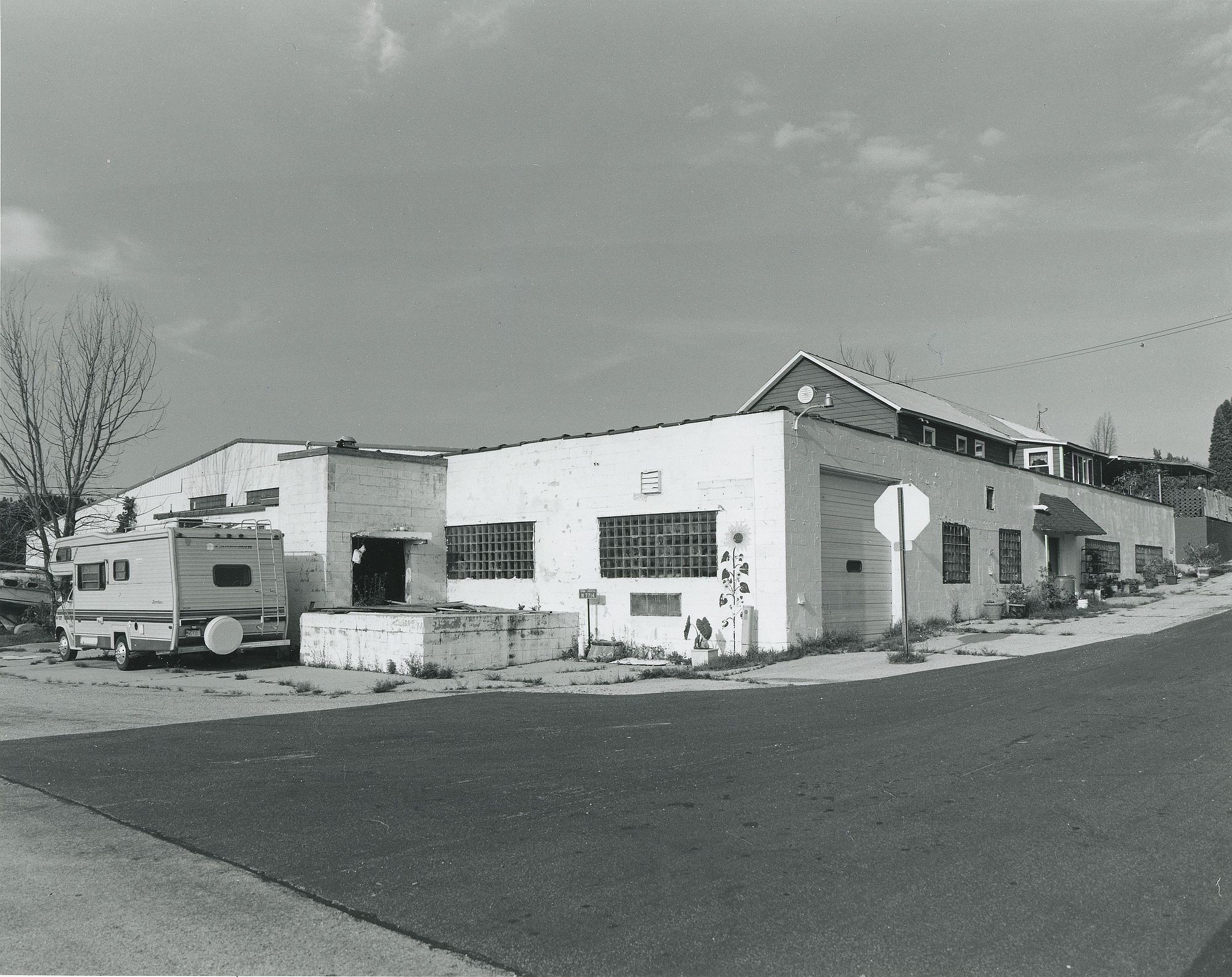
An interesting old industrial building on Zion Church Road in Theresa, Wisconsin. The photo was taken in August of 2016. This print was made in January, 2018 on 8” x 10” paper.
It is funny that thumbnails always seem to look a bit grey and flat but full pics look fine contrast-wise as this one does. A recent thread on contact sheets made me think more deeply about how much value there is in getting contact sheets right on contrast as opposed to ensuring that it is showing what's in the negative that's important even if this sacrifices contrast
I have actually given up on contact sheets - I scan negatives, but only so I can look at enlarged views on the screen in order to choose which negatives to print. All exposure and contrast decisions are made on full sized prints. I use the RH Designs meter to get close, then go by eye. I see I am getting greenish scans again - though it seems to depend on the monitor. The prints are NOT green, as they are MG Classic with 3 min 1:20 Selenium toned. I need to look into my scanning, but that is far less of a priority, as the print is the final end product for me.
Until you mentioned a greenish hue I hadn't noticed on this one. Now you have mentioned it I am still not sure if my detecting the merest hint of green is in fact auto-suggestion
Looks lonely with a lot of stories to tell. The contrast is nice with the whites holding detail. I'm also with pentaxuser on the green tint, but I'm seeing more shades of olive or sage but that's just me Just Kidding. I like it. It's real life.
Photrio.com contains affiliate links to products. We may receive a commission for purchases made through these links. To read our full affiliate disclosure statement please click Here.
PHOTRIO PARTNERS EQUALLY FUNDING OUR COMMUNITY:
This site uses cookies to help personalise content, tailor your experience and to keep you logged in if you register.
By continuing to use this site, you are consenting to our use of cookies.