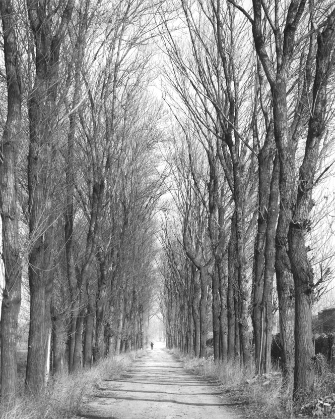
Reload of previous image. Work print, trying to balance the complexity of the wild branches with the lone walker. Comments on this welcome! Should I darken the sky? Lighten the man? The opposite? Leave it as is?
Everything looks about right for me, given the kind of sky that you'd expect to see at that time of year except. Possibly the man might benefit from being a little darker but only a little to make him stand out more. This might take some difficult burning-in given his size.
What I am going to say now has more to do with what I perceive as a change in the way APUG seems to render the pictures rather than the actual contrast on the print.
Pics look greyer and less contrasty than they did before the change to APUG. A higher contrast rendering might do the trick but it would seem to be only me that has this viewpoint so I may be in a minority of one
Photrio.com contains affiliate links to products. We may receive a commission for purchases made through these links. To read our full affiliate disclosure statement please click Here.
PHOTRIO PARTNERS EQUALLY FUNDING OUR COMMUNITY:
This site uses cookies to help personalise content, tailor your experience and to keep you logged in if you register.
By continuing to use this site, you are consenting to our use of cookies.