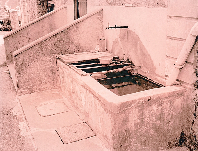
Looking at my notes this was the 7th print through the soup and it was overexposed 3 stops as before. The soup was replenished with 25a and 25b after print 4. (There is only enough capacity to do four 9.5x12 inch prints in the original bath.)
I have tried to get the scans to look as close as possible to the actual prints and this one is more pink than the tractor. The tractor print has more peachy/coppery tones than this one. I have a calibrated monitor and use profiles and colour management, but it is almost impossible to get them exactly right. My initial scans are quite off.
I am a beginner at this lith business and I have been reading up on getting more consistency, but it is rather a complex process with lots of variables. I just got the Moersch Lith kit which may give more control, but have yet to try it. Yesterday i did another batch of prints and they have come up more warm sepia/brown 25a+25b+950 (with less old brown and not so heavily oxidised). It shows the wide range of colours available with this paper at least.
Thanks. Well at least my monitor agrees with your prints if this one is more pink. One of the major problems in the galleries is monitor calibration to get a what you see is what is there on the print.
I think it was in the Lee Frost book that I read that no two liths are ever exactly the same. Might be an issue if you were commissioned to do several more prints because the recipient liked the first! Of course Lee Frost could be wrong or maybe my memory fails me on this.
I wonder how Tim Rudman tackles the issue of consistency?
I have been reading up on this consistency thing and it is very difficult. My initial reading of the Moersch kit instructions - which are quite detailed - is that the additives provided (sulphite and bromide) can be added to keep a consistent effect; and old brown - a big variable - is not necessary. This effect can also be changed for different papers - there is a table of starting brews at the back for different emulsions. I have yet to try it out.
I think you are right about the Lee Frost book. But he seems to have a much more relaxed view about these things. Tim Rudman has a chapter on the chemistry in his book and how it works to affect the print, but I didn't find it very useful (that's my fault, not Tim's). I think it requires serious re-reading and thinking through.
Photrio.com contains affiliate links to products. We may receive a commission for purchases made through these links. To read our full affiliate disclosure statement please click Here.
PHOTRIO PARTNERS EQUALLY FUNDING OUR COMMUNITY:
This site uses cookies to help personalise content, tailor your experience and to keep you logged in if you register.
By continuing to use this site, you are consenting to our use of cookies.