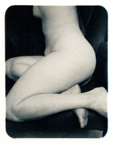


untitled (nude series)
-
A
- Shinnya
- Location
- in guest room
- Equipment Used
- Speed Graphics 3x4
- Exposure
- Not sure
- Film & Developer
- JandC 200
- Paper & Developer
- artistico
- Lens Filter
- none
| Photrio.com contains affiliate links to products. We may receive a commission for purchases made through these links. To read our full affiliate disclosure statement please click Here. |
PHOTRIO PARTNERS EQUALLY FUNDING OUR COMMUNITY:  |