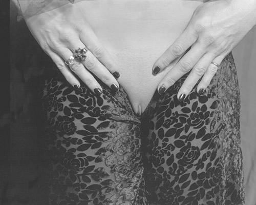
Part one of a series I am working on the image goes with torso as far as a series not the same model
comments are allways welcome.
Yes I hade uploaded a previous version I feel this one is better
Thanks
I've had the opportunity to do several workshops on the nude, and the one thing that gets reinforced each time is that it is enormously difficult to make strong, artistic images of nude subjects. The human body has all kinds of interesting curves and surfaces, and nothing is quite a sensuous as skin, so its impossible to avoid an element of sexuality. But the trick is to create an image that conveys the sensuous richness of the subject while not exploiting sexuality and crossing the very hazzy line that separates art from pornography.
The other risk when photographing the nude is that the final image can be excessively clinical. The objective is to avoid making images that are best suited as illustrations in medical text books.
Neither this image, nor the earlier entry in the series, appeal to me at the artistic level.
They both strike me as rather illustrative. And I really wonder if, by focusing so intently on genitalia, this image is approaching the boundary of exploitation.
That was not the Intent Mono as you so elequentley put it is hard to make the Images
I just went with what I thought was of Interest to me as the Image came to my glass
It is not an attempt on exploitation but rather to get the viewer to examine and appreciate
the female body in a different way.
I am male and I used to be a model at the academy of art for the drawing & sculpting lessons. The teacher had to say to the students over and over again: He is male, so show it in your picture. I agree with mono that the shot is not very interesting. Some cropping might make it work. But i do love the exploration of the body. All parts!!
Keep up the work Gustavo.
The content could work--for instance I could imagine this in more of a Helmut Newton mode, but then the pants would be vinyl and the nails longer, and the whole thing more glossy and crispy lit. It would have a different texture, but my guess is that that look would be more "commercial" than what Gustavo is after.
I don't know if it's just the scan, but it looks flat to me. I'd like to see a wider tonal range. I'd crop that black strip on the left, and maybe bring the darkest tones down to a pure black without losing the highlight detail. I'm not sure about the rings. I don't know if they are interesting enough to add to the image or if they would better be left out, but maybe there is some personal story there that I don't know and that would be clearer with more context.
Photrio.com contains affiliate links to products. We may receive a commission for purchases made through these links. To read our full affiliate disclosure statement please click Here.
PHOTRIO PARTNERS EQUALLY FUNDING OUR COMMUNITY:
This site uses cookies to help personalise content, tailor your experience and to keep you logged in if you register.
By continuing to use this site, you are consenting to our use of cookies.