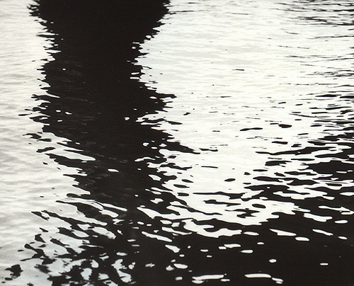


Under the Trestles
- Location
- Shenango River Lake, PA - USA
- Equipment Used
- RB67 ProS, 180mm C
- Exposure
- 1/60 @ f16
- Film & Developer
- HP5+, Thornton's Two Bath
- Paper & Developer
- AGFA MCC 111, PF130 1:1, selenium toned
- Is this print for sale?
-
- Yes
| Photrio.com contains affiliate links to products. We may receive a commission for purchases made through these links. To read our full affiliate disclosure statement please click Here. |
PHOTRIO PARTNERS EQUALLY FUNDING OUR COMMUNITY:  |