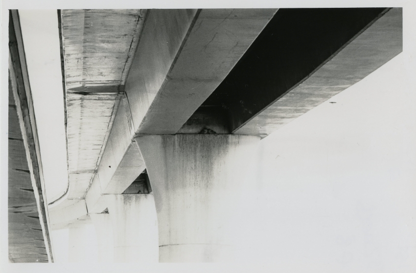
Using titanium toner, actual print is more of a creamy colour. Original print was 1 stop over exposed to allow for bleaching by the toner. Think I should of dodge the birds a little.
'Hard to articulate, but there's a lot going on beyond the subject elements that is interesting & pleasing. The whiting out of much of the overpass push towards abstract. Getting that much range is no small feat. 'Seen alot of artfully done undersides of bridges & overpasses (and like them). This treatment is new to me & holds my gaze for way longer than the subject matter normally would.
Thanks for your comments mr Silver. I wanted a light airy feel, despite that it was a bland concrete structure. The print is much better, can never get my scans right.
Theres actually birds on three of the ledges, you can just make out the last pair and Nigel no mates in the middle.
Photrio.com contains affiliate links to products. We may receive a commission for purchases made through these links. To read our full affiliate disclosure statement please click Here.
PHOTRIO PARTNERS EQUALLY FUNDING OUR COMMUNITY:
This site uses cookies to help personalise content, tailor your experience and to keep you logged in if you register.
By continuing to use this site, you are consenting to our use of cookies.