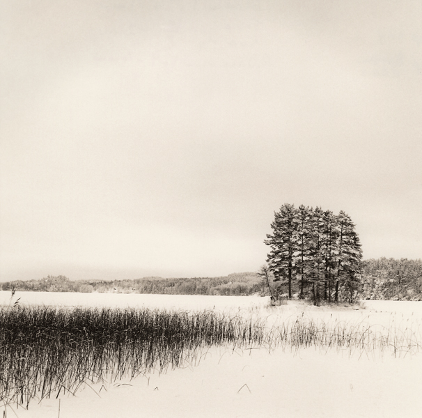
While I like both prints. This one does it for me as it's more balanced. The other one needs to be burnt in on the top left corner to hold the viewer into the middle of the frame where you composition is most strong, and what I believe was the intent of the photograph. If you had done that, then the other would be the best.
I don't see any reason to prefer one of these over the other. They're both very nice variations on the same subject, and each has its strengths. Nice work.
This is the more interesting image. The other one doesn't have enough content to hold my attention for more than 5 seconds. This one has more going on and therefore holds my attention much longer.
Photrio.com contains affiliate links to products. We may receive a commission for purchases made through these links. To read our full affiliate disclosure statement please click Here.
PHOTRIO PARTNERS EQUALLY FUNDING OUR COMMUNITY:
This site uses cookies to help personalise content, tailor your experience and to keep you logged in if you register.
By continuing to use this site, you are consenting to our use of cookies.