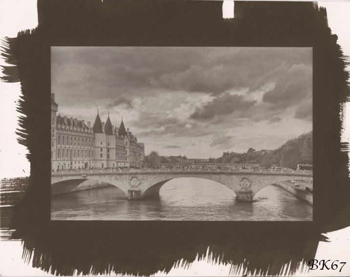


Traveling negative #2 of 3: Salt print (cold tone)
- Location
- a bridge in Paris
- Equipment Used
- traveling negative originally made by darkosaric
- Exposure
- 9:30 minutes under an UV lamp light
- Film & Developer
- internegative made from original traveling negative by darkosaric
- Paper & Developer
- Hahnemühle Platinum Rag (not seized) - it's a POP process, so no developer needed
- Lens Filter
- none
- Is this print for sale?
-
- Yes
| Photrio.com contains affiliate links to products. We may receive a commission for purchases made through these links. To read our full affiliate disclosure statement please click Here. |
PHOTRIO PARTNERS EQUALLY FUNDING OUR COMMUNITY:  |