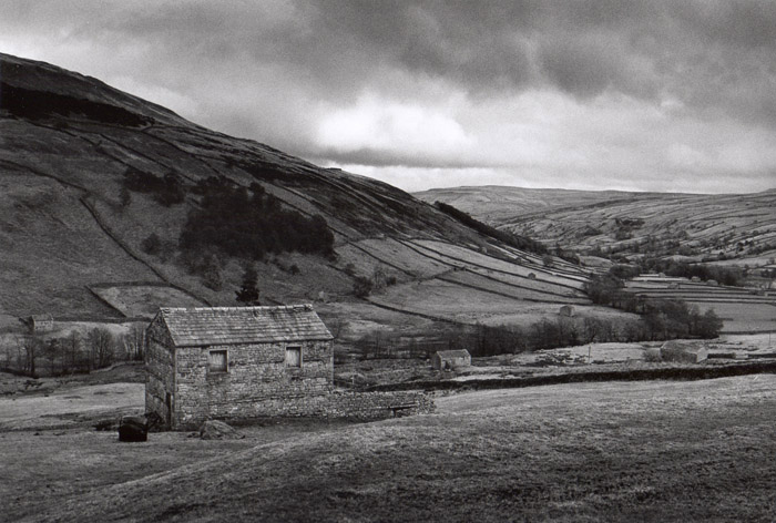
Here's my take on a classic Swaledale image. Dirty sort of weather and a dirty sort of print - recently reprinted on a batch of new Ilford Galerie Grade IV. Just one question really - is the bright patch of cloud a little too bright and therefore distracting?
this is a nicely balanced print. It works for me and that bright cloud is not too harsh either. This has a kind of Fay Godwin quality to it. You should feel good about this image.
i like this too -- the bright cloud is well placed, and i like the overlapping hills, and the way the tree line curves its way to the distance at the right .... very nicely composed, and the brooding light is appealing too ..... personally, i'd like to see that main stone bldg have more pop to it -- it's been so long since i've used galerie i don't remember if it responds well to ferricyanide, but maybe it's a thought?
I like this very much indeed - it really conveys the atmosphere of the spot - I can almost hear the wind in the grass! I didn't find the cloud at all distracting until I read your discription! HP5, ID11 and Galerie G4 is such a lovely, classic combination.
Photrio.com contains affiliate links to products. We may receive a commission for purchases made through these links. To read our full affiliate disclosure statement please click Here.
PHOTRIO PARTNERS EQUALLY FUNDING OUR COMMUNITY:
This site uses cookies to help personalise content, tailor your experience and to keep you logged in if you register.
By continuing to use this site, you are consenting to our use of cookies.