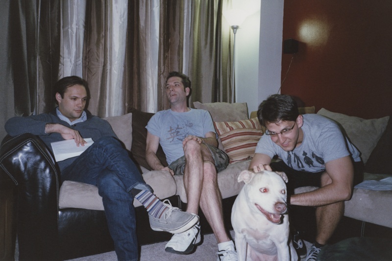
More color printing from the darkroom. Wanted to see how hard it was to color balance a snapshot with mixed light and harsh flash (not hard at all). Dodged the left and right sides slightly to soften the vignette effect.
These are supernumeraries (extras) that I work with at the Pittsburgh Opera.
The thumbnail looks to have a blue-ish cool look which the full size picture has also but to a lesser extent, maybe because any cast is spread a little more thinly on the full size picture. What were the colours of the tee-shirts? Were they a grey-blue or is it that we simply have the old problem of getting a scan to replicate the true balance of the print and possibly made worse by the colour balance of my VDU.Certainly a very cool look from Fuji Superia which I have always found to be on the warm side of neutral Thanks
Thanks for your comments, pentaxuser. Always helpful to hear what others see and think. I did consider some alternate filtrations for this print. Since the dog is out front and receiving and reflecting more flash than anything else in the scene, I tended to color balance against him. The shirts are probably an athletic gray -- I don't remember. I guess I can ask. But correcting for a blue cast would have done funny things to the flesh and made the dog look yellow or red. As I said there was a mix of lighting, so it was a challenge. And for a casual snapshot, I didn't feel the need to overwork it. Still, I might fiddle with it some more...
Thanks for comments. I actually quite like the look and the flesh tones and white dog look accurate which are both areas where a cast shows up so maybe it's just the lighting. It reminds me a little of Agfa colour. I have always thought of Fuji as being the "Technicolor" of still film and often overly warm compared to Agfa's "De-luxe".Rambling a bit here but I watched "The Magnificent Seven" the other night and it looked "cooler and slightly blue-ish" compared to other cowboy films I had seen despite being shot in southern sunshine. I noted that it was shot in Kodak "De-luxe" which I preferred and I'll swear that "De-luxe" films always looked cooler and more natural.
bvy, when I click on your link it says it is an invalid attachment so I can't see what the 45M+40Y print looks like. It has been a while since I did a colour print but certainly on my Durst 605 a reduction of 5M and 10Y on the dichroic head made quite a difference. I'd like to see it but the link isn't working
Photrio.com contains affiliate links to products. We may receive a commission for purchases made through these links. To read our full affiliate disclosure statement please click Here.
PHOTRIO PARTNERS EQUALLY FUNDING OUR COMMUNITY:
This site uses cookies to help personalise content, tailor your experience and to keep you logged in if you register.
By continuing to use this site, you are consenting to our use of cookies.