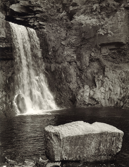
I understand why you took so much time composing, as I still feel the composition is not entirely balanced. Somehow, I feel the rock takes up too much space and precedence over the waterfall. Maybe that's the issue: you are trying to combine two different strong compositional elements in one picture, which can cause issues.
Looking at the picture, I think you might consider cropping out the entire rock and going for a square image... but maybe that's to bold an action and suggestion... well, let's see what others have to say about the image...
Marco,
You are absolutely right about this picture.
I think I knew when I was making the image that I was trying to do too much - each element was so dominant. But you know how it is sometimes...you set your mind on something and are determined to pull it off!
Thank you also for the comments on printing and toning - I am beginning to love that Foma paper as much as my old Record Rapid. They'll probably discontinue it any time soon!
I like it the way it is. The solid rock defying the soft water. I might have tried moving to the right and panning left to swing the falls more into the image. I know, you'd be in the water!
I don't agree,
(which makes this a great site) I think that it gives perspective and doesn't leave the bottom of the print empty. Yes they both are strong subjects, but I feel the rock balances the rock wall out not making it so uninteresting. My eye goes from the rock up the falls and then to the wall and back down. This is what a print is suppose to do, move your eye around the print and back to where it started.
Photrio.com contains affiliate links to products. We may receive a commission for purchases made through these links. To read our full affiliate disclosure statement please click Here.
PHOTRIO PARTNERS EQUALLY FUNDING OUR COMMUNITY:
This site uses cookies to help personalise content, tailor your experience and to keep you logged in if you register.
By continuing to use this site, you are consenting to our use of cookies.