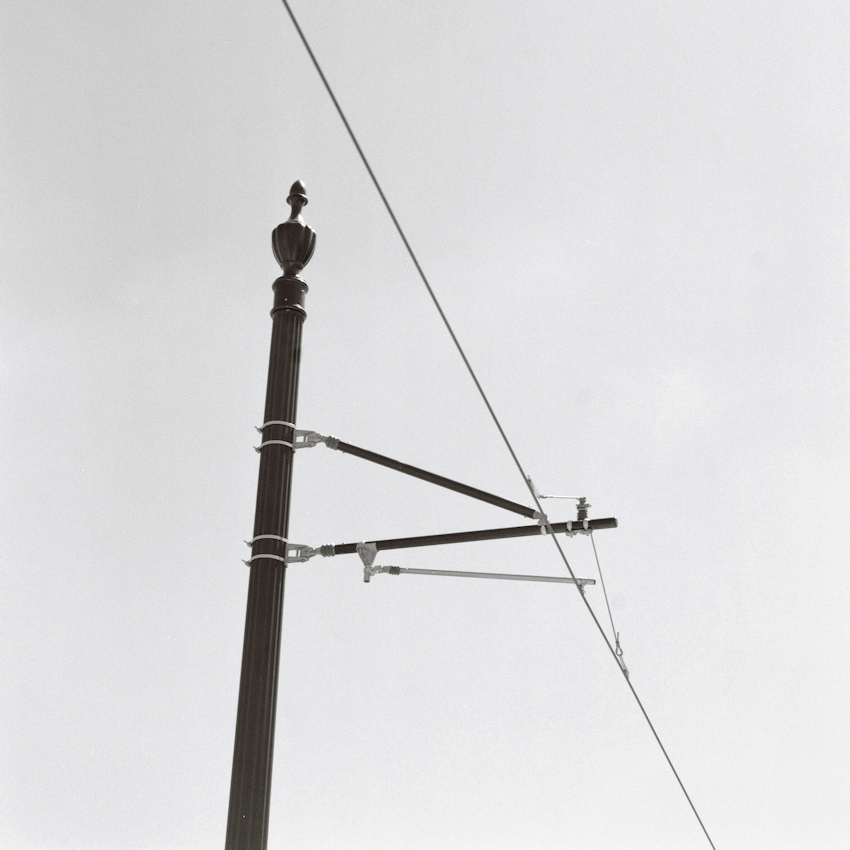
I put this in critique, as it is rather spare of subject against a nearly blank background. I wasn't sure i would like it, but when I first saw the scene i had to take it and see. Any reactions, comments, thoughts and critical view are most helpful.
I think it's pretty cool, an abstract detail. And the support pole is far more elegant than the more industrial sorts of things I'm used to seeing. (Technically it's a catenary and not a third rail, but who will know! )
Thanks, Dave! I did think of all the government waste that went into including finials on all these poles for over 1 mile of street that had been electrified for the street car. Well, I did know what it wasn't, but didn't know what it was! When i named it, i was musing and ruminating over so many political, urban decay, renewal, progress and other wanderings, and then just moved on... It was meant to be about being a photograph, not a social statement.
I love this kind of stark simplicity. W. Eugene would approve of the crossing patterns! Well found and executed, perfectly fitting into the square format, and with just enough variation in the sky.
Thanks @pbromaghin! I had wondered if i ever have opportunity to print, if a low contrast print (or split grade) would let me bring the sky down a little more but not overprint the pole.
I don't wet print yet so I cant really say, but maybe a few seconds of pre-flashing would bring down the highlights without affecting the pole. APUG has had some really interesting discussions on how to do it, with people posting good results in similar situations.
Photrio.com contains affiliate links to products. We may receive a commission for purchases made through these links. To read our full affiliate disclosure statement please click Here.
PHOTRIO PARTNERS EQUALLY FUNDING OUR COMMUNITY:
This site uses cookies to help personalise content, tailor your experience and to keep you logged in if you register.
By continuing to use this site, you are consenting to our use of cookies.