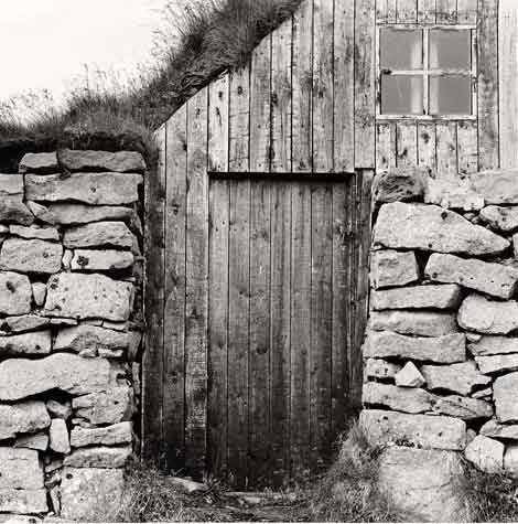
Really nice image, Dan. I'm sure the real print sings. When we were in the area in September, it always seemed like the light was hitting the wrong side of the fjord!
Normally, I dislike blank (sky) triangular areas in the corners. But with this image it actually seems to work -- balancing well with the window. Well done!
The blank bit of sky should be burned in to have about a 10% grey tone. Then it would not be so distracting. Where it is on the shot makes for an easy burn.
Otherwise, very nice, with great texture.
Morry Katz - Lethbridge, Canada
I'd have to see it with the sky burned in. The sky is next to the dark strip of dirt & grass. The sky and dirt might meld together and end up as a big dark corner. It might turn out to be better but the balance is pretty nice with the strip of dirt seperating the sky from the cabin. Light sky or dark sky, it's a great picture.
Photrio.com contains affiliate links to products. We may receive a commission for purchases made through these links. To read our full affiliate disclosure statement please click Here.
PHOTRIO PARTNERS EQUALLY FUNDING OUR COMMUNITY:
This site uses cookies to help personalise content, tailor your experience and to keep you logged in if you register.
By continuing to use this site, you are consenting to our use of cookies.