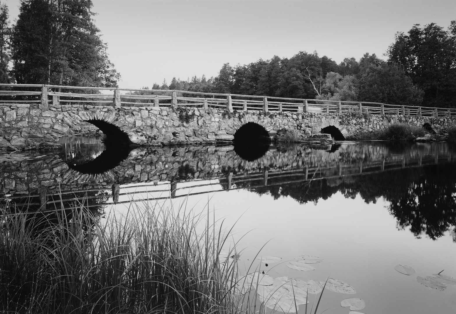


Stone bridge
-
A
- henpe
- Location
- Blidingsholm, Sweden
- Equipment Used
- Wista Field 45 DXII
- Film & Developer
- HP5+ @ EI200, developed in D76 1+1
- Paper & Developer
- Ilford Classic, glossy, fb
- Lens Filter
- 90mm
- Digital Post Processing Details
- Print reproduced using a D-SLR. Sharpening and some contrast adjustments to get as close to the print as possible.
- I grant PHOTRIO permission to share this gallery image and previous images on their social media pages.
-
- Yes
- Is this print for sale?
-
- Yes
| Photrio.com contains affiliate links to products. We may receive a commission for purchases made through these links. To read our full affiliate disclosure statement please click Here. |
PHOTRIO PARTNERS EQUALLY FUNDING OUR COMMUNITY:  |