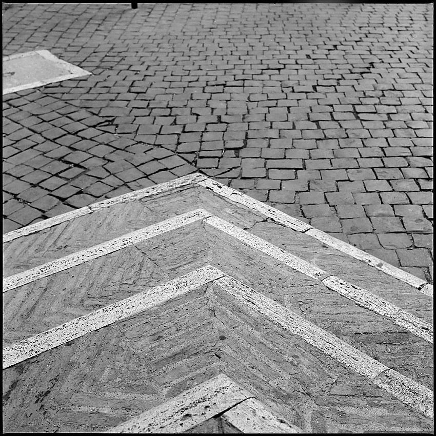
Nice - the third dimension just disappears. I like the asymmetry too, as it merges with the uneven cobbles. I'm in two minds about the end of the post at the top. This is an interesting contrast with the concrete elements in your recent US architecture work. Similar approach but the age and materials tells a different story.
The little black post at the top was something I didn't notice when composing the shot - and there's enough real estate left in the rest of the scene that I could certainly crop it out without harm. This was just a quick-and-dirty scan of the whole image to get a sense of the potential it has.
Photrio.com contains affiliate links to products. We may receive a commission for purchases made through these links. To read our full affiliate disclosure statement please click Here.
PHOTRIO PARTNERS EQUALLY FUNDING OUR COMMUNITY:
This site uses cookies to help personalise content, tailor your experience and to keep you logged in if you register.
By continuing to use this site, you are consenting to our use of cookies.