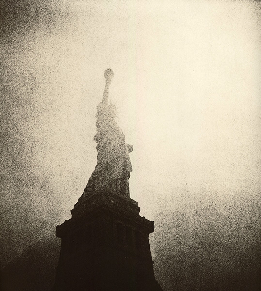
Statue 2
Jersey Vic

Statue 2

Too lith-y? Recognizable?
It was the last print in a very exhausted batch of developer so the contrast is really high.
Thanks
Location
NJ (yes, it's in NJ)
Equipment Used
Holga
Exposure
torrential rains
Film & Developer
Arista.edu (Fomapan 400) Rodinal 1:50
Paper & Developer
Varycon Matt (sweet!) in Fotospeed lith
Wow! The familiar made spectacular. Most excellent, Vic.

All the best,
Daniel
 
Thanks alot lady/ies (mi dispiace Andrea-non lo so) and gentlemen-your comments really mean alot to me. This lith 'option' is wonderful..I feel like a kid with a new Crayola 64 pack after working with 16 untll now.
 
Less is more. The lack of definition actually adds to the piece. Crayola 64 is almost as cool as Torspo hockey sticks...
Gorgeous, Victor. Gorgeous. I'll have to try some of the matte Varycon again, just for lith. Kinda settled on Fomatone but seeing this I have to ask: Why?!
- Thomas
 
..... it graduates, this one is even more arresting. I like the gritty silhouette, at the edge of recognition. Just beautiful and inspiring work, and it is not easy with such a classical motif.

r.
 
Thanks so much. It's really encouraging to hear this.
 

Media information

Category
Critique Gallery
Added by
Jersey Vic
Date added
View count
1,380
Comment count
23
Rating
0.00 star(s) 0 ratings

Image metadata

Filename
liberty2.jpg
File size
124.5 KB
Dimensions
539px x 600px

Share this media

Photrio.com contains affiliate links to products. We may receive a commission for purchases made through these links.
To read our full affiliate disclosure statement please click Here.

PHOTRIO PARTNERS EQUALLY FUNDING OUR COMMUNITY:


Ilford ADOX Freestyle Photographic Stearman Press Weldon Color Lab Blue Moon Camera & Machine
Top Bottom