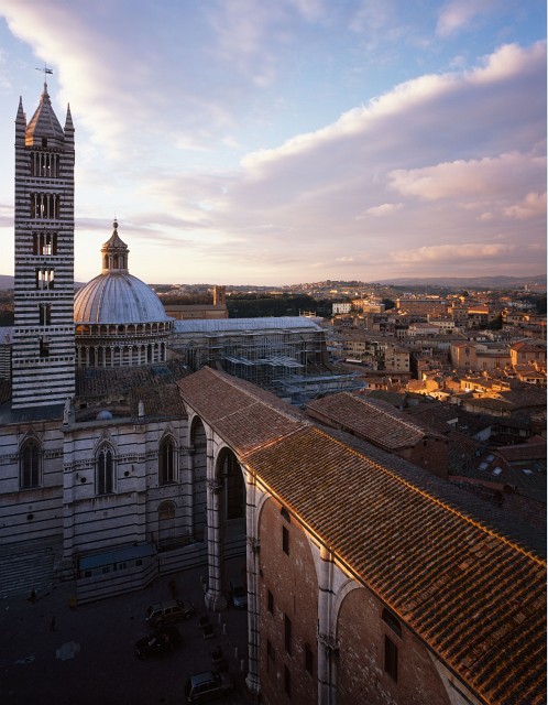
Siena - Il Duomo
Marco B

Siena - Il Duomo

View from the top of the planned but never finished gigantic site wing of the duomo, that was supposed to become the new main ship, the megalomanic plans stopped by lack of money, major structural problems and the plague in the 13th century
Location
Siena
Equipment Used
Tachihara 4x5, Schneider-Kreuznach Super Angulon 75/5.6
Film & Developer
Provia 100F
Paper & Developer
Diapositive scan
*Very* nicely composed, Marco. This really captures the importance of the tower in the city as a whole.

However... I think there should be some more shadow detail here. I assume this is a flatbed scan. I think it can be warmed a bit, though I realize that the slight blue cast is part of the provia "look."

P.S. By the way, is your last name Borsato? If so then I think you can afford a drum scan :wink:
 
No, it's not... ;-) unfortunately ;-( could use the money...

So a drum scanner is out of the question, however, this was scant on a equally well Imacon Flextight 949, that I can hire at a professional lab in Amsterdam for acceptable rates. And no, there just isn't much more shadow detail to be recovered here. Actually, I have made an attempt to get some more out of it, but it looked goofy and unnatural if the lower part was made lighter, so I think this is the best it can be.

I think this scan represents the original diapositive well.

You're just running into the limitation of diapositives here, with their relative smal exposure latitude. Maybe a color negative would have captured a bit more. Or using neutral graded density filter might have helped at exposure time.

Well, in the end, not that I care... I don't need the digital HDR look.
 
Keith, what is the difference between Astia and Provia? I know Velvia is supposed to have very punchy colors, but what were Provia and Astia originally designed for, what purpose or lighting situations? (e.g. is Provia maybe a "studio" film?)
 
Lots of variables here: colour temp, under/overexposure, reciprocity, granularity... but I'll offer a few rough generalizations that are sure to fail in some cases!

Astia has the most latitude of the three and is arguably the only one in the Fuji lineup which can give accurate skintones over a reasonable range of colour temps.

Provia tends to have a bluey/cyan cast if the light isn't right on 5000K and exposure isn't optimal. But provia saturation is regarded by many as somewhat more neutral than classic velvia, maybe neutral enough in some situations to be used for products or such, and it sometimes offers a bit more shadow detail.

100F allegedly has less granularity than velvia, but... personally, I think that is minor. The important thing is that both can give credible colours when used appropriately. It just depends how you like your greens and blues.

Astia doesn't develop a cast if you're a bit off on colour temp and has better colour rendition if you do over/underexpose. The saturation is also quite subdued compared to the other two, though you can underexpose it a bit if you want a little more saturation and it won't go nuts on you. Astia is the only Fuji film which will appeal to ex-Kodak slide-shooters, I think.

In terms of scannability, velvia can develop some ridiculous densities (Dmax close to 4, as I recall) and so it can be very tough to scan. Frankly. I think drumming it is the only way to go if you really want to get all the film can offer. Provia tends to be a bit easier to scan, I find, and digging out shadow detail usually is doable if the exposure was correct. Astia is the most readily scanned of the three.

I haven't been using 100F for a long time, I have been using 400x for those situations in which I want slide and I also want speed. 400x is truly remarkable stuff that actually pushes credibly. My ISO 100 preference remains velvia 100. For ~3200K colour temps I like 64T very much- you might like it for sunrises/sets. My favourite application of 64T is night-time stuff, it makes delicious skies.
 
Incidentally I just had another look at your shot on a better calibrated monitor and I officially take back what I said earlier- actually this scan does look good! I see some nice, delicate, pinkish tones in there.
 

Media information

Category
Standard Gallery
Added by
Marco B
Date added
View count
410
Comment count
6
Rating
0.00 star(s) 0 ratings

Image metadata

Filename
dn3_33_2040.jpg
File size
105.6 KB
Date taken
Mon, 04 February 2008 2:27 PM
Dimensions
498px x 640px

Share this media

Photrio.com contains affiliate links to products. We may receive a commission for purchases made through these links.
To read our full affiliate disclosure statement please click Here.

PHOTRIO PARTNERS EQUALLY FUNDING OUR COMMUNITY:


Ilford ADOX Freestyle Photographic Stearman Press Weldon Color Lab Blue Moon Camera & Machine
Top Bottom