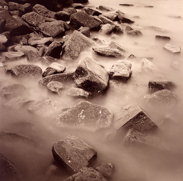
For a first try in toning this is extraordinary. Exposure is as good as it can be and it has "the glow" somehow. I would call it a real fineprint. Never expected that the normal MGIV would tone so willingly...
Thanks, i didn't like the B&W version of this very much - i couldn't get the contrast quite how i wanted. I toned this and a couple of other reject prints - but this turned out best. I'm not sure if this is always the case, but i seem to have had more success with prints that have a lot of middle and light tones, the darker prints did not work quite so well.
Lighter tones seem to have a pinkish brown look. I have commented on the doorway toned print. It seems that Speedisepia may have a bias to red/brown in a range of shades from an attractive red/pink form of brown onwards.
If its a Mr Maunder brew then there's a good chance that it's quite original in its look and a useful addition to the range of toners on the market
This is very nicely done. When you feel like working on this print and that of the doorway arch, consider split toning with sepia and selenium. The sepia will affect the high and mid tones and the selenium will blacken the low tones. It's almost always exceptionally attractive.
Photrio.com contains affiliate links to products. We may receive a commission for purchases made through these links. To read our full affiliate disclosure statement please click Here.
PHOTRIO PARTNERS EQUALLY FUNDING OUR COMMUNITY:
This site uses cookies to help personalise content, tailor your experience and to keep you logged in if you register.
By continuing to use this site, you are consenting to our use of cookies.