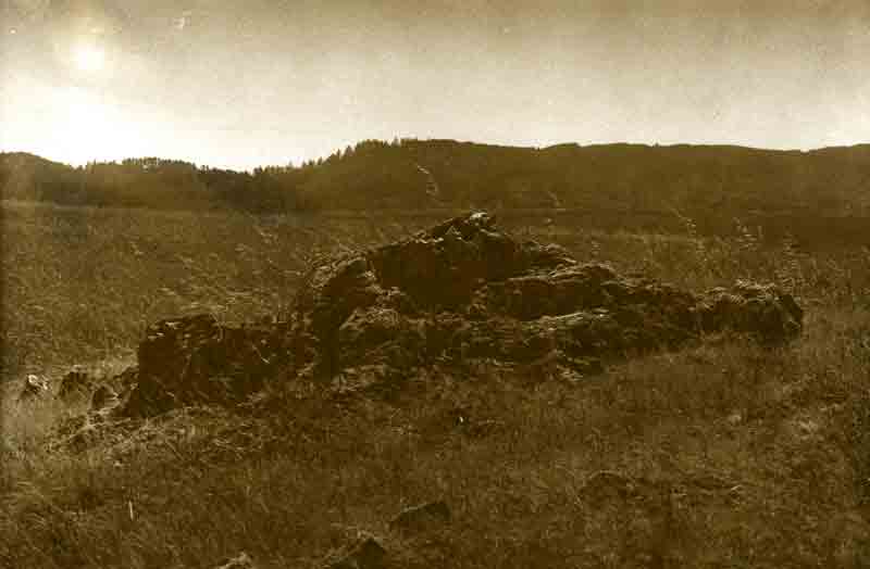


Rock-Horizontal
-
A
- bsdunek
- Location
- Northern California
- Equipment Used
- Yashica Minister III
- Exposure
- Metered
- Film & Developer
- Ilford Pan 50, Microdol
- Paper & Developer
- Adorama RC VC, Dektol, sepia toned
- Lens Filter
- none
- Is this print for sale?
-
- Yes
| Photrio.com contains affiliate links to products. We may receive a commission for purchases made through these links. To read our full affiliate disclosure statement please click Here. |
PHOTRIO PARTNERS EQUALLY FUNDING OUR COMMUNITY:  |